
Hi guys! I hope you all had a wonderful weekend!
For this week’s Color Palette Monday, I thought I would share a palette of good transitional paint colors. I frequently receive questions from readers looking for paint colors that are good for transitioning a home from strong warm tones to cool tones. The funny thing is that I also hear from those wanting to transition their home from cool tones to touches of warmer undertones.
Having a paint color with a nice subtle balance of warm and cool, helps ensure a smooth color transition from room to room and is a great way to introduce a cooler or warmer undertone in a home. Transitional colors are ideal for people who are uncertain about what colors to choose because the balance of tones helps ensure that colors will work harmoniously throughout a home. It’s also easier to make broader color jumps room to room by using balanced transitional colors.
So let’s take a closer look at this week’s palette:
(As a reminder, each color palette that I share is printable. It makes a huge difference to look at paint colors that have been printed out versus your computer monitor. It helps even more if you print out the palettes on smooth white card stock. Of course my palettes should not be used to replace a paint color card, so if you see a color you like, please refer to a paint color card).
Here is the link to this week’s color palette for you to print: Color Palette Monday #3 -Transition Color Palette
One of the hardest colors to choose for a home are dark accent colors for cabinets, fireplaces, doors, etc.. Black Fox by Sherwin Williams is really a near perfect dark balanced transitional color that would work well with either warm or cool tones throughout a home . I cannot get enough of this rich color and it really is the perfect transitional dark color and it would work with almost anything:
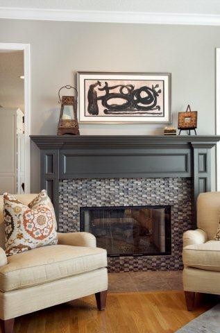
Black Fox is the perfect dark brown/black that has the slightest hint of warmth and if you’re looking to paint cabinets or doors throughout your home, this is a great color to consider. My friend Megan from the blog Honey We’re Home painted a door in her entry way this color and I don’t think she could have picked a more ideal color for the space:

Source: Honey We’re Home
Jumping to the other end of the spectrum, if you’re looking for a great light neutral transitional color, Sedate Gray by Sherwin Williams is a great one:

Source: Not So Newlywed McGees
Sedate Gray really is another ideal transitional color because it has a very subtle perfect mix of warm and cool tones that would also work very well with almost anything.
If you want to see more images of Sedate Gray, the blog Not So Newlywed McGees shares an amazing library revamp using this color and they have a lot of great shots here to give you a better feel for this color.
I know there of several of you looking for a way to incorporate a touch of cooler blue into your home but are not sure what color of blue. Aegean Teal by Sherwin Williams is a fantastic color and it has a balanced touch of warmth. I love how Jenny from Evolution of Style used this rich color in her bookshelves:

Source: Evolution of Style
Aegean Teal would look so beautiful in a bedroom or entry way and is a great way to incorporate blue into a home filled with warm tones.
If you’re looking for a beautiful transitional blue green color, Waterscape is another beautiful color that would be gorgeous in a bathroom, bedroom or an office space like Katelyn James used on her wall to revamp her office:

Source: Katelyn James Photography
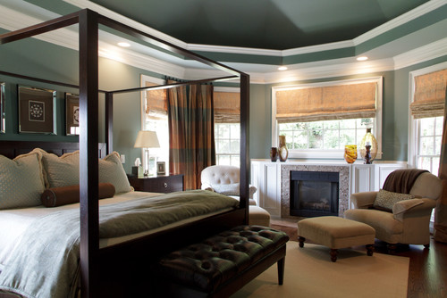
Underseas by Sherwin Williams is a really great color balanced with green/blue/gray and it looks amazing in this beautiful bedroom:
For a good trim, cabinet or ceiling color, Pure White by Sherwin Williams is a safe transitional white.
I hope you see a color here today that jumps out at you. If you really struggle with choosing paint colors, transitional colors like these can really make the process so much easier because they will work well with almost any undertone. If you see a color that is close but is too dark or light, you can always pick up a paint color card of these colors and look at all of the shades of these colors on the paint card.
Again, please keep in mind that lighting can drastically change a paint color and what looks safe on a color card may have a crazy hue that jumps out in certain lighting situations.
Thanks so much for hanging out with me for another Color Palette Monday! Do you have a favorite color that’s jumping out at you today? I would love to hear which one is your favorite. If you missed last week’s palette, “Nearly Perfect Neutrals”, you can get to that post by clicking the palette below:

One last thing, if you’re looking for some help in how to pick the perfect color in a space with the lighting, you can check out my post “Tips and Tricks for Choosing the Perfect Paint Color” by clicking the image below:

Have a great week friends!!
Cheers!
Cyndy
Trish @ Uncommon says
I have Underseas in my kitchen and love it so much that I decided to repaint my laundry room last week with it, too! Such a fun and beautiful color!
Take care,
Trish
Cyndy says
I have fallen in love with Underseas too! Such a gorgeous color and I bet its beautiful in your kitchen and laundry room. I was also thinking it would be a great cabinet color too! Thanks so much for stopping by Trish!!
Jane Roarski says
I am into interior remodeling and your choice of color is soothing to the eyes. I personally love the Aegean Teal and how it blends perfectly with white. Very contrasting yet subtle. Nice work.
Cyndy says
Thank you Jane! I’m so glad that you stopped by!
Jenny@EvolutionofStyle says
Such a great series with such amazing color palettes. I have such an obsession with palettes it seems – I can’t get enough! Thanks for featuring my Aegean Teal bookshelves. I added the Agean Teal to our basement media area as well, and I really love the color, and it works in that area since we wanted it a little darker for movie-sports watching.
http://evolutionofstyleblog.blogspot.com/2012/08/basement-reveal.html
Cyndy says
Thanks Jenny! Girl, you know how to pick paint colors! I have spent countless hours drooling over your blog with your color choices. I’m so glad that you are enjoying the palettes!
Kay says
Thanks so much for all the help! I have a horrible kitchen and am trying to pull it all thogether…might be impossible. The backsplash is slate with alot of blueish-gray in it. I actually like the slate. The countertop is an old corian color that is grayish-purple. Amazingly, it goes pretty well the slate, but it has alot of purple in in. The cabinets are solid maple ‘slabs’ that are ‘white-washed’ and have either a yellow or pink tone depending on the light! I hate them. The floor is a light colored tile that really doesn’t go with anything! The appliances are black. The wall color which extends into the whole house is a light gray that has alot of brown in it…kind of a taupey-gray. Since it was recently painted, I can’t change the wall color. I have decorated around this using purples and blues which has brought it more together than when we moved in but it needs more work….for sure. I want to paint the cabinets and put in laminate flooring and maybe a new countertop but don’t know how to pull the colors together. BTW, there is not alot of natural light in the kitchen but it opens to the living room which has alot of natural light. When we bought the home we planned to renovate the entire kitchen. A week after we moved in our vacation home in Florida was hit by a hurricane. A total renovation is no longer feasible. Can you help me…PLEASE. I don’t know where to start! Any help is greatly appreciated. I love your ideas and paint choices.
Mario says
Stumbled upon your page and it had some good info.
I was hoping to get some color guidance.
My foyer entry, living room, dining room and hallway are all connected and I used BM Butter Pecan paint. To add some color, I used Pearl Harbor that was on the same card under the chair rail.
While I would like to repaint everything, it’s tough with a 3 year old.
I was looking to change the color of just the hallway and maybe the foyer entryway and was looking for some color idea’s.
I like grays myself for maybe the hallway, but open to suggestions.
I always use BM Paint because of good luck, but willing to try something else if the paint is of quality.
Thank You!
Melinda Sheffield says
I could really use some help/advice. I recently bought a second home on a lake with a great view! The house is 50 yrs old. I would like it “cottage” style. I am having a hard time choosing paint.
The house is only 750 sq feet. It currently has cruddy “wood” paneling, that I sould like to paint over. The house is pretty dark, and very shaded. I noticed that when I primed the bedroom walls white, they really pick up lots of green. I will also be painting all the trim (maybe glossy). Soooo, I need a nice trim color, and preferably neutralish paint color. Any suggestions? BTW, I prefer Sherwin Williams paint.
I would like my house to seem “brighter” and “bigger”. Any help would be so appreciated!
Melinda Sheffield
Cyndy says
Hi Melinda! Sorry that I’m late responding to you. If you haven’t already picked your colors, I would suggest any one of these tried and true neutrals that I shared here: https://www.thecreativityexchange.com/2013/04/nearly-perfect-neutrals-color-palette-monday-2.html
Be sure and print out the palette, so you can see the true colors and the variations. Sounds like you need a light warm neutral (no green) to offset the green that is being picked up. Edgecomb Gray is a great color but it’s very light and may go too gray. All of the colors on that palette are the most popular neutrals out there and they all work well in a variety of lighting situations. As for trim colors, I would go one or two shades lighter than the neutral wall color that you pick. That will make the space appear so much larger.
Good luck and I would love for you to come back and tell me what you decided on. Thanks so much for stopping by and sorry again about my delayed response! I can’t seem to catch up!!
amanda says
Cyndy, so happy to find your blog! I need help! Recently bought our first home and started to look for color because its one big beige box-seriously! My builder painted the ceilings and walls same color SW Kilim Beige. After researching, I’ve discovered designers are moving into painted ceilings-I’m not yet a fan. A crisp white ceiling is pretty- having the same color is more informal and cozy feeling. I love the beautiful gray walls and can’t picture this with beige ceilings. So we’ll be painting the ceilings too. Should I paint the ceiling same as wall or a different shade of gray? If different, how much? Lighter or darker? Also, the beige seems to work more downstairs. Can the house flow if we do shades of gray up and keep the beige box down???
Any advice appreciated!! Thanks,
Amanda
Cyndy says
I’m right there with you on the painted ceiling. I prefer a crisp white myself with the same undertone as the wall. If you want it crisp, you can have Sherwin Williams tint “Pure White” with 10-20% of your wall color. This way, it’s crisp but it will still has the same undertone and blend beautifully with the wall.
It’s really challenging to mix grays and beiges unless they have the same undertone and it would greatly help if one of the shades to be at least one shade darker/contrasting. Good luck! I hope that helps!
amanda says
Thanks so much for the reply!! I’m going to mull the info/colors! Thanks again!!!
exterior remodeling says
Your choice of colors is a well defined combination of elegance and class. Excellent job Cyndy.
Paige H. says
I find myself in the position of requiring your input on paint colors. My company is closing our downtown office and moving us all home. Our second bedroom will now be my office. The problem: it’s a cave. It has poor, yellowed lighting, high-gloss cream walls, and navy blue carpet. It is a 10×9 corner, exterior room with a window on both exterior walls. We are currently unable to remove the carpeting (even though I know there are hardwood floors underneath that, with some TLC, would be beautiful). We plan to replace the light fixture, but the paint color has me sweating bullets because of that damnable navy carpet. I’m thinking light grey or light khaki walls with bright white trim and ceiling might do wonders in bringing the room out of it’s current Neanderthal existence. I even considered a roasted pumpkin accent wall, but my husband birthed a full-grown cow at the mere mention of the idea. I would also like to know if the walls, trim, and ceiling should be matte or semi-gloss. (Note: I’m also trying to think ahead to how it will look when we get around to refinishing the floors.)
Any input, support, and/or other ideas would be greatly appreciated.
elizabeth says
I am really having a difficult time picking out a color for our great room/kitchen area. Our great room is currently painted Lenox Tan which I like. Our dining/kitchen area (cabinets are Navajo white with honed black granite) is my trouble spot. Anything with a gold hue on the wall turns the cabinets too creamy.
Anything beige is okay…just meh. I had an interior decorator come in and she recommended coventry gray. I went with it and it came out blue! So sad. I am at a loss…any suggestions to end my misery? (colors in my home trend towards golds, reds, caramels etc…)
Sam says
So I just painted my hallway in Benjamin Moore feather grey. It looks like a powder blue instead of the grey I was going for. Regardless, the color is staying. I am looking to now find colors for my living room and kitchen. I have brown furniture and table in the living room. And an area rug in brown and emerald green damask print. What colour will compliment the feather grey in the hallway. I was thinking of going a pure grey but also wanted to add a punch of colour too. I don’t want boring.
The kitchen has warm walnut cupboards and stainless steel/black appliances.
Any suggestions are appreciated.
Bev Stone says
I am having SO much trouble trying to decide on kitchen colors!!! Can anyone give me their thoughts? Here’s the basics: My appliances are almond ( I know, old school, but I’m stuck with them.) I’m close to getting my cabinets redone. The room is small with one north facing window so not much natural light. Floor at this point is medium oak wood laminate. I would dearly love some dark cabinets, charcoal or black but feel the room is too small and dark already. I would love some of the soft whites, whitewashed, antiqued whites, etc. but don’t feel like that will go well with the almond appliances. Won’t I need to stick with something in the area of soft taupe for my cab colors? And about walls………………..
Cyndy says
I was just thinking that white/off white would be perfect with the almond! The whole time you were describing your space, I just kept thinking pure white. White walls would open up the space, lighten the dark space, blend well with your appliances and give you the choice to go dark or light on your cabinets. Why not consider white cabinets or a very light warm gray with a black island? I would recommend sticking with Sherwin Williams Pure White or Decorators White to avoid any undertones that could pop out in that space in off whites.
Good luck and I would love for you to keep us posted! Cyndy
Melissa says
So we just moved into a new house that is in desperate need of a colour update… All these tools on the Internet are both wonderful and overwhelming.
I am stuck so many deductions I just don’t know where to begin and I want to have the cohesive flow from one room to another but so worried that I won’t be able to do that
Melissa says
Auto correct it was meant to say decisions not desuctions
Shantelle says
I have a question regarding woodwork/trim. All of these samples of paint that I see are with white trim. I am curious-what colors work with natural wood trim? For example, I love love love the look of gray/blue colors, but think it will clash with the woodwork in my house. I am OVER cream/white. What colors would you suggest?
Shantelle says
Please respond-I mis-typed my email, it is smarie04@hotmail.com
Shantelle says
OK, not sure what happened! My original question wasn’t posted. I was wondering about wood trim. All of these paint colors are shown in homes that have white trim. I have natural wood trim in our house-and I am OVER cream/white on the walls. I love the look of gray/blues but think it will clash. Any suggestions on a palette?
Sheila says
I have the same dilemma as Shantelle. My husband won’t let me touch the trim with a paint color, but I also want to go with the grey/blue tones.
Danielle says
Would love some insight! All your post have already been helpful and I can’t wait to go pick up some paint palettes to bring them home to look. But moving into a new house and I have got to paint…kitchen is green, dining room red, and living room is “golden” something but obviously a yellow undertone! I’m more of a neutral person but I’ve looked into Sea Salt or blue Hubbard for the dining room cause I like the slight blue tint in them. But I have got to choose a main neutral color because its a two story house where you can see the upstairs so a lot has to be painted the same color!!! What’s a good neutral color that will still have a similar undertone as the sea salt or blue Hubbard? My other problem is right now the cabinets in the kitchen seem very yellow also but from what I’ve heard changing the wall color in the kitchen and main living area will help tone it down to not look yellow. So any recommendations on paint that I can go with for neutrals to help me out with all of this? Thanks so much!!!
Danielle says
I have to choose a paint color for our house were moving into to. The house is great just outdated paints in the rooms. The paint in the living room is a golden color and I would like to find a more nuetral paint since the upstairs and downstairs have to be painted the same color since they are joined together. So any advice on a color that can go with any kind of decorations? Also the kitchen cabinets have a yellow undertone so I want to stay away from colors with yellow because I don’t have time to redo the cabinets so I’m thinking if I pick a different nuetral color for the house and then a color in the kitchen will offset the yellow undertone on the cabinets and make it go away! Would love some insight
Karen says
I am looking for advice on painting the main floor which has a very open floor plan (living, dining and kitchen open to each other). The ceilings are vaulted in the entire space. I am looking for a grey with neutral undertones (no blue) do you have any recommendations? Also I am trying to decide if the ceiling should be painted white or the same color as the walls. Any advice is appreciated!
lisa says
Hi Cyndy! I love your tips. I am trying to choose a color to paint my kitchen cabinets. My walls are BM white dove, my floors are dark ebony wood with a matte sheen, my appliances are stainless and my counters are granite tile in mostly medium grey, with white, dark brown spekles, with mauve undertone (which is not my favorite). I can send photos. My color scheme is mostly black and white, neutral with a bit of silver sage and some pops of magenta. I am considering dove white but am loving greys too!
Thanks so much
Jodie Clark says
Please help my master bedroom has a slanted wood accent wall that’s medium brown and one small window. The space is rather small for a master so the lighting is badddddd. I painted the remaining walls with a plum that now looks grey!! I really need help with choosing a good color. Also I might mention that my furniture is the log cabin style on the lighter side. I’m stumped…..
stephanie says
I got stuck in the world of beige. Maple cabinets with a near matching laminate floor and wall color. My furniture is also a darker beige. I too, love the grays and blues and ready for a clean, crisp, calming look! I have been researching colors now for 3 months. Do you think I can incorporate these colors despite the color of the more ‘permanent’ furniture in my home? Will the gray and beige clash too much?
Brenda says
I would love some help on finding a new color to paint the walls in my living/dining/kitchen area. I put those three because they are one huge room (open concept) The color now on the walls, hallway, and ceiling is SW Sedate Gray then it transitions to Festoon Aqua (guest bath) Rain Washed (guest bed) Oyster Bay (Master bed) and Sea Salt (Master Bath) Good colors but with my new furniture in the living/dining/kitchen everything seems to be washed out. I would like to stay in the same neutral, coastal colors but am ripping my hair out trying to find a color. My floors are light bamboo. The ent. center, coffee table and end table are espresso wood with glass. The dining table is ebony with cream microfiber seats, my sofa and loveseat are a gray leather. Almost similar to the SW color Urbane Bronze? The kitchen cabinets are bright white and I have blue pearl granite countertops (gray, silver, black with blue) I am ripping my hair out!! I have 50 billion paint chips and samples and all turn out icky when I sample them on the wall (poster board pieces) Oh trim is SW alabaster. Sorry for the book
amy says
I would love some help deciding which way to go with paint colors in my living room. I have an 18ft wall Behind my couch, vaulted ceilings, an 11×20 room with skylights and tons of natural light coming in. Also, from the living room you can see upstairs. It’s a 2 story house but only half of it has a floor the other half is open from the first floor if that makes sense. Whatever color I choose or colors will be in the stairwell as well. I’m not good at picturing things. Any help is greatly appreciated:) I should also mention I’d like it to be neutral since we will be selling in the near future.
Rebecca says
That office is beautiful. I’d slap a coat of drawit paint whiteboard paint on the desk surface for those impromptu notes you’ll take down while you’re on the phone.
Rosa1014 says
I’d like to send you a pic of my family room. We have a granite stone fireplace (grayish/charcoal color) and painted this wall color (greenish) different than the surrounding wall (taupe). My husband picked the green color for the FP wall but I am not happy with this color and suggested a bluish-gray but he didn’t like. Since I wasn’t confident with my color I gave in thinking it can always get repainted. 2 years later I am ready for something new but am still stumped. I’d really appreciate it if you can give me some suggestions. Please help me.
Vicki says
I wondered if you could suggest a paint color for my family room. The trim is Benjamin Moore Mayonnaise. I am looking for a light paint color that will still make the trim & shutters stand out but that will brighten up a dark family room. I have dark wood floors, brown leather furniture and a natural jute rug. I have white wood furniture, a black entertainment center and some antique wood pieces. I love the Pottery Barn look. I prefer green undertones over blue undertones and I’m not sure how I feel about all the gray being used now days. Seems sort of trendy to me. Thanks for any help you could give.
Beth says
Cyndy, We just love your website, ideas and the transitional colors you suggest! We just painted our kitchen Benjamin Moore Lenox Tan and are trying to decide on a dining room color. At first we thought BM Saybrook Sage, but then fell in love with BM Carolina Gull. Do you think Carolina Gull would look nice, or do you have other suggestions? Also trying to decide on a laundry room color. Looking at Sherwin Williams colors, we like Waterscape, Jubilee, Summer Shower, Sea Salt or BM Palladian blue. We’re leaning more towards the blue than green, but would appreciate any suggestions or advice you could give us. Thank you!
Cyndy says
Thanks so much Beth! Those colors that you mentioned for your laundry room are all “chameleon” colors.. Meaning that depending on the light in your laundry room, they could really change colors. If you have no natural light in your laundry room and you want gray, you may want to look at blue grays, which lean blue with artificial light. I would test out Jubilee and go from there first. Same thing with your green/sages. It will depended on the light in the space. I would also test out Carolina Gull on a poster board and tape it to the wall. You will then be able to see what direction you may want to go. You may need to go closer to gray green to get a beautiful sage depending on the light. If Carolina Gull is too green, maybe take a peek at Benjamin Moore Spanish Olive. May be too dark and you could look at the next shade up. I hope that helps Beth! I would love to know what you decide. Good luck!
Alicia says
I am getting ready to paint my house and I am having trouble deciding on colors. In my head I am thinking grey with blue accents. I have a wall separating my living room and dinning room with a large opening. I was considering knocking it down to make a large room and painting the full back wall blue and the rest grey. However I ended up not tearing down the wall and I am now stuck as to what to paint each room. I also have a kitchen that will be painted which connects to the dining room. The kitchen will have dark cabinets light countertops and floors. Eventually the entry way and hallway leading upstairs will be painted as well. How can I tie them all together without being boring with all one color?
Kristy says
I absolutely LOVE your website. I found it so inspiring and informative! You have pure talent picking out paint. This is the first time I have ever left a reply on a persons website but I hopeful you can help me out with your expertise. My husband and I are redoing our split entryway in our home. We currently have a two toned staircase (white and oak). Also, my front door (on the outside is painted red) but the inside of the front door is painted white. I guess I’m struggling to make it flow from the red front door into the entrway. I really like warm/neutral colors. My favorite are warm browns. The rest of my house is painted a linen color. Can you please share with me your thoughts as to what color would go good in my entryway with the two toned staircase? I would greatly appreciate it. Thank you.
Vivian says
Wow! Wish I had seen all of your tips before painting! Oh well, I have lots left to do, so I’ll try your tips from now on. Actually I’ve been happy with my choices so far EXCEPT my first floor bath. I used the same Dried Parsley paint that graced my great room walls and is gorgeous in there… Right. Green green tone in a small windowless room. It gives a murky, under-the-sea feel to the little room. Live and learn. Thanks for some great tips to guide me from here on out!
erin says
I am really hoping for an opinion on whether waterscape by SW would be ok as an exterior paint color or if it is too bright? Thanks:)
Mariy says
I recently purchased a med gray sofa and love seat. Now I need to paint my living room to match. Any suggestions? I have a small living room 17×20 which is open to my kitchen. So my kitchen will have to also match my living room.
Cyndy says
Repose Gray or Mindful Gray by Sherwin Williams is probably the two best warm grays out there and they both would lighten up a smaller space and go beautifully with a gray sofa. If you do not have a lot of natural light, I would suggest Respose and if you have a lot of natural light, I would go one shade darker, which is Mindful. I hope that helps!
Janessa says
I have read a few of your posts and have found them very helpful and informative! I was wondering if you could give me some advice on paint, I’m new to this!
My husband and I moved into our first home and recently purchased furniture for our bedroom and living room, and we aren’t happy with the colors on the walls from the previous owners (darker neutrals, earthy colors). There is VERY little natural light with only three windows, so we want to lighten up the place and give some color at the same time – almost everything is beige. We have medium dark wood floors with similar tone wood furniture, except for the couches which are a lighter beige, and all doors and trim are white. Our new bedspread that we love is a creamy beige, trying to go with the olive color on the bedroom walls (and trying to lighten things up).
I love the pallet you have on this page, and we were thinking of going with blues/greens. I think our style is transitional, erring more on the traditional side (hence all the wood furniture), and we like the clean look, much like the pictures you have! Can you give some advise as to picking colors for this situation, especially because we have so little natural light and already bought our furniture/bedspread?
lisa says
Hi Cyndy,
I love your blog and advice. We are currently restoring a 1903 victorian. We are currently redoing the bathroom and master bath. We have a white claw tub, white wainscot, tan tile floors, same tan tiles in the shower but different sizes with niches, and a picture window in the bathroom. The master bedroom is painted in Revere Pewter. We were looking for a color to put on the walls above the wainscot for the bathroom, any ideas. We were looking at palladian blue? Not sure if that would work or it would be too dark.
Thank you,
Lisa
Amanda says
I am struggling with paint options. My living room, kitchen, and half bath/Laundry room are all connected. I painted my living room a yellow, straw color by Valspar (Lowes). I want to paint the kitchen cabinets white and we are replacing the floor with Costa Gray 12×24 tiles in the kitchen and bathroom (Home Depo). I love the “modern country look”. What color would be good to paint the wall in the kitchen and half bath/laundry?
Jessica says
I just read your original post and found it very helpful. I had one question about choosing the right shade of a color. In the post you say if you want a darker shade, go one shade darker and if lighter, go one shade lighter, I am not sure what you mean by that? Do lighter paint colors have the tendency to appear darker when applied?
Denise koster says
Cyndi, I need help! Found out painters are coming this weekend and I am still agonizing over colors…..dining room, stairs connected and living room. Can you rescue me??
I think i want light silvery gray for living room and light crisp blue for dining room. My house does not get a lot of light.
I love your sedate grey but I think it has green undertone. I need blue undertone.
My new couch is light grey although appears a bit darker in my bad light….navy side chairs….white comfy chair. I am going for gray, navy,dark blue, light blue, white color scheme .
You walk immediately into living room entering house and see dining room right beyond it. So it has to flow.
Right now I have teals, aqua and greens so really want to go true blues.
Denise
dkoster5@aol.com
nhu-y says
Hi Cyndi! Came across your blog while trying to solve my paint color issue 🙂 still trying to figure it out and figured you can help. Remodeled the mudroom with Antique white looking cabinets and figured since i love the KM Malibu Beige, why not paint the mudroom that color without testing it. Big mistake, it accentuates the yellow tone in the cabinet. Now Im looking to get it repainted with a color that would compliment the cabinets. I think i need a warm looking Blue/Gray/Green color. Would love your input! TIA!
Christine McClure says
I am absolutely in love with all of your post! However I am a new homeowner and very overwhelmed ??♀️. I want to focus on the master bedroom first but having trouble finding colors to match American Walnut trim ( which is everywhere) and ceiling colors . Country home lots of windows ( walnut trim ) trying for French country meets costal ? I do t know if you can help but any advice I would be more than grateful.
Kim says
hi, great article. I am doing sea salt in our bathroom, floor is vinyl with grays, beiges, creams..skylight and vanity lighting. I want a complementary gray for the vanity.. ( it can be a beige gray) I want a spa like bathroom, that is inviting. We have a coastal vibe throughout the home, if that helps.. I don’t think i want to go too dark, but what would u suggest? Kim
Kim says
sorry I didnt want to limit your gray suggestions, I wnt to know what grays would go really well for this color and my space? thanks Kim
Nikki says
So we are trying to paint our house and I’ve not the foggiest where to begin. I’ve read through so many of your paint posts (and others) and keep coming upon one issue. When I find colors I love on paint palettes and such, they are always VERY bright and intense colors. I’ve heard that when that happens you should try to find the more “muted” or “grayed-out” version of that same color. However, all the colors I see on walls that actually look like beautiful colors (Sea Salt, Rainwater, etc) are actually no where near my picks on a color wall. I love them in homes and such, but it doesn’t translate remotely when choosing. We love “Downpour Blue” and “Ocean Tropic” from Benjamin Moore, but as you can tell, those are very intense colors. So I guess I’m trying to figure out how to accomplish the same feel as these colors without being so intense and am also trying to figure out how to create a whole home color palette. Thanks for any possible suggestions!
Lindsay says
I have read through your posts and have gotten some great ideas! However, I still have one question that I just can’t find the answer to. When painting a bathroom, do you need to have the paint be a shade lighter/darker than the vanity? Our bathrooms all have a blue/gray vanity (dark) and I want to re-paint all the bathrooms. But I’m unsure if I should chose a darker or lighter gray or if I should chose a different color instead. HELP!!!