
Hi guys! I hope you all had a wonderful weekend!
If you happened to miss it last week, I kicked off a new weekly feature that I’m calling “Color Palette Monday”. My goal is to share color palette ideas from some of the most common paint color questions that I have received from readers. I know it’s challenging to find just the right color and I hope that this new feature will help you sift through the myriad of paint colors out there!
The best part of this weekly feature is that every color palette that I share each week will be a printable full page palette that you can print out and save for future reference:

These printable palettes should not be a substitute for paint color cards, but they will give you an excellent feel for the color and the slight differences. Believe it or not, printing out a paint color image comes a lot closer to showing the true color than a computer monitor does (unless your printer is low on ink!). You can print these palettes out on standard copy paper but the quality of the color is so much better printed on standard 8.5″ x 11″ smooth card stock (no fiber/linen lines).
Here is the link to the file to print this week’s color palette #2 Printable Color Palette #2 (Nearly Perfect Neutrals)
So this week’s color palette (#2) is inspired from another one of the most common question that I receive from readers; what is a perfect neutral paint color that always looks beautiful in any space? I get this question from people who are looking to find a wall color that will update a space instantly but most importantly, they want something that is a tried and true “safe” paint color.
Unfortunately, there is no such thing as a “perfect” neutral paint color but there are some “nearly” perfect neutrals out there. These are neutrals that consistently work well in a variety of lighting situations and because of this, they are not only popular with consumers but they are also favorites of home builders and designers. These colors are not a guarantee but it’s as close as we can get to finding a tried and true neutral and it’s certainly worth a closer look.
So what are these nearly perfect popular neutrals? Here they are:
(The top left color on the palette will always be a suggested trim or ceiling color. The lower left color will always be the darkest of the palette and would be good for fabric accents or a possible complimentary color to paint furniture in the space with the coordinated lighter colors. The dark color could also be a great wall color as well).
Probably the most popular/used color from this palette is Revere Pewter from Benjamin Moore:


Source: Decorgreat
source: Decorgreat
If you search the color “Revere Pewter” on Houzz, more than 2,400 rooms painted in this color will come up, which shows you just how popular this color is right now with builders, architects and designers.
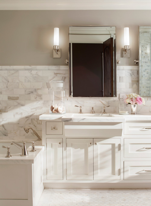
Depending on the lighting in your space, Revere Pewter will lean gray-ish or light tan-ish. I have also seen situations (tons of natural light) where Revere Pewter looked off white. While this color seems to work really well in almost every space, I think the ideal lighting for Revere Pewter is rooms that do not have a lot of natural light like entry ways, bedrooms, bathrooms, etc. This is great because these are the hardest spaces to nail a paint color.
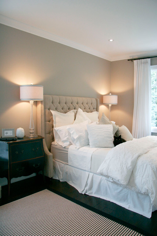
Another popular neutral that has been popping up a lot lately with builders and designers is Edgecomb Gray by Benajmin Moore:

I haven’t seen a room painted in Edgecomb Gray that I didn’t absolutely love. It works beautifully in almost any space including kitchens and bathrooms and I am seeing it paired a lot with Benjamin Moore Cotton Balls for trim and it’s a beautiful combination. It’s really hard to find lighter neutrals that are rich with a lot of depth and Edgecomb Gray is one of those colors and probably my favorite from today’s color palette.
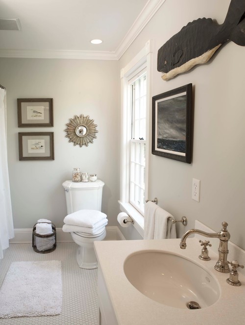
If you’re looking for an even lighter off white-warm gray, Balboa Mist by Benajmin Moore is another neutral that seems to be popular as well with home builders:

If you’re looking for something a tad darker but still a neutral warm gray, Pashmina by Benjamin Moore is another designer favorite:
For another great off white neutral, you might want to consider Overcast by Benajmin Moore:

source: Remodelista
For complimentary accent colors (trim, ceiling, cabinets, furniture) to these neutrals above, White Chocolate by Benjamin Moore used a lot lately for trim and one of the most popular dark browns out there being used for doors and also cabinets is Sherwin Williams Urbane Bronze:
Trim and ceiling are White Chocolate by Benjamin Moore:
the lower cabinets below are painted in Urbane Bronze by Sherwin Williams:

source: Hill Country Homebody
source: Hill Country Homebody
By the way, Urbane Bronze is a fantastic interior door color too!
Is there a color here that’s jumping out at you or do you already have one of these colors in your home and can share what you like (and dislike) about it? I would love to hear your thoughts!
Again, please keep in mind that lighting can drastically change a paint color and what looks safe on a color card may have a crazy hue that jumps out in certain lighting situations.
Thanks so much for hanging out with me for another Color Palette Monday! If you missed last week’s palette, “blue grays with hints of green”, you can get to that post by clicking the palette below:

I am really excited about this new feature and I can’t wait to share some pretty color palette inspiration in the weeks to come. If you have any suggestions for future Color Palette Mondays or any paint questions, I would love for you to share in the comment section below.
One last thing, if you’re looking for some help in how to pick the perfect color in a space with the lighting, you can check out my post “Tips and Tricks for Choosing the Perfect Paint Color” by clicking the image below:

Have a great week friends!!
Cheers!
Cyndy
Lee says
I am so into neutrals and have been blogging about them too. I love that “Remodelista” image, the sofa works perfect in that deep window. I saw a similar sofa which I thought might work in my own home but they are not the most comfortable to sit on but definitely look lovely.
I am planning to remove my summer blue and white pillows from my living area and replace them with neutral mixed patterns of beige and white and hopefully some interesting textures too. It’s mid Autumn and I need a change back to natural tones.
Lee 🙂
Cyndy says
Thanks Lee! I loved your inspiration post and was drooling all the way through! I love the idea of layering with neutrals and adding depth with textures. I especially loved the natural elements that you shared as well. Very calming! Thanks so much for stopping by!
Sheila Lovell says
Love all the tips but one question…all the beautiful rooms have dark wood floors and mine are all natural oak(which I love because it fills the rooms with light). Will the neutrals with gray tones work for me?
Joan Abington says
Love all your ideas on choosing the perfect color.
Regarding the neutral color palette- Do all the above neutrals have the same undertones and can they all work together? I love revere pewter but need to use a grey/beige along with it do you have a suggestion?
Melissa Gordy says
I love BM paint and have used several colors of theirs. I am having a difficult time picking a neutral paint color for my walls and need your help. I have a camel colored couch and honey pine kitchen cabinets…I LOVE revere pewter but it may be too gray with my couch…any thoughts on other paint colors. I don’t want a yellow or pink undertone. I was considering Manchester Tan. Please send me your thoughts:)
Obat Wasir says
Wow, awesome blog layout! How long have you been blogging for?
you made blogging look easy. The overall look of your
site is fantastic, let alone the content!
GB Long says
Help! I have Northwest exposure with a skylight and lots of windows facing North, so soft cool grey-ish light. Except in the afternoon when it goes yellow glowing Western. All my furniture is what they used to call Autum colors. Burnt red sectional- gold loveseat – chocolate chair. I can’t pick a light neutral! It either looks gray and drab or cold or… I don’t want to make the room dark and oppressive (I considered white and thought it would be too stark).
Kelly Hyer says
Hi Cindy!
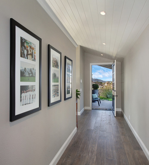
On the Traditional Entry picture by Laguna Beach Architect Anders Lasater Architects, it says the walls are Pashmina Gray. Is there any way to find out the name of the floors?