

A few years ago, I started a tradition on the blog by sharing my favorite colors that I pulled from various paint companies annual color forecasts/trend reports for the coming year. To go back and look at my forecast posts from past years, you can find them here. Today, I am sharing some of my favorites from the 2016 paint color forecast and trend reports.
More than any other design/color forecast that comes out, I look forward to these particular paint company forecasts because they are always the most reliable (when it comes to paint colors) and largely based on current paint color sales/indicators.
Several paint companies have just recently released their forecasts for 2016 and today I wanted to highlight these forecasts and share some of my favorite colors from the reports.
**All images in today’s post are colors from the 2016 paint forecasts. The names of the paint color are directly below each image for you.
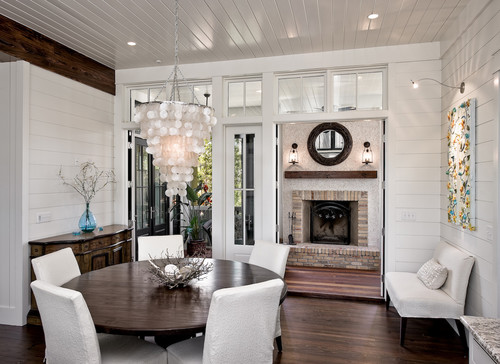
Alabaster Sherwin Williams

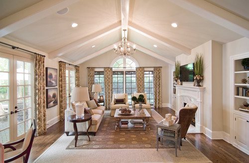
Useful Gray Sherwin Williams
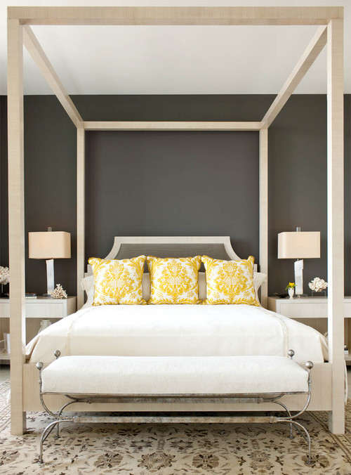
Urbane Bronze Sherwin Williams
These various paint companies base their forecasts on what consumers are actually buying and painting on their walls. The best part of this is that the paint companies have programs to track even the slightest changes in undertones as we buy paint color and they can see slight movement as we move as a whole from one undertone into another.
I certainly don’t make color decisions based on trends but I do like to know where we are heading and use these colors as a starting point.

Alabaster Sherwin Williams
Benjamin Moore does not have their 2016 color forecast out yet but Sherwin Williams, Dunn Edwards and Behr have come out with theirs. The common thread found in all of the forecasts is technology and the need for us to create spaces and environments to unplug and savor the moments in our busy and social lives.
And…., Something else that was a common thread in all of the forecasts are that we are moving into yellow undertones in our paint colors. I knew it was coming this year and if you look, so many of these colors in the forecasts have a yellow/green undertone. I have mixed feelings about yellow undertones but I could tell it was coming and that we are very slowly moving into warmer colors….
So today, I wanted to mainly focus on the Sherwin Williams 2016 forecast because they pulled together color groupings that represent where they think we are heading in consumer paint color trends in 2016. I’m also including Behr and Dunn Edwards forecasts.
This year, the four color forecast groups from Sherwin Williams are (click on the group name link if you want to read more about this color group);
Pura Vida (see all these warmer undertones?)

source: Sherwin Williams

source: Sherwin WIlliams

source: Sherwin Williams

source: Sherwin Williams
Here are some examples of some of the colors from these color groups that I was able to find:
Wool Skein Sherwin Williams
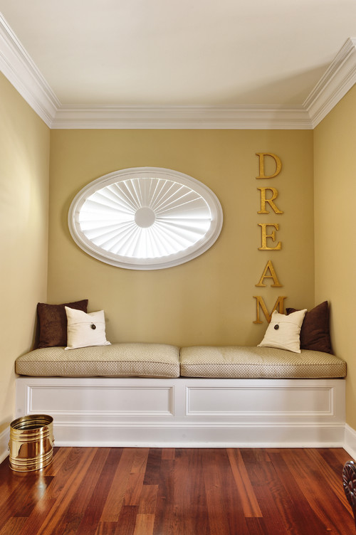
Urbane Bronze Sherwin Williams
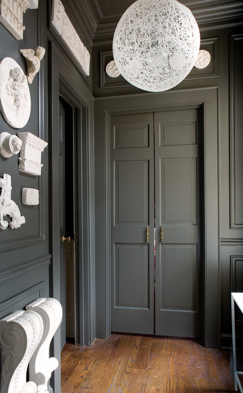
Urbane Bronze Sherwin Williams
Friendly Yellow Sherwin Williams
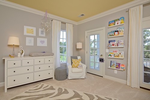
Ceiling is Friendly Yellow and Walls Collonade Gray Sherwin Williams

Backdrop Sherwin Williams
You can find the full Sherwin Williams full 2016 color forecast can be found here.
I really loved the beautiful colors in both Behr’s 2016 forecast and Dunn Edwards trend reports;

source: Behr
and the 2016 forecast from Dunn Edwards

source: Dunn Edwards
I did go through all of the various forecasts and pulled together my favorites and colors that really stood out as we go into 2016. Again, even though consumers are trending to slightly warmer colors, I think those colors that are almost 50/50 mix of warm and cool tones (transitional) are going to be the biggest trends in paint colors this next year, which is what I pulled together below from all of the forecasts:
SW= Sherwin Williams
DE= Dunn Edwards
BM= Benjamin Moore
SW= Sherwin Williams
DE= Dunn Edwards
BM= Benjamin Moore
So I have to know, do you have a favorite out of all of these colors? I am so drawn to Mythical Blue from Dunn Edwards and Charcoal Plum from Behr. I’ll never be ready for full on warmer undertones without some presence of cool in the mix. So what are your thoughts? Are you ready for warmer undertones and a little yellow or muted citrus colors?
If you want to see more rooms with exact paint colors, you can check out my Pinterest Board “Pick a Paint Color”here, where I have more than 500 rooms with specific paint colors pinned. Over the next few weeks, I will be pinning colors/spaces from the 2016 color forecasts.
Thanks for hanging out with me today and if you want to see my post for 2015 color forecast post, you can find it here.
Cheers!
Cyndy
Coco says
Thank you for this informative post. I am curious to know…. why don’t you like yellow undertones?
Cyndy says
Hi Coco! I like yellow as an accent color but on walls and as a strong undertone, I think it takes over and dominates, making it harder to balance other colors and tones in a space. I love a little yellow or warmth in a color- as long as there is equal amounts of coolness to balance.
I have loved this color phase that we have been in for a couple years of calm and balanced undertones because people can do so much more and mix tones. Going into a dominate undertone like yellow makes me nervous because it’s a color that can get old fast, especially if there is no cool balance in the color (in my opinion).
Thanks for your note Coco!
Pmm says
I much prefer your color forecast over the others. I too like a bit of cool undertone. Our designer pushed us to use SW Wool Skein and we got some- just a sample- on the walls and hated the warm tone. We just felt ‘off’ and uncomfortable around it, and didn’t like the cast it gave our skin colors. Thankfully, I found your website and read your posts back during our reno, and it made all the difference. We used colors with a cooler tone with a bit of gray in them, and it made the walls and furnishings flow so much better in our Craftsman home; we enjoy how it changes with light throughout the day. We really LOVE the resulting paint colors in our home, and are happy in the rooms. Thank you!
Cyndy says
Thank you so much PMM for your note! I’m so glad that you found my site and that I was able to help you as you picked colors. You made my morning!
You know, you said exactly what I really wanted to say but didn’t. 🙂 Strong warm undertones can be unsettling on a wall and really take over. They are not serene and soothing because they do not have the harmony of a balanced base that I personally believe all wall colors should have. It’s like you said; it felt off. When colors feel “off”, it’s because they are too heavy with an undertone and I think our eye and brain really wants to see balance.
Thank you again so much for your note and kind words! I can’t tell you how awesome it makes me feel that I was able to help in some way with choosing colors you love! 🙂
Charley says
Geez, I am in the process of changing all the WARM tone colors that our builder used in 2007. I much prefer lighter, airy, cool colors. We live in NC and we can use all the cool we can get & it is much more relaxing. Although, a couple of years ago, I did paint my master ancient marble & office one down on that color chart, Grasscloth & love them. At first the ancient marble looked like tacky mint to me but after I redid the linens, etc. it looks great & gives a dark room a much lighter & brighter appearance. I am technically a ‘lagger’ and am in the grey tones with green/blue undertones phase.
Cyndy says
I agree Charley and I too have finally got rid of all of that bright yellow and warm tones from when we moved into our home (we didn’t choose the colors). It took me years to get it all done and I love the cool/warm mix and hints of gray. So calm and now I have fun with bright linens and fabrics!
I’m hanging out right there with you in the gray/green/blue undertone phase. I’m going to stay here for awhile too! I’ll keep us going with plenty of inspiration!! 🙂 Thanks for your note and stopping by!
Anne says
I was thinking the exact same thing as I read this post! It has / is taking me a long time to rid my house of the yellowish walls and move to cooler, lovely grays. I am preparing to do more big paint jobs this year. Please tell me I won’t be sorry if I skip this current trend back to yellow undertones! I love this blog and have learned So Much. Thank you!
Reena says
We have just bought a 30 year old home and going through a major reno. The process of picking paint colour is overwhelming. During this process, I have come across your website and love it. It’s really informative!
We love the grey undertones and I am picking white cabinets for kitchen. I haven’t finalized the colour but narrowed down to BM decorators white, simply white and white dove. The tile we are going is porcelain with off white and grey undertone. I would like the island to be grey in colour. What colour would you suggest. I am looking to go with white Quartz and dark grey subway tile backsplash.
Cheri says
I’m loving the Mythical Blue, but also like Behr’s Raw Copper and Bowstring. I want to slather my walls and trim in transitional colors so that I can add warm and cool ‘stuff’ willy-nilly. I have old red oak hardwood floors that I plan to refinish. Do you have any suggestions for a stain that will lean to the cooler side? I absolutely hate orange/yellow wood floors, but I’m not sure how my beach house will fare with dark wood flooring. Any thoughts?
Renae says
Interesting comments on the yellow undertones. My entire house is painted in Wheeling Neutral for the most part and has the yellow undertones you speak of. I have Shelbourne Buff and Dunmore Creme in the kitchen and lower level family room. I want to change the paint color because as you say, you get tired of the yellow, HOWEVER, living in Minnesota we have plenty of cold winter. I find grey to be too cold for MN. My woodwork is maple with honey tones to it. It is so difficult to find a color to match that isn’t yellow. Do you have suggestions?
I just had a neighbor repaint her home in the grey tones and now she is replacing tile, wood, window treatments, and furniture because it didn’t match the new paint color. I don’t want to do that!!!
Thanks for you help.
Karen says
I really love all the colors you have included in your color forecast!!
I’m wondering if you could help me pick a few colors for my doors and windows for the exterior of my home. Do you do online consultations ?
Thanks Cyndy.
Robin says
Hi. Just a thank you for all your wonderful posts in general. I find them Godsends and super helpful always. You do such a great job and I just wanted to tell you how much I appreciate being able to find so much info regarding paint colors etc so easily. 🙂