
Beach Glass Benjamin Moore
I hope you guys had a wonderful weekend!
It’s been quite awhile since I have shared a paint color palette and today, I’m doing something a little different. I’m sharing my favorite 2015 paint color trends.
I’m a monthly contributor on Remodelaholic and I also create a color palette each month and share on their site. Today, I’m sharing two palettes that are my favorite 2015 paint color trends and the palettes are; 1) The New Neutrals and 2) The New Transitional colors. I’m sharing my new favorite transitional colors here today and at the same time, I’m sharing my favorite new neutrals here on Remodelaholic. So be sure and check out both palettes today.
I have done my favorite paint color picks each year for several years now, here are last year’s picks. Because I’m a paint color geek, I pick my favorites by looking at the color forecasts, consumer trends and then I compare them to the best selling paint colors. I then narrow them down by versatility and only share colors that have a good track record of working in a variety of lighting situations.
**All of the images on today’s post are from today’s color palette. The color name and brand is directly below each image.
Beach Glass Benjamin Moore
Transitional colors are colors that have an an almost equal balance of warm and cool undertones. In other words, they are safer colors and work with almost anything.
These colors are perfect if you have a lot of warm tones in your home (like warm colored wood floors or trim) and you want to incorporate some cooler colors like grays or blues. It also works if you have a lot of cooler colors like grays in your home and you want to incorporate a little more of the warmer colors.
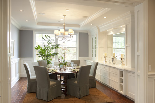
Gray Owl Benjamin Moore
Transitional colors are very similar to neutral colors in that they will pretty much work with anything and they can help you transition room to room (transitional colors have just a tad more color pigmentation than neutrals).
For instance, if you have a tan/yellow bedroom and want a cooler master bathroom color, a transitional color like Solitude (Benjamin Moore) can help you make the transition because Solitude (below) has just the right amount of warmth in the color to blend with a warmer color like yellow (look in the mirror below and seen that the bedroom color is a very warm tan):
Solitude Benjamin Moore
or.., if you have very warm pine or wood floors/trim and you want to incorporate cooler grays or blue, a transitional color like Solitude has enough warmth that instantly blend and help you add a little more cooler colors as you can see in the below image:
Solitude Benjamin Moore
If your home has a lot of cool gray colors and flooring, a transitional color can help add warmth in a subtle way and keep the cool tones from being to sterile and cold.
I personally prefer using transitional colors because it’s such a great way to offset strong tones in wood floors or tile and that balance of warm and cool makes it so much easier to safely incorporate new colors in fabrics and accessories. It also makes it easier to change wall colors room to room.
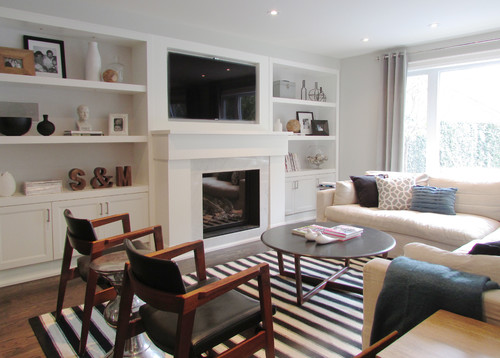
For example, look at all these layers of bright colors and patterns (mix of warm and cool tones). Notice how the wall color (Gray Owl) just helps to pull everything together in a very subtle way. This is what transitional colors do best and calm, diffuse and offset all of the strong undertones in a room. Transitional colors ground and neutralize all of the undertones going on in a space:

Gray Owl Benjamin Moore
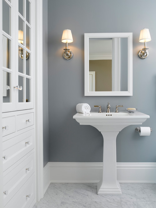
Transitional colors can also help to keep rooms like a bathroom from being too cold and sterile. Notice how the transition color Moonshine (Benjamin Moore) just very slightly warms up the cooler toned marble below. If the home owner had chosen a cool gray without any hints of warmth, this bathroom would not have come to life like it has with the Moonshine:

Moonshine Benjamin Moore
By the way, Moonshine is one of the most versatile and dependable paint colors out there because it instantly offsets and grounds any undertones found in flooring or furniture:
Moonshine Benjamin Moore

Moonshine Benjamin Moore
Here are more of my favorite transitional colors that I think will continue to be very popular in 2015:
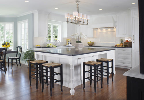
Blue Springs Benjamin Moore

Pure White Sherwin Williams
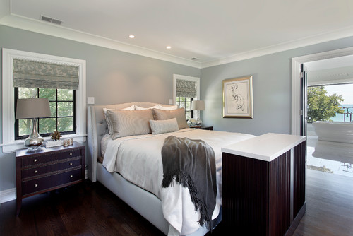
Beach Glass Benjamin Moore

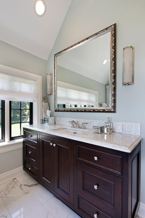
Philipsburg Blue (on the vanity) Benjamin Moore
I’m so excited about the direction we are going in paint colors in 2015 and don’t forget, you can check out my other color palette of neutrals that I pulled together over on Remodelaholic here.
Also, if you need a little more help in pinpointing and how to zone in and pick a paint color, I have some easy tips and tricks that can make it so much easier to choose here.

Thanks for stopping by!
Cheers!
Cyndy
Jenny@EvolutionofStyle says
Great palette! There are a few new colors ion there for me, and I’m loving Beach Glass! Thanks for sharing!
Cyndy says
It always amazing me how you and I zone in on the exact same colors girl! Beach Glass is new for me as well and I stumbled across it looking at BM bestsellers and on Houzz. All of the sudden, it’s being used a lot and I can see why. Fantastic transitional color!xo
Lisa Hughes says
Hey, I love these colors you shared and Beach Glass was one I loved too. I was wondering if you could share a color scheme for exterior that would give this light airy feel too, my home is a cottage style built in 1900, small with front porch, exposed beams and lots of trim. Any thing you could suggest?
Lynne Favreau says
I appreciate your explanations for how the colors work. Really in love with the whole palette but Solitude is speaking to me.
Cyndy says
Thank you Lynne! Solitude is a very beautiful color, rich in depth and it’s the perfect transitional color and should work with almost anything. Thanks for stopping by!
Kelly says
I am leaning toward Gray Owl, it has a soft elegance to it. Thank you for such a great post.
Kelly
Cyndy says
Thank you Kelly! Gray Owl is becoming one of the most popular paint colors because it’s such a great transitional color. Fantastic undertone balance and works well in almost any lighting situation. So glad you stopped by! 🙂
Rieca says
I love transitional colors and I love BM. I used beach glass in my last house as the color to go through the hallways and deepened it in my living room and then continued it into the kitchen. It is a fab neutral that really is moody and changes with the light. I had as you described a need to balance out warm and cool tones and this paint really does that.
Now new house, in a totally different climate with different light I tried the beach glass and it did not work for me.
I have yellow toned granite, with medium teak floors and lots of bright sun in California. I just painted my cabinets timid white and now looking for a perfect paint for the walls. I may go get a sample of the gray owl. I tried rever pewter another fave and I got to say I am not sure.
Any suggestions?
Thanks for another great post!
Rieca
Noralee says
I LOVE the Beach Glass as well! If I use this color for the bathroom walls, what color do you recommend for updating the oak vanity? You have such an eye for the matching. Thank you!!
Susan Scales says
Great post, thank you! Last year, we painted our laundry room Paper White and it looks great. Our laundry room is small (barely wider than our washer and dryer) with one window. Paper White gives the walls and ceiling a hint of color, very light gray with a touch of green undertone. Per my husband and sister the walls are whitish.
Joely Bruns says
In the beach glass bedroom wondering where to purchase shades in window…thanks
Suzanne Pekarek says
I love your articles and fell in love with Grey Owl and Moonshine based on your reviews. I was wondering if what was a good accent wall color to pair with Grey owl?
Suzanne says
I am in love with Grey Owl and Moonshine based on your articles! I had a tough time finding a color that made me feel at home. What color would you recommend to make an accent wall in a room with Grey Owl? Thanks!