Hi guys, it’s Jenny from Evolution of Style back with another contributor post and Color Spotlight. Color Spotlight is where we highlight one very versatile (and popular) paint color and today we are highlighting Comfort Gray from Sherwin Williams.

When you get the urge to give a room a refresh, most of us turn to paint as a starting point since it gives you such a bang for your buck. However, when it comes to choosing a color, that can be a daunting process (which requires input from Facebook Friends). Perhaps your walls look something like mine do right now:

Paint sample overkill. But that’s what you do when you’re on the hunt for “the perfect color”, right?
Then I chatted with Cyndy, and she suggested looking at Comfort Gray by Sherwin Williams, saying that it was a very popular color in her reader poll on favorite paint colors.

I have added it to my paint swatch gallery wall.
In looking around at different uses of Comfort Gray, it does prove to be very versatile, which is what many of us are looking for when painting some of the main living areas in our homes. We want to be able to change out accessories on a whim, and still have a cohesive look. We want a neutral, but not a boring neutral, right?
Let’s take a closer look. One thing I love about this color is how well it works with wood tones. While our current home has white trim, our previous two homes had stained trim, and finding colors that I loved, that also worked with the wood trim, could be a challenge. Not so, with Comfort Gray.
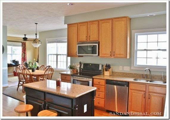
Look how pretty it is in this oak kitchen.
 |
| {Source} |
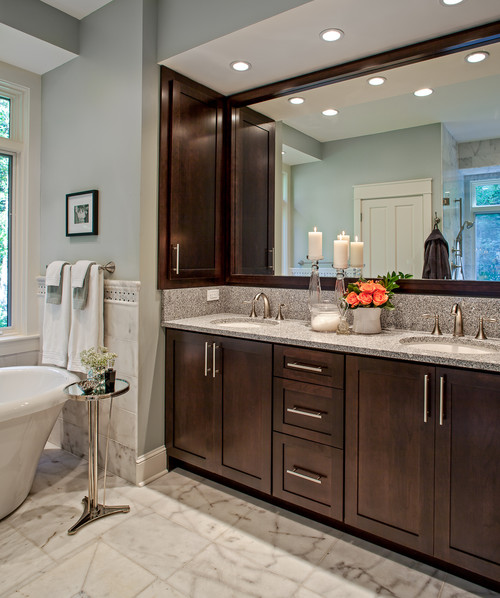
It’s equally luxurious in this master bathroom.
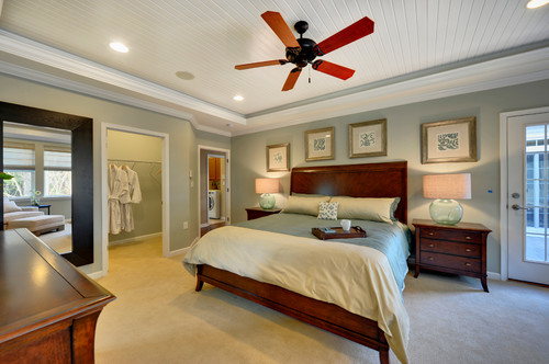
It’s also versatile in the sense that you can use it in any room in your home. It’s a gorgeous, tranquil color in this master bedroom (again, working with the wood tones in the furniture):
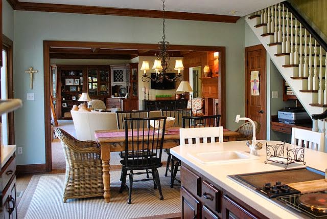
It really gives a rich feel to this kitchen/dining space at Sweet Chaos Home, doesn’t it?
 |
| {Source} |
So pretty in this dining room:

A stunner in this kitchen.

I’m completely smitten with this family room.
 |
| {Source} |
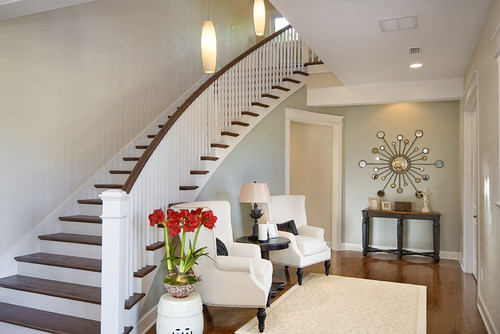
It even works in an entry area, it’s so versatile.
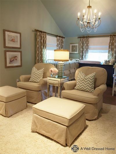
For a twin nursery, I don’t think you could find a more soothing color.
 |
| {Source} |
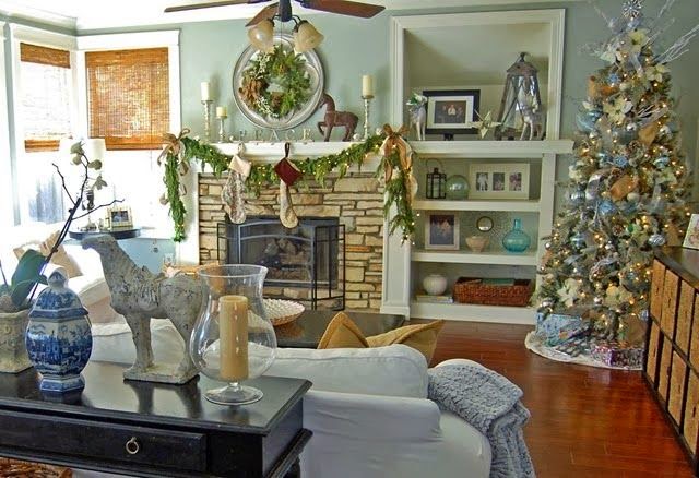
Am I the only one who considers how a paint color is going to work with Christmas decor? Well, no worries, Comfort Gray works for the holidays.
 |
| {Source} |
Have you used Comfort Gray in your home? Come on over to say hello at my blog, Evolution of Style.

Debra Aubin says
I am loving the color gray right now and see how it works so nice on walls. I am wondering how do you think it would work on painted furniture? I refinish worn furniture with paint and I just wanted to know what you thought about using it on a piece of furniture. The comfort gray is really nice, but hard to tell how light it really is as it looks different in the rooms that you displayed. I appreciate any thoughts you have on using it to paint furniture.
Thank you
Debbie
Susan Benjamin says
We just used Revere Pewter by Benjamin Moore. We absolutely love it!!
I read so many people rave about this color that I decided to go with it. It is in the main area of my house, kitchen, dining and living room. It is one big wide open space.
I love the way the color changes from daylight to night time. I would highly recommend this also!
Cyndy says
This is so funny Susan, the last Color Spotlight that Jenny did on the blog was for Revere Pewter here: https://www.thecreativityexchange.com/2014/02/color-spotlight-benjamin-moore-revere-pewter-paint-it-monday.html
Jenny and I agree and love Revere Pewter and it’s probably the most versatile paint color out there today. I have yet to hear someone say that they didn’t like it. I am so glad that you left a note to tell us all the good stuff about Revere and yep, it’s the perfect color for a wide open space.
Thank you so much for your note and stopping by!
Emily says
I used Comfort Gray in my kitchen. It’s a beautiful color, but a bit of a chameleon. When I finished, I stepped back and thought – Wow! I now have a blue kitchen! It took a while to get used to, but now I love it. I do not think of it as my gray kitchen, but as a blue.
Karen Peterson says
It looks blue in my bedroom as well; interesting how much it changes based on light.
Elle says
We’re doing our kitchen in this color. Husband thinks it’s green, I think it’s blue green. It looks gray in the morning light. It’s an interesting color. It’s not 100% what I was going for, but it works with my granite. The problem is actually trying to find colors to paint nearby rooms. Having trouble trying to find a light but not too light tan for the adjoining family room. And something for the adjoining Dining room with a chair rail. Turning out to be a daunting task.
Jennifer says
Go to Sherwin Williams’s website and look at the colors that are suggested by them as “coordinating” for Comfort Gray. We used it in our Master bedroom and have a nearby apricot in our bathroom that is brilliant with it. And our rug under our bed has a multitude of colors, so I think you’ll find it pretty easy to choose!
candace says
I painted our dining room and kitchen comfort gray…sea salt in the 1/2 bath and canvas tan in our den…
Diana says
With Comfort Gray, try Sea Salt (love this color!), Agreeable Gray, Silvermist, or Silverpointe. I’m finding these colors work well together–nice contrast so not everything looks the same, but unified and soothing. (Also Alabaster and, you’re sticking to Sherwin Williams, Choice Cream. I have Behr Perfect Pearl, a very warm white, in my living room, and it is working nicely with this palette.)
Lyn says
I love your color choices. Almost every color you mentioned is on my list. Do you have any pictures to share? I would love to see your vision.
Lisa says
Oh my goodness? I’m using all of these colors on my new home! Sea salt in bathroom and 1/2 bath .. laundry room comfort gray and agreeable gray in hallway leading into the dining/kitchen/living room. Our master bedroom is gray screen and master bath is online … 😊
Carol says
Would comfort gray go well in a master bathroom with no windows and beige tiles with a pink tint?
Tiff says
Have comfront gray in living room now having trouble choosing colors for dining room kitchen that leads from living room open area. SmAll bath in between. Do i paint it all same color or try a different gray? Kitchen cabients are a grayish color and light counter tops
Lisa Pape says
I will be using Comfort Gray on exterior new Hardie board siding. The back of my house is all stucco. I would like a lighter version of Comfort Gray for the stucco. Any recommendations? Thank you!
Jan says
How did your house come out? I’m thinking of painting mine the same color
Diane Lewis says
I used Comfort Gray in my living room, dining room, and kitchen. I wanted lighter version also and had it mixed 75% lighter (10 ounces of white added). I get so many compliments and “what is this color?”. I love, love, love this color. It does change with lighting.