
Cabinets painted with Fieldstone Benjamin Moore
Eider White Sherwin Williams
The results are in from our reader favorite paint color poll and I have been so excited to share our new- 2014 “favorite’s” color palette. In case you missed it, last month I kicked off our Second Annual Reader Favorite Paint Color poll here on the blog, Facebook and Twitter and asked readers to share their favorite colors. Over the last 30 days, I have received tons of responses (thank you, thank you!!) and I have pulled together a palette of all of our favorites.
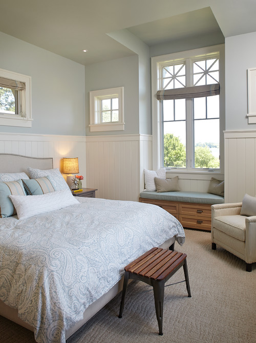
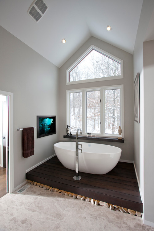
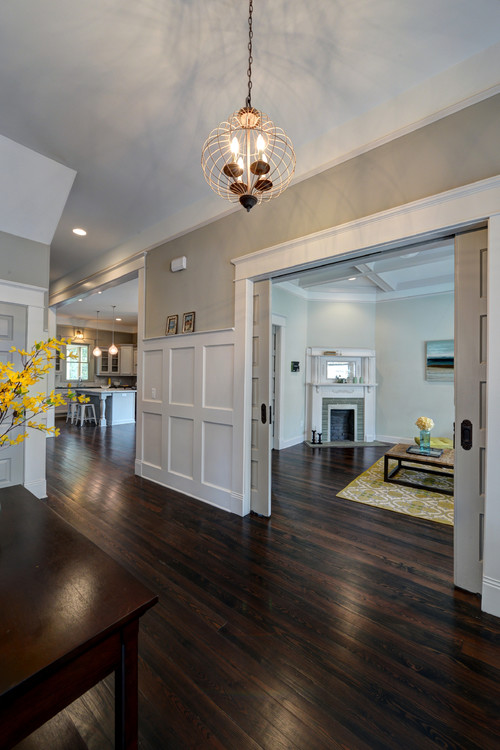
All of the images in today’s post are rooms painted in today’s palette. The color name and brand is below each image.
Trim and door painted in Tricorn Black Sherwin Williams
Just to give you a little background, I had to narrow down our favorites from all of the responses and I did it by choosing colors that were mentioned multiple times. This not only helped me narrow down the colors but it also identifies those colors that work well in a variety of a lighting situations because we all have different lighting situations in our homes. All of the colors in the palette were mentioned at least four times and some even more (Sea Salt and Comfort Gray). So we have us a great list here to work from!
Overwhelmingly, Sherwin Williams Comfort Gray and Sea Salt were (by far) the most popular colors. What is REALLY interesting is that they are almost identical colors:
 Sea Salt by Sherwin Williams
 Comfort Gray by Sherwin Williams
However, Sea Salt and Comfort Gray are chameleon colors because in some lighting, these colors can lean more green, gray and in spaces with a lot of natural light, they can lean blue. The great news, is no matter the lighting situation or how the color leans, both colors always look amazing:
Sea Salt Sherwin Williams
My friend Megan from the blog Honey We’re Home, just painted her dining room in Comfort Gray and it looks so beautiful (you can see her project here):

via Honey We’re Home
Comfort Gray Sherwin Williams
As far as the other colors in our favorite’s palette, Sherwin Williams Repose Gray and Mindful Gray came up quite a bit as well and they are two beautiful warm grays that are actually on the same paint card (Mindful Gray is one shade darker than Repose):
Repose Gray Sherwin Williams
Mindful Gray Sherwin Williams
Chelsea Gray by Benjamin Moore is another color that came up frequently and several people mentioned that they recently painted their interior doors and cabinets in this color. Chelsea Gray is turning out to be an all-star color that looks beautiful anywhere:
Chelsea Gray Benjamin Moore
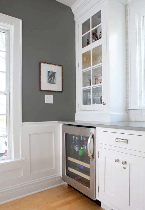
I was surprised to see both Benjamin Moore Jamestown Blue and Fieldstone pop up again because these two colors were really popular 4-5 years ago. All of the sudden, I’m seeing a big resurgence of these two colors being used more and more. I love it because these are two all-star colors that also always look beautiful in different situations:

Jamestown Blue Benjamin Moore
Cabinets painted in Fieldstone Benjamin Moore
So many awesome colors that you guys shared and I can’t thank you enough for participating in the poll and sharing your color feedback! It’s so great to find these colors that are working well for everyone and I hope you can use this palette as you look for new colors. You can see the results from our 2013 poll here.
By the way, I will be pinning more colors/rooms from the poll over the next few weeks on my Pick a Paint Color board on Pinterest here. If you haven’t had a chance to check out that board, I have almost 500 images of rooms and paint color names.
Thanks for stopping by!
Cheers!
Cyndy
Jenny@EvolutionofStyle says
Love this! All such gorgeous colors, it’s no wonder people have problems making up their minds! Pinning of course. 🙂
Cyndy says
Ha! I was thinking the exact same thing Jenny! With gorgeous colors like this, it’s no wonder it’s hard to pick. By the way, that Chelsea Gray kept coming up Jenny! I think it’s a sign for you! Thanks girl! xox
Maria Gillespie says
Our whole lower level is painted in sea salt and we love it!
Cyndy says
I bet it looks gorgeous Maria! Sea salt is such a beautiful color and everyone who has it in their home says they absolutely love it! I’m going to have to use it somewhere. Thanks for stopping by!
Megan @ Our Pinteresting Family says
Many amazing colors out there. Thanks for putting this all together. I always enjoy hearing what other people love.
Cyndy says
Thank you for your vote girl! I still giggle when I think that you and I had the exact same favorites! Not surprised though, we always seem to gravitate to the same colors! Big hug friend!
Kelly says
These are beautiful, what a great post. I would love to share it on my blog!
Kelly
yourcolorconsultant.com
Barb says
I just painted my living room Sea Salt the other night. It was after dark so we had bare lamp bulbs and I was thinking “Whoa boy! This is really AQUA!” But no worries, the next morning in normal light it is the soft color I wanted.
Cyndy says
Oh I’m so glad to hear that it turned out perfect for you Barb. Yes! Sea Salt is a chameleon color that greatly changes in different light. I’m thrilled to hear that is exactly what you wanted!
Thanks for your note and stopping by!
Jessica says
I have fallen in love with these colors. We haven’t had the opportunity to paint anything more than the babie’s nurseries but these colors have me singing the possibilities.
They all flow so nicely together too! I have three rooms that are a ‘combo’ room and these colors would all go nicely and distinguish the spaces.
annmarie says
I have used Silver Strand which is close to Sea Salt but in a well lit east facing living room it turned definite nearly dark blue at night more a greeny grey—i am no color expert but wonder has anyone had any experience with that color and undertones (which i dont understand)–and if i might be better off switching to sea salt or comfort gray. It seems the slightest bit of blue in what looks neutral on the card turns up shocking blue in my LR. wish i could post photo but dont know how–thanks for any advice
Nancy says
Sea Salt AND Comfort Gray were shocking blue in my sunny living room. May have to go back to plain ol beige because color on those walls are always nothing like the sample chips. My garage shelf is full of paint mistakes…. Did you ever find anything that worked? I use this room as a guest room and an office/library/front room. It is 11×11 and very sunny.
Cyndy says
Wow Nancy, you must have really sunny light in your living room! If that is the case, you’ll want to lean a light green/gray without any blue at all in the base to get to those truer colors. Natural light adds blue. I’m very surprised to hear that Comfort Gray went shockingly blue. I would just paint a sample on poster board and tape to your wall to tweak and see what the colors do. I recommend looking at Healing Aloe and Hollingsworth Green (both from Benjamin Moore). That would be a great place to start and work from there. Good luck!
jules says
Has anyone tried Fossil by Ben Moore?
Julie says
Any have any ideas for a hallway gray? My hallways are narrow with little light. I want a true light gray, not blue to green. My trim will be a pure white.
Linda says
I am puttung stucco on my new house. I had chosen a steely gray with white trim, but the coldness of the “brown coat” is making me want to add more color. What do you think of Silver Strand with white trim, or Silver Strand with the tint doubled? I like how the light changes the color but i dont want a shockingly blue house!
Kay says
I love all these colors. I was planning to repaint our stairwell & hallway which has little to no natural light. But the bottom of the stairway leads into the kitchen with a fair amount of natural light but no direct sunlight due to our wrap around porch. I tried ALL the neutral sherwin williams grays – mindful, analytical, repose – I loved how they went either brown or gray. In my house, however, they looked purple, so purple. I randomly chose SW natural linen because it looked a little more brown than gray – interestingly enough it’s classified as a yellow. Brought home the sample & it was great, just a shade too dark. SW made a custom, lighter version of it for me & I decided at the store that color was going on the walls no matter how it looked when I got home. It was PERFECT! It looks exactly like the photo of repose gray that you have listed above. Lighting is a crazy thing. Next is to repaint the kitchen (and I LOVE sea salt and rainwashed) but I am terrified of these chameleon colors in my lighting.
Kelly says
Help! I have an open concept kitchen/family room and am stuck on color selection for family room. Kitchen was just done in silver strand, but husband thinks it is too much blue to do family room. Floors and cabinets are warm mahogany and rich cherry, dark leather couches and tables, white trim. Only have one sliding glass door which faces west, so the colors all look very different. Thought I had a winner with Repose Gray-but husband nixed it.
Hoping to find a cool neutral, that will go with the cool silver strand without being too gray, or too yellow.
Help please!
cynthia says
I have used Sea Salt in my last house and loved it. Wanting to paint my open living, kitchen and dining comfort gray, as it looks out to the pool wanting spa like colors, what blue can I use to paint possibly the dining room or an accent wall? Not sure what blue would go with comfort gray?