
Last year, some of you guys may remember that I started a tradition where I shared a color palette of all of your favorite paint colors. That color palette (the one shared above) is my favorite paint color palette because it has really come in useful for people looking for safe, tried and true colors. I especially LOVE that it was something that we all created together!!
The reader’s palette from last year are colors that were mentioned multiple times as favorites and that is a sure sign that these colors work well in a variety of lighting situations. By the way, if you missed last year’s post and the rooms painted in those colors, you can find that post here.
Some of you guys may remember that Palladian Blue from Benjamin Moore was by far the favorite color from last year mentioned:

Palladian Blue from Benjamin Moore

Palladian Blue from Benjamin Moore
Urbane Bronze from Sherwin Williams was also a very popular favorite:
Urbane Bronze from Sherwin Williams
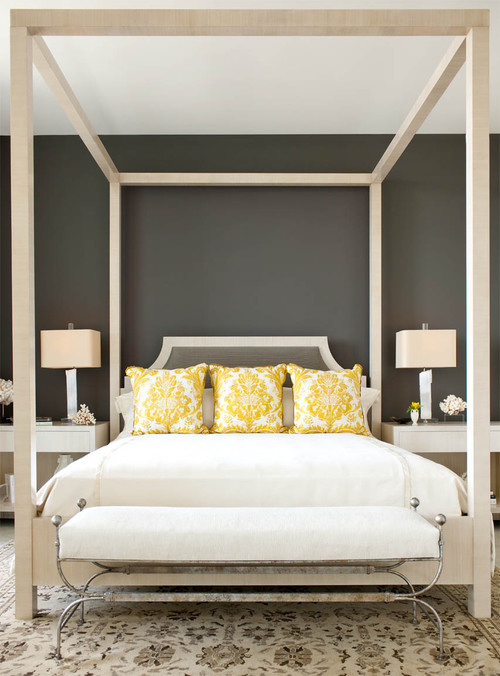
I know a lot of you guys have used Urbane Bronze on your interior doors, which I think is where Urbane Bronze really shines.
So I thought I would continue the tradition and ask you guys again to share your favorite paint colors. I would love to update the color palette with new favorites, as well as the staple colors that we still love! This is not anything official and all you have to do is tell us your favorite paint color at the end of this post in the comment section. You can mention as many colors as you like as well. I will keep the comment thread open until October 1st (3 weeks) and then pull together the palette with rooms painted in those colors and share are new updated palette on October 6th.
I’ll start us off and share my two new favorite colors that I have recently used that I absolutely love. Repose Gray from Sherwin Williams and Balboa Mist are gorgeous light warm grays that I have used a lot lately and am thrilled with them. Both colors have just the right hint of warmth to keep the grays from being to cold and sterile. They are also great for transitioning my home from warm tones to a little cooler grays.
On the paint card, they look like the same color but they’re not on the wall. Repose Gray leans just a tad grayer than Balboa Mist:
Balboa Mist looks gorgeous in the day and night:

This is what Balboa Mist looks like with a lot of natural light:
Balboa Mist Benjamin Moore
Balboa Mist with less natural light and early evening:

Repose Gray (Sherwin Williams) is a very similar color to Balboa but just a tad darker and a tad more cool gray. I prefer Repose Gray:

Repose Gray by Sherwin Williams
Repose Gray by Sherwin Williams
Repose Gray is a fantastic color for built-ins as well! I just love both colors and use Repose for rooms with a lot of natural light and Balboa Mist for rooms with less light.
Ok, so it’s your turn now! Tell me your favorite paint color(s) in the comment section and I will pull all of our favorites together and share the updated 2014 favorite colors palette on October 6th! I can’t wait to hear what colors you guys are loving right now.
Thanks for stopping by friends!!
Cheers!
Cyndy
Megan @ Our Pinteresting Family says
Great minds think alike. I love repose gray. It’s the color in our boys nursery, and it is so calming and looks great in any light. 🙂
Cyndy says
I just laughed when I saw your message on FB Megan because I knew you had not seen my post! You and I are sisters from another Mother girl! LOL! xo
Amanda says
I recently painted my bathroom Smoke by Benjamin Moore and I am obsessed. Here is a post with pictures of the paint in our bathroom. http://oldhousetonewhome.blogspot.com/2014/08/diy-budget-bathroom-remodel-reveal.html?m=1
I am also loving Señora Gray by Bm
Cyndy says
Oh that is an amazing revamp Amanda! Wow! Great job and I love Smoke mixed with the rich blue vanity! Smoke is beautiful color and in spaces with a lot of natural light, it is also really amazing! Thanks for sharing your project with me Amanda!
Amanda @ Old House to New Home says
Thank you so much for your kind comments on my post! I want to paint all.the.rooms. smoke now!!
I have to add that I painted my bedroom Sea Star by BM and love that too! Apparently I have lots of favorites!
Ann says
I am constantly drawn to SW Comfort Grey.
Cyndy says
Oh yes! SW Comfort Gray is a good one Ann! My friend Megan from the blog Honey We’re Home just used Comfort in her dining room and it looks so gorgeous! Thanks so much for sharing your favorite!
teddymom says
I love SW Comfort Gray and Agreeable Gray. Also SW Rainwashed – a little more complex, chameleon color than Sea Salt – looks green-gray in my no-window guest bath.
Cyndy says
Wow! Comfort Gray keeps coming up! I haven’t used it yet but I have been seeing it a lot lately and it looks so pretty. Rainwashed is another great color and I agree, it’s perfect in spaces with no natural light!
Thanks so much for sharing your favorites!
Jenny@EvolutionofStyle says
Ooooh, such a tough question, as I have so many colors that I love! One that keeps coming back to me lately, is Chelsea Gray by Benjamin Moore. Absolutely *love* this color so much. It’s such a great gray next to crisp white trim or beadboard – smitten kitten here. Can’t wait to see the final palette!
Cyndy says
You loved Chelsea Gray last year as well Jenny if I am remembering correctly or was that Kendall Charcoal? Chelsea Gray is in my top 10 for sure! Gorgeous cabinet color too!!
Elizabeth Scruggs says
My new, favorite go-to color right now is Sherwin Williams Accessible Beige. Dependent upon lighting, it reads beige at times and grey at times- in the same room. I use it a lot in for a neutral backdrop for colors to shine.
Cyndy says
Sherwin Williams has really nailed those warm grays in a big way! Accessible Beige is the perfect example. Just the right amount of warmth to keep the gray from looking sterile. I’m so glad to hear that you love it throughout day and night!
Thanks so much Elizabeth for sharing your favorite!
Susan M says
Always love your color pallets! I have painted my dining room, now home office, in Dorian gray. A beautiful medium gray. Next, I plan on painting my kitchen and powder room Repose gray. I just love how clean and fresh these grays are!!
Cyndy says
Thank you Susan! So glad that you like the palettes! Dorian Gray is a great color and I’m so glad to hear that you love it. You will LOVE Repose! I agree, they have nailed the grays with that hint of warmth!
Thanks for sharing your favorite and I can’t wait to hear what you think about Repose! Send me a pic when your done!
Kristen says
I am in love with a Farrell Calhoun color called “Seal Blue”. I have used it in my master bedroom in two different houses and I simply love it-it makes the bedroom feel sophisticated, yet cozy. Another bold color that I recently painted in our guest room is “Grass Hopper” by Farrell Calhoun. For paler robin’s egg blue, I used Farrell Calhoun’s Appleton for my kitchen walls and I paired that with Sherwin Williams “Extra White” on the cabinets and trim. Lastly, I am positively in love with Sherwin Williams “Sea Salt”-I used it on my master bathroom ceiling and in my office on my walls. Talk about serene-I just love how it turned out! If you would like to see pictures of our new house using these colors I mentioned just shoot me an email and I can send you a slide show of pictures that I made.
kim pulliam says
I love Blue Peacock by Sherwin Williams. I used this in my master with heavy white molding. Its beautiful.
Cyndy says
Oh, I bet that is gorgeous Kim! I just found an image on Pinterest for a door painted in Blue Peacock. It’s such a rich color. Thanks so much for sharing your favorite Kim!
Annette Fulton says
I just painted a room with Meditative by Sherwin Williams. It appears slate blue-gray in the evenings, and a warm blue during the day. The woodwork was painted with White Duck by Sherwin Williams… great combination.
Judy Thorley says
I recently painted my master bedroom BM Gossamer Blue and I absolutely love it. It’s a pale greyed blue with a hint of green. Looks elegant with dark hardwood and furniture. I was going to Use Palladium Blue until I saw how green the paint chip was.
Lauren Skrapits says
Hi Cyndy. I love your posts for inspiration . I recently used Gray Owl for my sons bedroom and it is the most beautiful shade of gray! The room gets a lot of natural light and it almost has a touch of blue to it. I’m also a big fan of SW Sea Salt and BM Patriotic White. Looking forward to seeing your future color palettes. Lauren
Kelly says
I love revere pewter by Benjamin Moore, very versatile.
Cyndy says
Revere Pewter is one of the best colors out there and your right Kelly, it’s one of the most versatile colors. I have yet to see it look bad in a space! Great choice and thanks so much for sharing your favorite Kelly!
Jayme S says
I have always been a “green color” girl but decided to go out of my color comfort zone when I painted my living room last month. After 15 different color samples on my walls I kept coming back to SW Sea Salt. It is a wonderful color for my little cottage style home. I love how soothing and clean it looks. It changes color a bit depending on the time of day and which wall I’m looking at but it always looks great! It was your blog that introduced me to this wonderful color….so I’m thinking a big “THANK YOU” is in order.
Cyndy says
Aw, that makes my day Jayme! I’m so glad that I was able to introduce you to a color that you really love in your home. Sea Salt is one of my favs too! I feature it a lot because it looks amazing in almost any space. Thank you so much for your kind words!
Tammy says
Awesome idea – it’s so great to hear other’s experiences with a color they have used. I am about to paint my new basement den in Palladian Blue so I am excited to see it was a favorite last year. We recently painted our bedroom and ensuite in Benjamin Moore Pashmina – what a beautiful soothing colour – love it!
Cyndy says
Oh, Pashmina has always intrigued me. It always looks amazing in images but no one has ever told me that they have used it and loved it. Thanks for the info and someone else on Facebook also mentioned that they love it as well. Be sure and test Palladian first on a poster board. It should be perfect because you probably do not have a lot of natural light in your basement but every once in awhile, Palladian can take a wonky turn in certain lighting situations. Really, all blues can do that..
Thanks for sharing your favorite.
Paula says
I’m so glad I found your website!! You have amazing ideas and I especially love that you show different paint colors in different lighting.
I have been tearing my hair out trying to find the perfect blue/gray for my bedroom! After 15 cans of sample paint I think I’ve found it…sure wish I had seen your site before I tried all these paint colors! You are brilliant:)
Cyndy says
Aw, thank you Paula! I’m so glad you found my site and can’t thank you enough for your kind words. Ok, now I’m curious, what color did you pick?? My bedroom is a blue gray and I ended up having to mix Behr Stone Fence with Behr Rhino (50/50). Because I have so much natural light, I had to go grays with blue undertones to get the perfect color. Would love to know what you settled on!
Thanks again for your kind words and stopping by!
Leslie says
Cannot get enough of SW Comfort Gray….did my living room last fall in it. It does not disappoint. 🙂
Cyndy says
Wow, there is Comfort Gray again! It has come up many times and I think it’s the new All Star! Everyone is saying the same thing that they are absolutely in love with the color. Such great info!
Thanks so much for sharing your favorite!
Cicely Jones says
Hi,
I love your site. I am currently at the end of a renovation. My go to color was Halo OC-46 Benjamin Moore. I absolutely love this color. It is a light greige and works well in areas with small amounts of natural light. I paired it with BM White Heron on the trim. Thanks for your site…keep up the good work!!
Marci Richmond says
I’m having my living room & dining room painted revere pewter. You can look into my kitchen thru a large opening and my painter suggested an accent wall and using that color in the kitchen. Any grey suggestions that won’t read too dark? I’m sampling Sweatshirt Grey BM
Cyndy says
Benjamin Moore Gray Owl is a gorgeous gray Marci but depending on how much natural light you have in that space, it could be too light. If you do not have natural light, it might be exactly what you’re looking for and it would transition well with Revere. Hope that helps!
Carolyn. Hunter says
Hi we are remodeling. We have a center hall colonial with a smaller living room and a large dining room (I switched them). I have chosen 3 colors. BM meditation, pashmina and revere pewter. I am having trouble trying to decide how to,use the colors. Should I use the darker meditation in the large dining room, the pashmina in the living room and the revere pewter in the foyer or the meditation in the smaller living room and the pashmina in the larger dining room? The house is a northern exposure but the DR has a2 large windows one north and one south. The living room is north facing but has a large bay. And the foyer is pretty dark we plan to paint all trim white dove. We have 6″ baseboards, a fireplace and large crown in the DR. Other rooms have 6″ baseboards and crown. Any suggestions?