
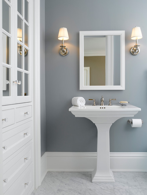
Solitude Benjamin Moore

I’m excited today to be participating in a decorating series with 25 other bloggers and we are each sharing some of our favorite decorating tips and tricks this week. Thank you to Beth from Home Stories A to Z for organizing this series. By the way, if you’ve come my way today via Traci from Beneath my Heart, welcome! Today I’m talking about how to choose the perfect paint color.
If this happens to be your first time stopping by here, I’m Cyndy and I have a thing for paint. I talk a lot about paint (any kind of paint) and share paint color palettes on my blog. I do share a whole lot of other stuff too but I focus a lot on choosing paint colors.
Today I’m sharing my little “elimination” method that I use that automatically takes the indecisiveness out of choosing just the right paint color. If you try using this process, your ideal paint color will most likely jump right out at you, without weeks of agonizing with ten paint swipes all over your wall.
So let’s jump in!
By the way, all of the images in today’s post are in the color palette main image and the name and the brand are below each image.
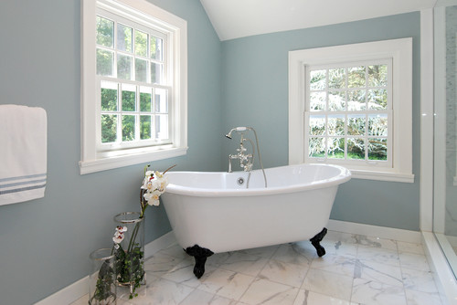
Yarmouth Blue Benjamin Moore
Change the Focus
Instead of agonizing over colors you love, change the focus and eliminate the undertones and shades of a color that you do not want. This makes the process so much easier because you automatically eliminate colors with purpose, instead of holding onto color choices because you are attached or love them in someone else’s space.
The next time you’re choosing a color, go to the paint store and pick up your paint chip cards. Zone in on roughly what color you are interested in and pick up all of the paint cards surrounding that color. Pick up cards 3-4 deep (up, down and side to side) and going into other colors, even if you think there is no remote possibility that you would ever choose that color (this will help you later). You should have a stack of about 16 paint chip cards.
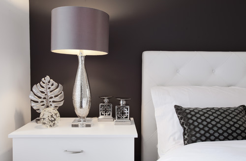
Deep Caviar Benjamin Moore
Eliminate Undertones
Next, go into the room that you are choosing the color for and layout the cards in color/shade order just like it was laid out in the store (light to dark and undertones moving into other undertones). If it helps, you can take a picture with your phone at the store to help you layout.
If the room predominately has natural light throughout the day, don’t turn the lights on. If the room has very little natural light and you will have lights on throughout the day, choose your colors with the lights on.
Look at your paint cards in the light in the space and eliminate the colors with undertones that you absolutely know you do not want. You can eliminate the color by writing an “X” on the color (leave the chips laid out to help you better see undertones).
It helps to look at the room adjacent to the space you’re going to paint to determine what the undertone is. To make sure that the colors flow smooth room to room, you can write a check mark on the colors that have the same undertone and color of the room next to the space you’re wanting to paint. For instance, if the room next to the space is blue with a slight green undertone, check the colors that lean slight green and blue.
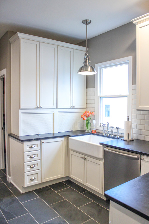
Perfect Taupe Behr
Eliminate Shades
Next, write an “X” on the shades that you know you don’t want for more eliminations. For instance, if you know you want an almost white light space, write an “X” on all of the darker shades of colors that you know you are not interested in. Or, if you’re looking for a medium shade (not too dark and not too light), draw on “X” on all the light and dark colors that you would not consider.
At this point, you should be left with anywhere from 2-8 cards without an “X” on them. The next step is to look at the cards in the evening with the lights on and see if the undertones have changed. For instance, did a warm gray that was perfect during the day, turn pink or peachy in the evening lights. Mark an “X” on any of the colors that you don’t like in the evening light.

Decorators White Benjamin Moore
Down to Two Color Choices
You should now be narrowed down to two colors at this point or maybe even down to one. The next step is to paint a large poster board with your remaining colors and tape it to the wall. This will help you envision what the color will look like on a bigger scale. Look at the poster board at all times during the day and take down any colors that you decide that you do not like.

Silver Strand Sherwin Williams
Final Decision
If you’re still down to two color choices, try mixing a half cup of each color together in a plastic container and paint on a poster board to see if you get the best of both colors. If that works, have the paint store mix your two colors together. You can also try increasing or decreasing your ratio mix (1/4th color mixed with 3/4th color, etc..) in a plastic container to see if that helps.
For me, this little method works every time and quickly because I’m no longer choosing colors I love but rather automatically eliminating for a good reason (undertones and shades). This process gives you a strategy or method to the madness, instead of not knowing where to begin, how to decide or choosing colors for no reason.
If you’re looking for more paint color inspiration, I have a “Pick a Paint Color” board on Pinterest with almost 500 spaces with the names and paint colors to help. You can also look through all my past color palettes here for more paint color possibilities.
Thanks so much for stopping by and the next stop in this series is Finding Home, where Laura is sharing some great tips for 5 Ways to Personalize Your Home.
Megan @ Our Pinteresting Family says
I love the Silver Strand color. Wonderful tips as always.
Beth@HomeStoriesAtoZ says
I use the same approach when choosing paint colors and love your tips! Thanks for joining the How to Decorate series!
Bonita says
This was so helpful! I wish I’d had it a few years back when I literally had 12 color splotches painted on my living room month for months trying to decide what color to pick!