
Hi guys!! I hope you all had a great weekend!
I’m starting a new weekly feature on Monday’s that I’m calling “Color Palette Monday”. My goal is to share color palette ideas from the most common paint color questions that I have received from readers. I know it’s challenging to find just the perfect color and my hope is that these palettes will help everyone sift through the myriad of colors out there and give you some coordinating color suggestions as well (trim, ceiling and accents).
The best part of this weekly feature is that every color palette that I share each week will be a printable full page with a small area for “notes” the printable palette looks like this:

Here is the link to this week’s color palette printable: Color Palette Monday #1(Gray/blue/green)
My printable palettes should not be a substitute for paint color cards but they will give you an excellent feel for the color and the slight differences. Once you see a color that you like, please do not rely on my palette but rather go pick up the paint card to see the color at it’s best. Believe it or not, printing out a paint color image comes a lot closer to showing the true color than a computer monitor does (unless your printer is low on ink!).
I recommend printing the palettes out onto smooth card stock (no linen/fiber lines) for the best quality but standard copy paper (8.5 x 11) will work as well. Below, you can see the huge differences with the computer monitor image on the left and a picture of the printable palette on the right:

I am also numbering the color palette each week on the printable and the post, so if you want to print and save them, you can refer back to the number for the post that will have the coordinating room examples. Also, I will only be sharing colors that I am familiar with first and if I can’t find a familiar color, I will only share colors that I have looked at the physical paint card and compared it with other familiar colors.
Ok, so now that I have written a novel about how this new feature is going to work, let’s talk about this color palette for this week!
Today’s color palette is probably the most common paint color question that I have received lately. What are some great paint colors that are a combination of gray blue with hints of green? These combination of colors are fantastic transitional colors because they have cool and warm tones and would work in almost any space and with any color of wood and flooring.
I pulled together some fantastic gray blue colors with hints of green and you will see that some have more or less hints of green than others:
(The top left color on the palette will always be a suggested trim or ceiling color. The lower left color will always be the darkest of the palette and would be good for fabric accents or a possible complimentary color to paint furniture in the space with the coordinated lighter colors. The dark color could also be a great wall color as well).
Probably the most popular/used color from this palette is Palladian Blue from Benjamin Moore:

source: Bower Power Blog
Depending on the lighting in your space, this color could go more green or more blue but either way, the the gray/blue/green mix is really beautiful. I have seen it used predominately in bathrooms and bedrooms and it’s really soothing mixed with the white. I have recommended this color many times and so far, everyone has been thrilled with it.
Quietude by Sherwin Williams is another beautiful color that I think would be amazing in a bathroom or a bedroom:

Source: The Lettered Cottage
Valley Mist by Behr is a lighter blue gray with a touch of green and you can see more of the gray in this color. However, I have seen some spaces where this color has really gone green, so be sure and check this color in the lighting in your space if you’re considering it:

Source: Explanation required Blog
Sea Star by Benjamin Moore is darker but still has that gray/blue/green mix:

Source: One Project Closer
Charlotte Slate by Benjamin Moore has been made popular by this gorgeous BHG Color Palette that has gone viral on Pinterest. Of course, it’s the beautiful blue/green/gray color below:

I think Charlotte Slate would be beautiful painted on a piece of furniture or on cabinets. I could also see this rich color in a small powder room with crisp white towels or a den/library.
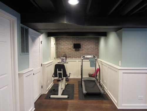
Finally, Halcyon Green by Sherwin Williams is another beautiful gray/blue/green that can warm up any space. See how this color just brings life into this otherwise dark basement work out space:
Again, please keep in mind that lighting can drastically change a paint color and what looks safe on a color card may have a crazy hue that jumps out in certain lighting situations. If you like a paint color, be sure and pick up a paint card and a sample and look at the color in your space with the exact lighting. If you’re still unsure, paint a large poster board with the sample paint and tape it to the wall and look at it throughout the day and night to see how the color will look.
Thanks so much for hanging out with me for the first Color Palette Monday!! I am really excited about this new feature and I can’t wait to share some pretty color palette inspiration in the weeks to come. If you have any suggestions for future Color Palette Mondays, I would love for you to share in the comment section below.
If you want to keep up with the weekly color palettes, you can go and like our Facebook Page here to receive new post notifications in your FB timeline. By the way, several times a week I share paint color inspiration over on the Facebook Page and we have such great discussions of paint colors.
One last thing, if you’re looking for some help in how to pick the perfect color in a space with the lighting, you can check out my post “Tips and Tricks for Choosing the Perfect Paint Color” by clicking the image below:

Have a great week friends!!
Cheers!
Cyndy
Heather dela Cruz says
THANK YOU for posting this. I have been searching for the perfect shade of powdery grey/blue/greenish forever. Color-matching is not my strong point, so I am thankful for this blog post!!! =)
Cyndy says
Oh I’m so glad that you can use this palette Heather! Thank you for your comment and for stopping by!!
Jenny@EvolutionofStyle says
What a fun series! I love looking at different color palettes and getting new ideas. I have Palladian Blue in my great room and it’s a fabulous color!
Here is a post that shows our great room in our most current state. Lots of changes have taken place since I painted! 🙂
http://evolutionofstyleblog.blogspot.com/2012/11/the-hardwoods-are-complete.html
Cyndy says
Yay! I’m thrilled that you stopped by Jenny for the first palette in the series! Palladian Blue is a pretty awesome color! I have yet to talk with anyone who isn’t happy with it. I’m heading over to your post right now! Thanks again~
Breanna Duncan says
Wonderful post! I absolutely love this mix of colors. We have Palladian Blue in our half bath and it’s a beautiful color and acts as a chameleon depending on the lighting we get throughout the day.
Rene says
Hi! I am color challenged! I am starting to plan a 3rd floor playroom for my two young girls and for some reason have navy and pink stuck in my head. Looking at Ikea navy blue couch and chaise both in the velvet. Would love hot pink accents like pillows, etc. thinking of light gray carpet. What color walls? Not feeling beige or yellow. I have revere pewter coming up the stairs into the room. I’m leaning toward a lightish blue that can work with all. Room has lots of white molding and built in shelves. I appreciate any thoughts from all of you! Rene
Cyndy says
Thanks for stopping by Rene! What about Balboa Mist by Benjamin Moore? I featured it yesterday as a nearly perfect neutral. I love the navy and pink and I love the idea of a light blue or a gray/tan light? Both would be so beautiful. For blues, maybe palladian blue by Benjamin Moore? Wow, I love the idea of the velvets too! Good luck and I would love to hear what color you decide on!
nelda says
I get overwhelmed with all the choices when it comes to picking a paint color, so thank you, thank you, thank you! I painted a white bookshelf palladian blue and was shocked when the color was more blue at home than the gray it looked like at the store. Now I know why.
Lesa says
BIG THANKS AND SO EXCITED ABOUT THIS SERIES…..I’VE BEEN FRETING ABOUT PAINT CHOICES………
debbie says
I absolutely love the ikat fabric and there are so many of the colors that would be beautiful. I appreciate all the great colors most of which are my favorite palette. Do you have a particular brand of paint that you prefer; also, what type (eggshell, flat etc.), please? The family that owned our home before we purchased it used flat in the kitchen and it comes off everytime I wipe with damp cloth. From what I understand, eggshell or semi-gloss is better for bath and kitchen. We used all eggshell by Behr in our previous home and it was really easy to clean and did not rub off.
Maureen Mahoney says
This is a great new addition. Just when I was looking for a blue/gray color. I love the Palladian Blue, but it looks more green to me than blue, what would the next bluish color be?
Does Benj. Moore name colors by different names for collections. I am looking for a griege color that is not too dark to put in my Florida condo. My furniture there is “beachy colors” blue/white/green stripes, white / whitewashed wood, white cabinets. I was looking at Ashten Tan(which looks like it is the same as Hot Stone Springs, to me) or Hampshire taupe. I loved griege avenue but was afraid it would be too dark. What would you suggest in a Benj. Moore color and a blue to blend in for the master bath if we decide to do that another color. Thanks.
Moe
Christy says
This is so helpful as I consider a color with blue-green. I am using a southwest theme of red and yellow and want to accent with turquoise. I want an adjoining room to be a blue-green that blends with the turquoise–but not so bright. I am thinking palladian blue…or do you have another recommendation? I saw Benjamin Moore’s Turquoise Mist but find it too green.
Thank you,
Christy
Patti says
I am in the process of painting my whole small house this color to give a sense of space. Could you recommend a color for the trim? I want a white, but I’m afraid that a white white would make it look too blue. I want a softer white to soften up the space. Does that make sense?