Over the years that I have been sharing color palettes and talking about paint colors on my blog, the number one question I always receive is; are there any fool- proof colors that always look perfect in any home? I get this question because there are a lot of people out there who have absolutely no interest in choosing colors and just want a color that is pretty much guaranteed to work and look amazing (without the frustration of choosing a color). Today I wanted to share 15 of the most versatile and dependable paint colors with you.

Choosing paint colors can be challenging (although it doesn’t have to be) but regardless, some people just don’t want to deal with it and would rather have dental work done than agonize over colors. I do get it and I have been wanting to make a list of the most versatile and dependable colors for those of you who want the safest bets when it comes to colors. If you’re one of those persons, this post is just for you.
**By the way, the images in this post are all part of today’s color palette and the name of the color and brand is directly below each image.

Ultra White Benjamin Moore

Sea Pines Benjamin Moore via Heather Scott Home
For example, some of the types of questions that I receive are asking what is the best navy, the perfect warm gray or the safest white that will work with anything. I always tell people the same thing; there are technically no fool-proof paint colors but there are some colors that are universally beautiful and work about 95% of the time. These are colors that I call “All-Stars“, that are about as close as you can get to fool-proof.
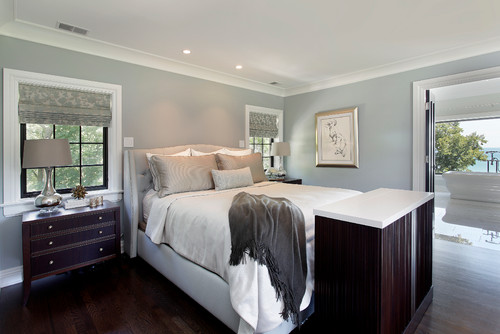
Beach Glass Benjamin Moore
As a reminder, it’s always best to test these colors by painting a large poster board with the sample color and tapping to your wall. While these colors may universally work well, they may not be the exact color you’re looking for.

I’m not going to do a lot of talking until the end of this post. Instead, I wanted to share examples of these dependable colors painted in spaces for you to see these colors in action. At the end of the post, I’ll tell you why these colors universally work so well.

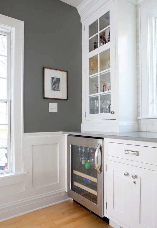
Benjamin Moore Wrought Iron

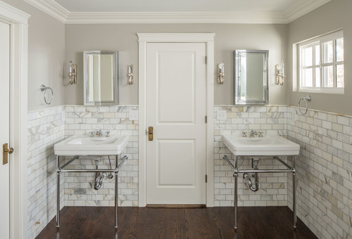
Sherwin Williams Sea Salt
Mindful Gray Sherwin Williams

Sherwin Williams Mindful Gray
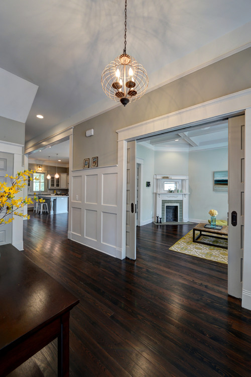
Mindful Gray Sherwin Williams

 Repose Gray Sherwin Williams (my office/studio)
Chelsea Gray Benjamin Moore (Sherwin Williams also makes a great Chelsea Gray both are all-star paint colors)
Fieldstone Benjamin Moore

Benjamin Moore Fieldstone

Benjamin Moore Fieldstone
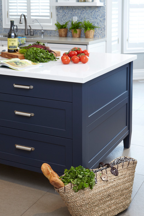
Hale Navy Benjamin Moore

Boothbay Gray Benjamin Moore
Hale Navy Benjamin Moore

Kendall Charcoal Benjamin Moore (fantastic cabinet paint color as well)

Benjamin Moore Kendall Charcoal

Benjamin Moore Kendall Charcoal
The reason these colors work so well is that they all have a balanced mix of warm and cool undertones, so they’ll work well with other colors in the home. These colors also each have enough gray in the mix to neutralize any strong hues or undertones that could jump out in poor lighting situations. Choosing colors that have gray in the undertone is one of the safest ways to choose colors.
I have updated this post by sharing my “Go-To” paint colors that I recommend the most to my clients.

I have a trick for choosing colors that is very easy (and quick) if you’re interested in veering off of this list. Choosing paint colors does not have to be agonizing and my little trick will help you spot the perfect color for a space instantly and you can find that post by clicking the image directly below:

Tips & Tricks for Choosing Paint Colors
I hope this list helps you in some way and remember to test a sample of the color first to just make sure the color is what you’re looking for. If you want to see more rooms painted in different paint colors, you can check out my “Pick a Paint Color” board on Pinterest here, where I have more than 500 paint colors and rooms painted in these colors to help you.
You can also look through all of my previous color palettes here.
Thanks so much for stopping by today friends!
Cheers!
Cyndy
Jenny@EvolutionofStyle says
What a great palette! I still need to find a place to add Beach Glass to my home – maybe I should have tried that in my master bath! I’ll find a place – sometime. 😉
Kelly says
Thank you! I agree and also have picked up some new “All Star” colors to try in the future. A great post, as always!
Amy fogg says
These colors will make a great palette for one of my OYSTER PAINTINGS! They r so soothing and coastal! Thanks for the color inspiration!
Megan @ Our Pinteresting Family says
I always love hearing your thoughts on paint color . And as always the rooms you share are inspiring.
Sandra says
Thanks for the great colour inspiration. We’re building a new home and I love these colour palettes….Thinking mindful Gray may be in our main living space. Cheers!
Lisa says
Most of your examples are shown with white trim. Do you have different recommendations when pairing paint colors with 50-60’s era lighter maple/oak trim? I always struggle with how to keep it from looking more orange than it already does. Thanks!
Michelle says
Lisa I know this is nearly a year later. But I had an interior designer in my home last year due to same question you had. I had beautiful 50’s oak trim and I refused to paint it contrary to the trend of white. She said Accessible Beige from Sherwin Williams would work best with the oak trim. She was absolutely right. White paint on the walls completely failed, but it brought out the beauty of the trim. Make that a consideration if you have not yet painted. Good luck!
Lisa says
Thanks so much for this comment! I’ll definitely take note of that specific color. We haven’t yet painted our great room area, and that color might be perfect. I have a hard time seeing the undertones in paint colors on my own.
sandy says
painted my kitchen accessible beige, with honey oak cabinets. Was absolutely the best color. warm, soft , worked great with black accents as well.
Lisa says
Sandy – Thanks for the review on the color with your trim. We still haven’t painted that area of the house, but if we ever get to it, accessible beige is the color I’m going with! I’m glad to hear it worked so well in your house.
Lisa Zylstra says
I finally got around to painting our kitchen/living/dining/utility rooms this summer, and we went with white on the ceilings and accessible beige on the walls with new white outlets/covers/light switches. It looks awesome! I love how neutral and versatile of a color it is, and it looks great with all of our woodwork. It definitely doesn’t make it more orange and balances it out very nicely. And I love how the color can read beige or almost gray depending on lighting or what other colors you have by it. Thank you so much for the great recommendation!!! If we move, I’ll definitely consider using this color again!
JoAnn Keller says
What about Cherry Trim and Cherry Cabinets. My husband would veto painting the trim, it’s new and wood is sacred here on the high prairie. Sigh.
Karen says
Just saw your facebook post yesterday about BM’s best selling paint colors and the timing is perfect for me as I’m going a bit color crazy trying to find the perfect shade of Teal for my entry wall and after several samples sizes I’m leaning towards BM Pacific Rim. Not sure what to paint in the surrounding formal living/dining and family room, which are currently BM Shaker Beige. My large, high ceiling entry way is currently chocolate brown and I have been wanting to paint that wall teal for the past year so I’m going to try your “trick for choosing color that is very easy.” Thank you for posting all the great photos for ideas, would love your opinion about my shade of Teal with Shaker Beige, is it too warm for the cool shade of BM Pacific Rim?
gerry henderson says
I have trustwell hickory, I was putting in my living room. My room is 12′ x 16′. I have 1 large picture window in there. We just can’t figure what color to paint room. Can you please help me. I have read you whole article posted.I understand it should be 3 shades lighter, can you please help me. I should have said I have the back wall done in a dark wood panel, really would like to keep it. Thank you.
El says
Be careful of that Sea Salt. Painted my my family room with it, lots of natural light…it looked like a mint green baby nursery. Had the contractor paint over it a few days later. A family member painted a windowless bathroom Sea Salt, and it still looked minty…no gray tone at all. I lied and said it was so pretty. Just be careful of it. Might be OK in a beach house.
Joan says
I am painting a small 800 square foot condo all one colour. So far I have picked intense white for the walls and cloud white for the trim. Intense white is a very light gray and a warm gray. Should I be picking a cool gray or neutral because it’s florida and a small space. I don’t want too blue. Any help is appreciated. I always buy Ben Moore paints. Joan
Karen Halfyard says
I just located your blog when searching for some information on Benjamin Moore’s Pale Oak (OC-20). I am considering using it in my kitchen/dining room (it’s one room) however I have cherry coloured cabinets. The room is facing North/West with one 60 inch window and a French door. I would love some input, thank you.