

Distant Gray by Benjamin Moore
I hope you guys had a fantastic weekend!! Welcome to another Paint It Monday.
Last year, I started a tradition where I highlighted my favorite colors from the color forecasts from the various paint companies for the next year. More than any other design/color forecast that comes out, I look forward to the paint color predictions from paint companies themselves because they are by far the most accurate indicators of paint color trends. Several paint companies have recently released their forecasts for 2014 and today I thought I would share a few of my favorites from all of the collections.
**By the way, every room featured in this post is one of the paint colors in the 2014 paint forecast. The names of the paint color are directly below each image for you.
Anew Gray by Sherwin Williams
Paint companies predominately base their forecasts on their current bestselling paint colors and what the consumers are actually buying and painting on their walls. The best part of this is that paint companies have programs to track even the slightest changes in tones as we buy paint color and move from one color to another. The combined mix of all this information enables paint companies to pinpoint with near perfect precision where we are heading in paint color. I love this information because it’s “real time” and what’s happening today since it’s based on current consumer paint trends.
Crushed Ice by Benjamin Moore
I was really blown away when I saw both Benjamin Moore and Sherwin Williams’ 2014 forecasts. I really think they nailed it in a big way and I was really excited to see some of the new colors.
Both Benjamin Moore and Sherwin Williams emphasized the same key words in describing their 2014 forecasts; muted, serene, and simplicity and I believe from what I have seen lately from readers, so many of you are really looking for calm neutrals rich in depth wall colors but simplistic. Again, I’m not surprised because we are all having so much fun choosing bold colors, patterns and finishes in our accessories and accent pieces rather than our walls. We need calm and muted wall colors to offset all of the fun we are having with bold patterns and colors.
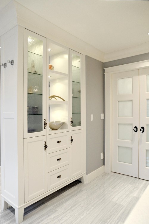
Distant Gray by Benjamin Moore
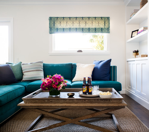
Trim and Door painted in Tricorn Black by Sherwin Williams
So some of these colors in the forecasts you may have seen before and some of the colors are new and good indicators of where the paint companies think our paint color palettes are heading. I was not surprised in the least when I saw Palladian Blue from Benjamin Moore included in their 2014 forecasts. It’s probably the #1 color that I have featured here on the blog over the last year and everyone who has used it has absolutely loved it:
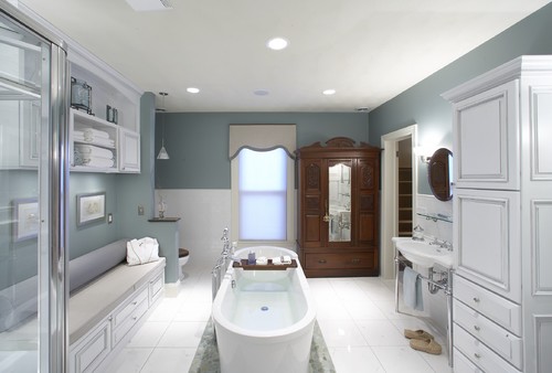
Palladian Blue by Benjamin Moore
With all of this said, I never make design or paint color decisions based on a trend or a forecast. However, it’s such great information to find out what undertones and colors are popular in paint and where paint colors are heading because it’s a great starting point when looking for colors that will be around for awhile.
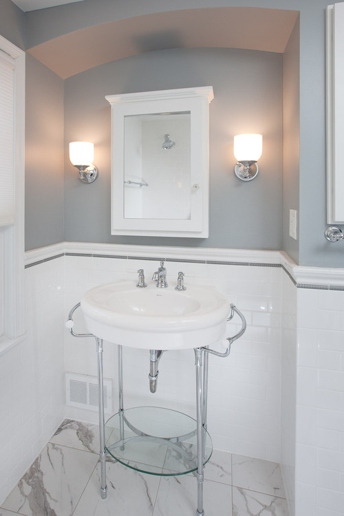
Earl Grey by Benjamin Moore
Wickham Gray by Benjamin Moore
This year, I am only choosing two color forecasts to feature (Benjamin Moore and Sherwin Williams). Not all of the paint companies have released a forecast yet but more should be out shortly. Keep in mind that there are tons of colors in each forecast collection and I have just had picked a few of my muted/neutral favorites.
I absolutely love every color in the Sherwin Williams 2014 Color Forecast. I especially loved the colors in the “Reasoned” section of the forecast. Again, they just nailed it and really, I think Sherwin Williams summed 2014 up right here:

source: Sherwin Williams
These colors while muted, serene and simplistic are incredibly rich in depth. It’s so hard to find muted and simplistic that are not sterile. While the colors “appear” simplistic, they are very complex in their depth and layered subtle undertones. You can go find Sherwin Williams complete 2014 Color Forecast here.
Benjamin Moore has come out with Color Trends 2014 “The New Neutral Palette”. In the past they have come out with several collections but all I have seen is this smaller collection. It’s absolutely fantastic:

Source: Benjamin Moore
To see a closeup of all of the colors and to read about Benjamin Moore’s “New Neutral Palette”, you can find it here.

Caribbean Teal by Benjamin Moore
There are just so many colors that I love in both collections and I can’t wait to see what other paint companies share as their forecasts come out as well. As they come out, I may highlight those as well.
So, I went through both Sherwin Williams and Benjamin Moore’s forecasts and pulled together a color palette of my favorites:
I love all of these colors and am looking closely at Van Deusen Blue and Crushed Ice for a spot in my home. Is there a color jumping out a you? I would love to know which one is your favorite and what you think of the colors forecasted!
By the way, if you want to see more rooms with exact paint colors, you can check out my Pinterest Board “Pick a Paint Color”here, where I have more than 300 rooms with specific paint colors pinned. Over the next few weeks, I will be pinning colors/spaces from the 2014 color forecasts as more forecasts come out.
Thanks for hanging out with me today and if you happened to miss last week’s Paint It Monday, you can find it here.
Cheers!
Cyndy
Krissa says
I am helping my parents with their new house and my mom doesn’t like grey! I’m trying to convince her otherwise. :). My living room is painted Wickam Grey and I absolutely love it! The blue undertones allows me to bring out different colors like turquoise and yellow giving my room a pop of color. I’m happy to see it made your list! I will be forwarding this post to my mom 🙂
I love all your ideas! Love your posts!
Cyndy says
Thanks so much Krissa! So great to hear that you love Wickham Gray, it’s such a beautiful color and I think it’s so versatile too like you mentioned. Thanks so much for stopping by!!
Lori says
Love, love, love SW Anew Gray. Very warm and versatile.
Cheri says
Cyndy,
Great post! It’s really helped me with wall color (I love gray) but I was wondering if you could do a post on choosing a complementary ceiling color?
Jenny@EvolutionofStyle says
How did I miss this post until now? I love all of the colors you pulled together in your “favorites” – that Tricorn Black is really jumping out at me, along with Crushed Ice and Earl Grey. All of them are so lovely, and really work well together, which I love. So am I trend-setter since I had Palladian Blue in my family room a couple of years ago? 😉
Thought of you when I got a new Benjamin Moore paint deck from my “paint guy” – you would appreciate it. Each strip has three colors that work together – great ideas for coming up with ideas for room palettes or even an outdoor color palette.
diane jones says
you are brilliant. i was down to the wire on finding 2 colors of grey. my painter is “slated” (slate grey — every word is a hue of grey at this point) for tomorrow morning at 8:30 a.m. i have lots of chips and samples, but no concrete (cement grey MSL266 — somebody help me ), but had lost my grip … .
AND THEN I FOUND YOU! not even Emily Henderson and Ryan Gosling’s moody post on going grey helped me like you did. it’s your life’s calling.
while i can’t commit right here , right now to specific colors, i have narrowed it down to Sherwin Williams… the 2014 color forecast had me at ” embracing my inner geek”.
Gray Matters and a Mindful Gray — even the traditional French Gray are calling my name.
i think i can sleep again tonight.
thank you a thousand times over !
my best !
Orlando Painting Contractor says
Hi Cyndy – love the inspirations with the color combos, and the grey is such a perfect choice for so many reasons and rooms! Thanks as always for the great pictures too!
Kelley's Painting Service says
Cyndy,
Every year we do a post for our clients about the New Year paint color forecast as it is one of the most often asked questione we get ask when helping customers pick colors for their home or business.
Your blog today is great and I will be sending your info on to many of our clients!
Gloria says
WOW!!! I was looking at my favorite colors from Sherwin Williams and Benjamin Moore’s forecast for 2014 then I found your wonderful site! I love all the colors you picked! Any thoughts about colors that would go well with SW Olympus White (my 2 story foyer) and SW lazy Gray ( above chair rail in dining room, white below). I need to paint family room/kitchen combination and powder room. Need to stay neutral and light as house is in woods and doesn’t get a ton of light, also planning to sell in a few years. Would really appreciate any advice. I read your article about undertones and Olympus white seems to have black undertones? I like blue green undertones…thanks!
Helen says
Thank you for sharing! We’re looking at using the Mt. Ranier Gray on our kitchen cabinets – hopefully it’s not too blue but I’m excited to try it.
UHOME says
You are doing great job. It’s very tremendous and Awesome work. Thank you for sharing with us. I love the color of sofa and design also which is design by Mill Valley. Its my fav. color.
Gray Renovation says
Our dining room is Van Deusen Blue and I love it!! We painted the ceiling gold….
Alana says
We’re painting over all our Country Cream – ICI from 10 years ago with SW Crushed Ice – loving the gray. It’s cool but vibrant at the same time.
Laurie says
This gave me some awesome color ideas for my out of date dreary small living room! Thanks