

Source: Pottery Barn
Naval by Pottery Barn Paint
I hope you guys have had a wonderful weekend! Welcome to another Paint It Monday.
A few months ago, Sherwin Williams and Pottery Barn launched another partnered paint collection (Spring/Summer 2014) and I am really excited about the colors. Today for Paint It Monday, I thought I would highlight for you some of my favorites from this latest collection.
Normally, when I create a color palette, I narrow down and choose 6-7 of my favorite colors and create the palette that you’re use to seeing. However, with this collection, I really love 12 out of the 20 colors and that’s too many colors for me to create my standard palette, so today I’m doing the palette a little different. I picked my favorites from the latest collection and put them in color order for you to see the variation in colors:
Here are all the colors from the collection just in case you want to see the rest of the colors that Pottery Barn/Sherwin Williams came out with for Spring/Summer 2014:

Source: Sherwin Williams
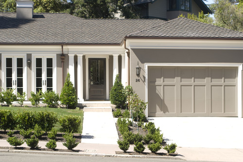
This whole collection is really beautiful and spot on and I think my favorite color from the collection is Functional Gray because it truly is one of the most functional grays I think I have ever seen in a paint color. It’s very versatile and it looks beautiful in any space and interior or exterior, let me show you..
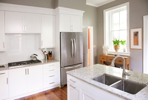
Functional Gray in a kitchen:
as an exterior color:
Functional Gray in a bathroom:
and a living room:
In fact, many of these beautiful colors in the Pottery Barn Collection are very functional and versatile. I’m really excited to see this because I think that’s what consumers are really looking for when it comes to paint. Colors that work well in different spaces and lighting conditions.
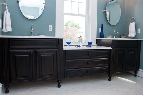
I just love Smokey Blue and again, this is another really versatile color that could work in a bedroom, laundry room, dining room and I can even see it used on cabinets. I love it in this bathroom:
Smokey Blue by Pottery Barn/Sherwin Williams
Backdrop is a new color that I haven’t seen before and I really like it a lot and it’s a nice mid warm gray transitional color:

Backdrop by Pottery Barn/Sherwin Williams
For the darker colors in the collection, I’m intrigued by Turkish Coffee:
Turkish Coffee by Pottery Barn/Sherwin Williams
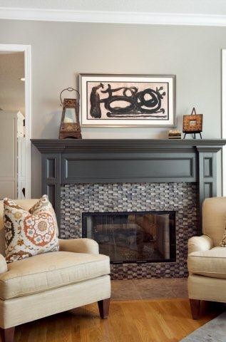
Lastly, Iron Ore has become another one of my favorite’s for cabinet, trim and interior doors and it on a wall it’s a beautiful dark slate gray (dark navy/gray mix) even though it looks dark gray in this image:

You can pick up the Pottery Barn Paint at Sherwin Williams. One last thing I wanted to mention. I discovered on the Pottery Barn website that you can type in the month and year and page number of any of the Pottery Barn Catalogs and it will tell you what the paint color is for the wall in that space. They would probably sell a lot more paint if they put the name directly on the page but now we can find out and you can find the paint finder here on the left side of this page on the Pottery Barn Website.
So what do you guys think about this collection? Do you like the colors? Is there one that’s jumping out a you? I would love to know which one is YOUR favorite.
Thanks for stopping by today friends and if you happened to miss last week’s Paint It Monday, I shared a round-up of the most popular paint projects and color palettes that I shared in 2013. You can get to that post by clicking the image directly below:

Cheers!
Cyndy
Jenny@EvolutionofStyle says
I’m am digging these colors, Cyndy! Functional Gray is freaking fabulous! Definitely adding it to my color inspiration list. Once again, you’re giving me the itch to get painting!
Cyndy says
Oh yea Jenny, Functional Gray is REALLY extra special! I was really surprised by how I much I loved the colors this time around. I wasn’t terribly impressed with the last collection. I should have known that we would go straight to the same color. Ha! We could have a 1,000 paint colors to choose from and I think you and I would pick the exact color!
megan says
I am seriously in love with the functional gray. It looks so amazing on the exterior of that home.
Kim Brotzman says
I love rain and morning fog and Pottery Barn! I need to get some swatches. Blues and grays are always my favorites.
Judy Anne says
Re: the “Backdrop” color
Have you seen the Jill Sharp Brinson /Bosch Green Energy home at Serenbe? I think maybe it was in BHG last year but I googled it online and found more images.
Such a darling small home! She used the “Backdrop” color in interesting ways there.
I do like the paint palette….also loving the indigo items Pottery Barn is featuring right now.
Veronica Mason says
hi there, so I love your website and suggestions! I need help. I have a somewhat open floor plan and I need help with colors. I like the blues and grays and loving the pottery barn 2014 sherwin william color collection.
Roxann Huney says
Love the functional gray but need a darker for some accent what do you suggest
Robin says
Wanting to do a popping color for my laundry room makeover. Smokey Blue seems to be the color for me. Thanks for the in sight. I would love to do more to our home to make it warm and cozy.