
Happy Friday friends and welcome to another Friday Favorites!
Every year, more than any other design/color forecast that comes out, I look forward to the paint companies coming out with their predictions for trends in paint color for the next year. While paint color forecasts usually come out in late fall, I haven’t had a chance to post about them until now and thought I would post just a few of my favorites.
By the way, every room featured in this post is one of the paint colors in the 2013 paint forecast. The names of the paint color are directly below each image for you.

Viscusi Elson via House of Turquoise
Benjamin Moore Stratton Blue
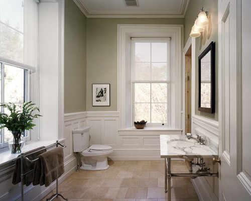
Benjamin Moore Camouflage
Paint companies predominately base their forecasts on their current bestselling paint colors and what the consumers are actually buying and painting on their walls. The best part of this is that paint companies have programs to track even the slightest changes in tones as we buy paint color. They also look at outside color indicators/trends going on in design, fashion and other influences. The combined mix of all this information enables paint companies to better pinpoint the direction/trends in paint color. I personally find this information more useful than any other other color forecast out there because its “real time” and what’s happening today since it’s based largely on current consumer paint trends.

via West Elm
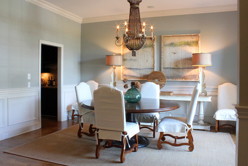
Benjamin Moore Evening Dove
Some of these colors in the forecasts {the bestsellers}, you may have seen before and some of the colors are new and good indicators of where the paint companies think our paint color palettes are heading.

Michael Abrams
Benjamin Moore Silhouette
With that said, I never make design or paint color decisions based on a trend or a forecast. However, it’s such great information to find out what undertones and colors are best sellers in paint because this tells us that a color works on a wall and not just on a paint chip. I want to find colors that I love and not have to repaint multiple times until I get it right because some crazy hue jumps out when I get it on the wall. This trend information is simply a great starting point when you are looking at a particular color that you will ultimately love.

Less Than Perfect Life of Bliss
Sherwin Williams Silverstrand
So now that I have written a novel here, lets’ get to my favorite paint color trends for 2013…
Benjamin Moore Sea Haze
I have only picked three paint companies to feature just a few of my favorites from their forecasts for 2013. Keep in mind that there are tons of colors in each forecast collection and I have just had picked a few of my muted/neutral favorites. I’m not ready to venture into the bright bolds on my wall yet but if you are, be sure and visit each collection to see some of the bright and bold colors.
My favorites from Benjamin Moore’s 2013 paint color forecast are;

Benjamin Moore has come out with four different collection of color palettes for their forecast and the collections are called; Artisian, Urbanite, Coastal and New Traditional. Each collection is amazing and keep in mind that I just picked a couple colors from each collection and made the above collage. There are so many more colors so be sure you check out each collection on Benjamin Moore’s website here.

Tara Seawright via Color Chats Benjamin Moore
Benjamin Moore Baja Dunes
My favorite colors from Sherwin Williams 2013 color forecast are:


Sherwin Williams also has four collections of paint colors in their 2013 forecast and they are called Midnight Mystery, Honed Vitality, Vintage Moxie and High Voltage. Again, I picked just a few colors to feature, so be sure and check out the rest of the collections on Sherwin Williams website here.

Sherwin Williams Unusaul Gray

Sherwin Williams Herbal Wash
Here is Behr 2013 paint color forecast:


Behr also has four collections in their 2013 and they are Classic Caprice, Color Metric, Sweet Jazz and Apres Ski. You can view all of the colors on Behr’s website here.

Behr Sweet Jazz

Benjamin Moore Van Courtland Blue
If you want to see more rooms with exact paint colors, you can check out my Pinterest Board “Pick a Paint Color”here, where I have more than 100 paint colors pinned. Many of these paint colors in the forecasts are new and I wasn’t able to locate painted rooms for you to see. As I find these colors, I will pin them on my Pinterest Board.
If you want to see more rooms painted in specific paint colors or you’re looking for a little help in trying to figure out how to pinpoint and pick just the right paint color, you can visit my post “Tips and Tricks for Choosing the Perfect Paint Color” by clicking the image directly below:

Ok, so I have to know, what do you think of these 2013 colors? Is there a color that has jumped out a you? I would love to know in the comment section below this post.
Have a fantastic weekend friends!!
Cheers!
Cyndy
Anja says
How interesting! Love the colors you chose. What I don’t really get, though, is why the Pantone Color of the Year – which is emerald this year, go figure – is always so different from the colors that people actually would want to put on their walls. Well, I guess I’ll never be a trend setter 😉
Cyndy says
Thanks Anja! Yes, the Pantone color of the year is emerald green and what’s interesting is that when it comes to paint color, we have been moving more into colors with green undertones. If you look at the blues, taupes and browns that the paint companies are forecasting and bestsellers, many of them do have a green undertone. I have been seeing a lot of painted furniture in emerald green and I do think we will be seeing a lot of accents in this color in both design and fashion but don’t think we’ll be seeing a whole lot of painted emerald green walls. Happy New Year Anja and thanks for stopping by!
Doris says
Oh, I so love the colors from our paint manufactures more than Pantone forecast of “Emerald”!! I also see the Emerald being used in furniture and accents and definately in fashion.
Cyndy says
I really never get the Pantone forecasts. At least with paint, you can see how we naturally transition from one tone into another each year, which {I think} is how we evolve and move through colors both in design and fashion. However, with Pantone, there is no natural transition and we went from tangerine (last year) to emerald. I could see going from tangerine to red or even yellow but emerald? Not being able to see this transition year to year, makes me not give it much weight. I personally think we are moving from green undertones into yellow (to offset the green-natural transition), Benjamin Moore does too because they picked Lemon Sorbet as their 2013 color of the year. Thanks Doris!!
Cindy Eikenberg says
Cyndy, thanks for sharing these! I have been struggling with a color palette to go with my cranberry carpeting (yeah, it seemed like a good choice at the time!) and the Après Ski looks inspiring as do all of the greys! I love that you have made it easy to see all of the choices! Have a great weekend!
Cyndy says
Thank you Cindy! Yes, Apres Ski is perfect to work with cranberry! I agree, light grays would be perfect for balance. By the way, cranberry is in every paint forecast! Girl, you were just ahead of the trend! 😉 Thanks for stopping by!
Amy says
I love these colors. We’ve been in our house 6.5 years, and I just started painting the walls and really decorating about 1.5 years ago. I never have anything ‘fashionable’, always what I like, so it is really interesting (exciting???) to me that all my colors are on these lists! Wow!
We have grays in the bedrooms, creamy white trim everywhere, and in the breakfast room/kitchen my favorite: Pratt & Lambert Moss Lake (2221). It’s one of those great colors that looks blue, green, or gray depending on the lighting and how you accessorize.
Thanks for all the great advice you give!!!
Melody says
I am terrible at commenting, but I had to tell you I love your posts,, and always read your newest. However, I am hopeless at choosing paint colors, but I will try your method and let you know what happens.
Cyndy says
Thank you so much for your kind words! I’m so glad you commented Melody! Yes, please give my little process for picking out paint a try. I think you will get a lot closer to your ideal color! Keep me posted, ok? Or let me know if you need a little help in final decisions! Thanks again Melody!
Monica says
Great paint post I have never used Benjamin Moore so I will try it always hear how the colors are wonderful just need to expend outside Home Depot visits.
Cyndy says
Thank you Monica! I like Behr too Monica, which is sold at Home Depot. I love that awesome new 2 in 1, primer and paint mix by Behr!! Fabulous paint!
Meg says
Love that Benjamin Moore Camoflauge was listed! We painted our bedroom that color a few years ago on advice of the professional painter when we bought our home. It is a wonderful neutral and my favorite color in our home. Very subtle green. I would highly recommend it. Looks great in any lighting.
Cyndy says
So good to know Meg! Yes, Ben Moore camouflage has been really popular! I haven’t seen it in person but everyone who has painted with it loves it! Thanks so much for stopping by Meg!
Bridget from Refined Vintage says
If this is the future, bring it on! I am loving all these tranquil shades, I plan on redecorating my Bedroom this year and there are so many great colors that you have featured, It is really giving me inspiration. I have pinned almost everything here! Thahk you!
Cyndy says
Thank you for stopping by and pinning Bridget!! I’m glad you were inspired!!
Katherine says
Came here from your choosing paint colors “tips & tricks” post I’d pinned 🙂 one thing that stood out to me is that I really like the Benjamin Moore colors, but not the others so much. Does each paint company have a “personality” (for lack of better word), or did you just post BM colors I love? 🙂
In seriousness, do you have any tips for painting a complete reno? Specifically, choosing colors that blend well from one room to the next? We’d like to paint before we move in, but don’t know yet what lighting we’ll use in some rooms. Ideas? I have a history as a bad wall color chooser and this time I’d really like to not have to paint multiple times!! 🙂
Cyndy says
Thank you for stopping by Katherine! That’s really a hard one Katherine! Without the lighting in the space, it gets a little more sketchy with paint colors. You could go into the space and use natural lighting with your paint cards to see how those colors work with your natural light in the space. However, it is challenging to nail a paint color without the exact lighting in the space.
If it were me, I would probably go the safe route and pick a tried and true neutral that is used often by builders for spec homes like Shaker Beige, Bleeker Beige, Stonington Gray or Revere Pewter (All Benjamin Moore) because these colors are used frequently because they work in a lot of different lighting situations. Then once you get in the space and live in it awhile, maybe have a room or two painted for contrast. You could also just have the walls primed and then have the final coat done after lighting install. Good luck Katherine and please keep me posted on your final color choices!
lynn sheppard says
Help, Looking for a lovely slightly aged looking cream paint that would look great with an open two story deep forest green foyer. Ihave some coral accents. I like latte and caramel colors as well. Thr floors are medium tone oak. I am trying to paint a small dining room, hallway and a bedroom all opening to this foyer. traditional southern home…..Iam going a little nuts over this!!! I cannot get rid of that expensive old dark green wallpaper in the foyer.
Cyndy says
Ironically Lynn, we were just talking last night on The Creativity Exchange FB page about this color, “Rice Grain” from Sherwin Williams. It appears to be a creamy light taup-ish color, with both a green undertone and a touch of yellow warmth. It may not be light enough but it’s worth looking at the card and going from there. Sounds like you need both yellow and green undertones. If it’s too dark, maybe go up a shade? Hope that helps and thank you for stopping by. Would love to know what color you decide on.
Tami says
We are moving into my parents’ basement to help care for them as they age. They have very nice solid oak woodwork everywhere and because my dad was a woodworker, we don’t have the heart to paint over it, as much as I would like to. I have been searching everywhere for paint colors that look good with oak but EVERY photo seems to show white trim these days. Wish that was an option but since it isn’t, do you have suggestions? I am leaning towards a taupe and teal combo but wonder what tones of taupe will complement the oak? They are using SW’s Latte upstairs but I think I would prefer something with just a tad bit more color.
Thanks!
Crystal says
I need HELP! I have painted my dining room french blue by Benjamin Moore-Origins (In Canada). With Behr’s high-gloss Camambert. Now I’m stuck on what colours to compliment the open concept living room, kitchen and front entrance. Do I use one colour for all three rooms or can I paint each room a different colour? Also, What colour goes well with french blue? Any suggestions, or feedback would help me out so much! Thank you 🙂
Geraldine says
Hi: Any suggestions for paint color for a small, north facing bedroom. I don’t want it to feel cave like so I’m shying away from dark colors. Everything I’ve read says do not use white since it will look dingy. I want something cozy and warm feeling. I’m at a complete loss. Any suggestions would be greatly appreciated! Thanks.
Cyndy says
I agree Geraldine, you probably want to shy away from dark colors or white. I would suggest maybe a nice neutral light color that has some depth. This way, you have some depth on the wall but you could add pops of color through pillows, fabrics and bedding. Maybe look at Ben Moore Tapestry Beige or Ben Moore Shaker Beige for very light colors with depth.
Shaker Beige is very popular with home builders because it works in almost every room and light and for a light color, it’s very rich. If you want a lighter gray/blue take a peek at Ben Moore Smoke (may be too blue) or Ben Moore Gray Owl (nice light gray/blue/green). I hope this helps Geraldine!! I would love to know what you decide. Thanks for stopping by!
Geraldine says
Thanks, Cyndy! I’m getting paint samples this weekend and I’ll let you know how it works out. I’d like to try a yellow color as well – maybe Benjamin Moore Hepplewhite Ivory?
Kim says
Cindy,
What paint maufacture makes the paints on the color palette above that says favorite tips for choosing paint color – 2013. I love all these colors and want to use in my home and new office. Who makes the three color paints that are shown in drops? What are the colors.
Thanks so much!
Kim
Bernadette Keaggy says
I love paint, and really my favorite paint is Benny Moore. The revere pewter is fantastic and also Pashmina works in many situations also. thanks!
Cyndy says
Oh thank you for the recommendation for the Pashmina Bernadette! I just pinned it and your right, it is a gorgeous color! Thanks for stopping by!!
Yvonne says
Greetings!What a Godsend your blog is! Can you recommend a WARM white with possible undertones? I have a Deep Russet sofa and chair, ebony colored furniture and colorful Tribal rugs. I want a rich yet subtle wall color for my open floor plan – kitchen flows into the living room which is also connected to the front foyer. Please I need help becuase I’m so worried about the unknown undertones that all colors have. Don’t want any grey or green undertones. Thanks Yvonne
Cyndy says
Thank you so much Yvonne! I’m glad that you are enjoying my blog!! I have recently been researching whites with a lot of depth and I think in light of what you are describing, maybe take a look at Benjamin Moore White Chocolate, Linen White and Overcast. Overcast will be the darkest of the whites but it is gorgeous (if you have a lot of natural light) and would be ideal and balancing for the various undertones that you are describing.
You can see these colors painted in rooms on my “Pick a Paint Color Board” on Pinterest here: http://pinterest.com/theexchange/pick-a-paint-color/
Good luck Yvonne and I would love to know what color you ultimately go with!! Thanks for stopping by!
Lily says
This is an amazing design. Very nice and modern. Thank you for sharing this.
Terri says
Your color choices are beautiful. We want to paint my husband’s study. The oriental rug colors are coral and navy with taupe. The furniture is medium to dark brown tones with a brown leather couch. Any suggestions for wall color that is not too dark.
We don’t want it to feel like a cave. I love navy and coral colors together. the beige colors I’ve been trying for wall color just don’t work. Should I use a shade of taupe?
Cynthia Swienton says
Just found your site! We are trying to decide what color to paint our master bedroom. It has big windows, and we have no treatments (we live in the woods!) and the rest of our house has very organic, earth colors. I was going to go with a more purply color, but then came upon this site with the grays. We were looking at Ben Moore’s wisteria, and tempest – but now I think they have too much purple in them? Any suggestions? I love the dove gray, but not sure what other colors to put with it. We are getting new bedroom furniture, and the bed is the Stickley willow bed, in a dark stain. Any suggestions?
Mindy McMinn says
Our bedroom walls are Concord Ivory (Benjamin Moore) and I need a good color for the master bath. We painted it HC-4 Hawthorne Yellow, and it is WAY too bright with our white counters and cabinets. The ceilings are 12 foot, and the hardware is brass. Any suggestions?
Judi says
Cyndy,
In your opinion, does Benjamin Moore’s Overcast have a hint of green undertone? I see this and like it, but one of your earlier posts implies other wise. I’m looking for a white that has a very slight green undertone. Any suggestions? Thank You.
Cheryl says
Love your color choices but after much research, your favorite brands: Benjamin Moore and Sherwin Williams both do not hold up well to scratches/abrasions and with two dogs, my paint choice must be durable.
One that ranked well overall and is budget friendly is Valspar. Do you have any favorites from their line that are similar colors you’ve chosen above and in the past?
Barbara Renfrow says
Yes, I would like some help on the following: I am an antique artisan in a leased space to showcase my antiques and interiors. I want to paint my walls in my venue a color that will attract clients and customers to my location as I am competing with about 350 artisans like myself in this location. I do not like the material of the walls but it is necessary because I hang art work and heavy mirrors, or anything else appropriate with the design taken into account. The two surrounding walls are peg board….ugly but necessary. What would be a great color for the walls that would look great with painted antiques on one wall……………..that I will soon be phasing out……….as I sell this merchandise and will have only wood-stained antiques and just throw in some painted furniture to make a splash with the wall color and the wood stained antiques. Where I am painted furniture is waining down as so many artisan dealers are doing this………………and the wood stained antiques are being asked for. Can you help me out and give me your opinion and suggestion for an exquisite color to make a statement. Thanks so much, Barbara Renfrow
Marisol says
Hi!!! I love your blog! I am hopelessly overwhelmed by the process of color selection for my new (old) home, which I’m renovating. I finally selected gallery taupe from Behr because I thought it looked beautiful and versatile in my friend’s apartment. The living room, the wall that frames my kitchen, and the half the staircase will be gallery taupe. I need a shade/brand of white for the adjacent staircase wall as well as an accent color for a nook type space in the living room. I was considering Benjamin Moore moonlight white for the staircase and either Benjamin Moore evening Dove or Behr mocha latte for the nook. All walls border the taupe. Any thoughts? THANKS
christine says
Love your ideas. We just moved into a new house and am looking for a paint color for my master bedroom. The room has hardwood floors and mahogany furniture. It’s a large space and my husband doesn’t seem to be too excited about neutrals/ tans. Our comforter is light blue- but was looking for a color that we could change the bedding with the seasons. Any suggestions?
Cindy says
Help. We are getting the exterior of our home painted and I know what I don’t like but can’t seem to find what I do like. Front of home is brick. Painting front door sherwin Williams brick paver red to match hues in brick. The cedar part of home (trim and back) of House is currently latte. We want to go a few shades darker. I don’t like golds, greens or greys. So, do you have any insight to share that would include the name of a suggested sherwin Williams color???? Appreciate any help u can provide. AssistanceThanks in advance for your
Cyndy says
Without seeing a pic of the home or knowing more about the color of your brick, it’s difficult to suggest something. However, I have been seeing a lot of exterior trim work painted lately in Benjamin Moore Texas Leather. It’s a gorgeous color and it may be too similar to Latte. Also, what about the possibility of going a dark slate/dark brown color, which would really compliment the red brick? Check out Iron Mountain by Benjamin Moore. I am in love with this color for exterior and I really think it looks best with red brick.
I have images of both Texas Leather and Iron Mountain painted on exterior trims on my “Pick a Paint Color” Pinterest Board here: http://pinterest.com/theexchange/pick-a-paint-color/ and they are about a 1/3rd of the way down. I do have some other exterior colors pinned as well that may inspire you. I really hope you take a close look at Iron Mountain! Keep me posted on what you decide and thank you so much for stopping by!
Barb says
I am stumped. I live on older farm house. We are redoing our bathroom and the washer/dryer/sink/shower/tub will be white with neutral floor, congoluem. My sink is mulit colored in browns from Mendards. I had peach rug..so am tired of that. My lighting is not very good on ceiling and only one north window. I have two lights on old side of medicine cabinet. I am getting prefab cubboards in white. I was going to go BM Lemon Sorbet but is that not a good color for bathroom and had picked out August Morning but too dark and maybe get sick of orange tones. ? I read the Lemon Sorbet should be put in kitchen. I don’t want any thing pinky looking because the peach always gave off pink glow. I want to just go a soft color but rich color. I am not found of grays but I see some grays have color tones in them. My walls are plywood on part of them. Don’t want to go too dark because of lighting. I have Creamed custard in living room, sage in kitchen. I am terrible at colors and here at BM, I cannot get samples. Any suggestions would help. What color of ceiling would you go with the Lemon Sorbet by the way?
Tiffany says
Thank you for such an insightful post. I just saw a photo of a living room painting with Benjamin Moore Silhouette and now it’s all I can think about for the home we’re buying. The problem is that the window trim in the formal living room is stained wood, not painted. I actually prefer white painted trim, but is that a crime against architecture to paint the unpainted trim of a 100 year old home?
deb says
Please help !
I have opened a can of worms.
Took down two stories of wall paper and chunks of wall with it.
Our painter is suggesting orange peel or knock down to camouflage the imperfections. (He also suggests spraying the ceiling)
I untimatly want to hang picture frame mouldings and crown mouldings to break up the huge space.
Our floors, doors, stairs, banisters and trim work are all golden oak…which my husband will not allow to be painted.
So, what color should I paint the walls !?!?
Desperate in Wisconsin !!
Bob Blume says
The color palette for 2013 is gorgeous. I love the neutrals with a burst of color here and there.
Sherry Wasylyshen says
I LOVE your site !!! It’s got REAL people comments and info requests. I think you love the same colors as myself from what I see. I just painted my living room a gorgeous blue/gray and bought a new living room suite in a medium to dark mocha, trim on two large windows is all white along with baseboards and crown moulding, Flooring is a new walnut type color. I gave away everything from the old living room. New draperies are a light damask pattern blue/gray. What other color can I use for accent wall, or other items? Should I paint one wall in BM silhouette? Also some pillows came with the furniture that has a touch of red in it but I don’t think that will go with anything else. Do you? HELP !!
Orlando Paint Contractor says
Hi Cyndy,
Terrific post and we’ve seen a real interest in many of these colors – our clients love the warm neutrals as a base for the bright colors we have in our homes and gardens here in Florida. Thanks for the great ideas and pictures!
Jason Franich - JM Painting says
The Unusual Gray from Shermann Williams is an excellent example of how paint can look one way in a palette, but have a profoundly different tone once it’s actually been applied. The rooms decor and natural lighting really make this a very lovely shade of gray that I might never had considered using until seeing in such a well designed setting. Thank you very much for such an excellent post.
Sheila Xavier says
These colors are quite popular with our clients. They have a very modern and clean feel that can blend with various accents and decors. Thank you for sharing!
Heidi says
I really enjoy your blog. Thank you for all the words of wisdom you offer!
We have several rooms in our house (including entry way & hallway) painted in Eddie Bauer Pecan, which works really well for us – covers kids’ finger prints until I get around to cleaning them, adds a nice warmth, etc. However I want to paint some other rooms that are connected to the entry way (such as the living room) and the hallway (bedrooms) in a complementary neutral, but not the same thing. We don’t paint very often, so I want it to be neutral & not trendy so we can redecorate over the next few years when we want to, without having to repaint. I was thinking of going a little lighter, but that whole family of tans and golds confuses me. I just don’t want it to clash with the Pecan. Any ideas?
Aaron martinez says
hi are you on CardsApp? how can I subscribe? do you use your own app? thank u
Pink says
I am awful at picking out paint colors. I have tried to read all of the helpful hints, but unfortunately I am still at a loss. I have a dining room and living room that feed right into each other. There is a middle wall divider, so it separates the two. Our living room furniture is a light cream color with brown pillows. The dining room furniture is dark wood. We currently just have white blinds and our going to do white trim. I have so many colors picked out..grant beige, berkshire beige, texas leather, sag harbor gray, gray mirage.. Ughh! We also have a hallway I need to paint. We are also thinking about going dark for all of our doors. Wondering if that is a crazy idea. Any ideas would be so much appreciated! Thanks in advance.
Pink says
I am awful at picking out paint colors. I have tried to read all of the helpful hints, but unfortunately I am still at a loss. I have a dining room and living room that feed right into each other. There is a middle wall divider, so it separates the two. Our living room furniture is a light cream color with brown pillows. The dining room furniture is dark wood. We currently just have white blinds and are going to do white trim. I have so many colors picked out..grant beige, berkshire beige, texas leather, sag harbor gray, gray mirage.. Ughh! We also have a hallway I need to paint. We are also thinking about going dark for all of our doors. Wondering if that is a crazy idea. Any ideas would be so much appreciated! Thanks in advance.
Ginger says
I am excited to see the groups of trendy colors for 2013. I want to repaint my living room so badly but I am lost as to what direction to head right now. They are currently a dark sand/tan color. My house was built in the 60’s. I do not have matching furniture and cannot afford new furniture as I am a cancer patient and paying medical bills. My couch and 1 chair are navy blue. My loveseat and other chair are dark brown and I have a fireplace that has soft orangish/tan brick. Carpet is ugly brown but almost with hints of goldish/greenish but not strong. I thought about painting the fireplace wall an accent color and the rest the walls a white or lighter color. Any advice? I was contemplating orangish accent or blue or dark grey? Drapes are all cream colored old fashioned lined standard drapes. Help?! Any ideas?
Orlando Painting Contractor says
Hi there Cyndy – we always come back to your site for inspiration becasue it’s one of the best online and in the industry – love the takeaway ideas you share in every post. We’re Fans!
Cyndy says
Wow!! Thank you so very much for your kind words! You’ve made my day and coming from paint contractors is just so extra special. I really appreciate all of your notes on the posts and can’t thank you enough!! Cheers my painting friends!
Monica says
I love a gray/taupe color. Which would you recommend for a master bedroom makeover?
Cheryl says
What ceiling color would you put with Camouflage in a Kitchen? Don’t want to go with basic white – Love Sparrow but its a little dark. Any suggestions?? Thanks so much . . .