
I hope you guys have had a great weekend!
I have been wanting to share a coastal color palette for quite sometime now for Color Palette Monday but it has taken me awhile to find just the right colors. If you are looking for a pop of color in a room but want to still keep it neutral and safe, calm coastal colors are a great solution. I think of them as muted bolds.
Here is this week’s printable color palette:
(As a reminder, each color palette is printable. It makes a huge difference to look at paint colors that have been printed out on paper, versus your computer monitor. It helps even more if you print out the palettes on smooth white card stock. My palettes should not be used to replace a paint color card, so if you see a color you like, please refer to a paint color card).
Here is the link to this week’s printable palette: Printable Color Palette Monday #9
I know that many of you prefer neutral colors in your home ( like I do). The thought of interjecting a bright bold color in a space makes many us a little nervous but I also like to find a color here and there that is different (but still safe). Something to consider and a great place to look is at calm coastal colors like this:
Woodlawn Blue by Benjamin Moore
here is Woodlawn Blue painted in a dining room:

Source: Beachnut Lane
Woodlawn Blue by Benjamin Moore
Summer Shower by Benjamin Moore has a lot of depth and adds that pop of subtle drama but again, calm and balanced undertone:
Summer Shower by Benjamin Moore
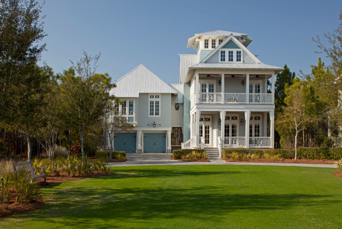
One of my favorite things to do is look through beach houses for color inspiration. I also consider exterior paint colors as well because it might make a great powder room color or a cabinet color. A great selection to look through beach houses and colors is by looking through Houzz. Just look at these exterior colors, they would be beautiful in any space:
Misty by Sherwin Williams
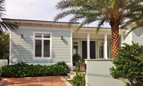
Copen Blue by Sherwin Williams
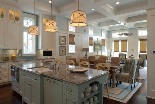
Another beautiful calm coastal is Jamestown Blue by Benjamin Moore, which adds a great pop of color to this fantastic kitchen on the cabinets and wall:
So if you’re looking for pop of color but still want to keep it neutral safe, consider a calm coastal color. The best part of all, these colors also make us instantly think of the beach!
Thanks for hanging out with me today and if you missed last week’s color palette, you can get to it by clicking the image below:

Cheers!
Cyndy
Megan says
Cyndy you always have such inspiring ideas when it comes to paint palettes. These are some gorgeous colors. They make me want to go to the beach. 🙂
Ellen Carroll says
Lovely. Always enjoy your color palettes. Have had a ton of peeps repost your griege color palette that I pinned on PI. Don’t even know these peeps either!
Would you consider coming up with a color pallete for the river/lake? You know, not as crystal clear as the coast. A little more murky, rusty, darker colored water. Not a log cabin type palette, but something more rustic chic/traditional. Lots and lots of peeps have river/lake homes. Thanks for your consideration.
J. Shillings says
These colors would be lovely anywhere , not only the beach homes! Love them ALL!
Patty Virginia says
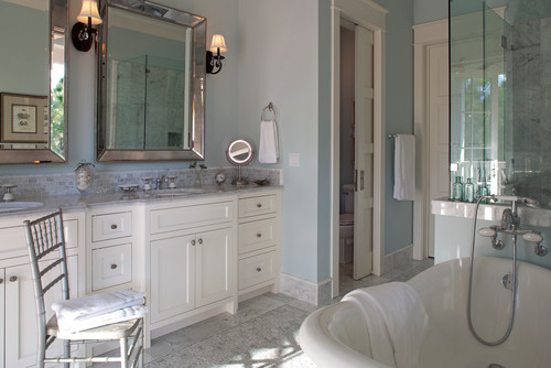
I want the Ebb Tide bathroom. Every color is so beautiful that it is difficult to decide which one to choose. I’m relaxed just looking at the pictures! Thanks for sharing this with us. Pinned and shared on FB.
Janet says
The love the Ebb Tide bathroom color but it looks really blue and the paint sample looks more like a soft green color. Does it really darken up that much?
Thanks!
Cyndy says
Thx Janet. Actually, I am not 100% convinced myself that it is the color, so I have pulled the image until I can find out with certainty. I’m pretty sure that color is closer to Jamestown Blue. I will let you know when I find out for sure.
Sorry about the confusion Janet.
Aisha says
Hey. I really love you palattes and have been following you for a couple of months now and the only blog I follow.
I really want to re do my room and bath in green or blue shades. My furniture is really dark wood brown and I feel like maybe green would go better with it than blue. I also want to incorporate a pop of color in like an accent wall in the same shades and something similar that can flow into the bathroom. I would really appreciate your input and color ideas. I’ve never had dark wood furniture and am unsure how to design it. And I dont like the rustic autumn colors like maroon, rust, gold combination it’s in right now. I like colors in my life!
Thanks
Greta says
Blue Horizon is fabulous on the ceiling of my front porch and the house is painted Jamestown Blue! My Mellow Yellow front door is like a burst of sunshine with these coastal colors. And Jamestown Blue is a green blue that is pretty dark.
debbie says
Gorgeous paint colors and blue is one of my very favorite colors. I’m having such a difficult time selecting just a few but I know I should not mix lots of different colors so I don’t make our rooms look so choppy. I’ve heard every room color should blend into the following rooms. Well, I’ll think about it tomorrow (I loved Gone with the Wind).
Orlando Paint Contractor says
Cyndy, another great post! These colors and ideas are very well suited for may of our coastal homes in central and north Florida – thanks for the ideas and suggestions!
Interior painting says
What should I do if my homeowners association keeps denying new house paint colors?
glevio says
What a gorgeous paint color for our interior… really like it!
April says
After painting some sample pieces, I chose Woodlawn Blue as the color of our shed. We have a French Cottage thing going in our home interior/exterior and the yard. Second choice is Wedgewood Gray (which is ironically more blue and the Woodlawn blue is more gray, but I digress). I don’t want a coastal look. I have to make my final decision soon. Opinions? Thanks.
Adrian says
Hi, I just stumbled on your blog and i love it! My wife and I couldn’t decide (or agree 🙂 ) on colours for our house but when we saw the calm coastal palette we both loved it! Is there any chance you could recommend a gray thats a bit darker and still works with this palette? Thanks so much.
Your new fans!
Melisa Callison says
Fell in love with the Olympic EbbTide Lowe’s was able to find the color I got a sample and it was the perfect shade of subtle green
Painted three walls with it and it now looks blue. I don’t get it. Help.