
I hope you guys had a fantastic weekend!
I am really excited today to welcome Jenny from the beautiful blog, Evolution of Style as a special guest blogger:

Jenny shares beautiful DIY home projects on her blog and has a knack for picking just the right paint colors for her home. I asked Jenny if she would share her color palette and home with us today and was thrilled when she said yes!

Jenny’s home is full of rich paint colors that all work beautifully together. Each room in her home is full of inspiration and painted with just the right beautiful warm transitional color. Thank you so much Jenny for guest blogging and opening up your gorgeous home to us!
Welcome Jenny!!
Hello!
My name is Jenny and I’m visiting from my blog, Evolution of Style. I’m so thrilled to be a guest in this fantastic color palette series that Cyndy has put together! I don’t know about you, but I can’t get enough of color palettes, and have been loving this series, and am excited to share the colors I have incorporated in my home.
We bought our house about two and a half years ago, and fell in love with the open floor plan this home provided. While I love the openness, it definitely creates a challenge when it comes to choosing paint colors that work well and flow together.
With this new home, came a blank slate, to start over, experiment with new colors and take my home in a new direction, which is what I did. It’s so funny to me that I have so many shades of blue in my home now, as I never used to be a big fan of blue when it came to home decor. Now, I can’t get enough of it! Teal, aqua and indigo blue have all found a place in my home and work together. This color lends itself to changing out pillows and accessories, which I have been doing on a regular basis.
One thing I have learned over the course of choosing colors for my home is that neutral doesn’t have to mean beige, white or even gray. Shades of blue can create a great neutral backdrop for many other colors, so you’re not limited in changing up your color scheme with new throw pillows or accessories.
Here is the paint color palette from my home:
(As a reminder, each color palette is printable. It makes a huge difference to look at paint colors that have been printed out on paper, versus your computer monitor. It helps even more if you print out the palettes on smooth white card stock. My palettes should not be used to replace a paint color card, so if you see a color you like, please refer to a paint color card).
Here is the link to the printable palette: Printable Color Palette Monday #7 {Evolution of Style}
Our master bedroom was the first room that I painted in this house, and I love the calm, tranquil mood this paint color creates. I chose Mineral Deposit by Sherwin Willliams:

But the room that really sets the tone for the whole house is the great room, since it’s the first room you see when you walk in the front door. After much deliberation, I chose Palladian Blue by Benjamin Moore. It’s been a process, and this room has gone through a lot of changes over the past 2 1/2 years thus the changing furniture in some of the pictures.


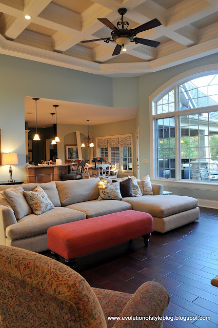
This color lends itself to changing out pillows and accessories, which I have been doing on a regular basis.

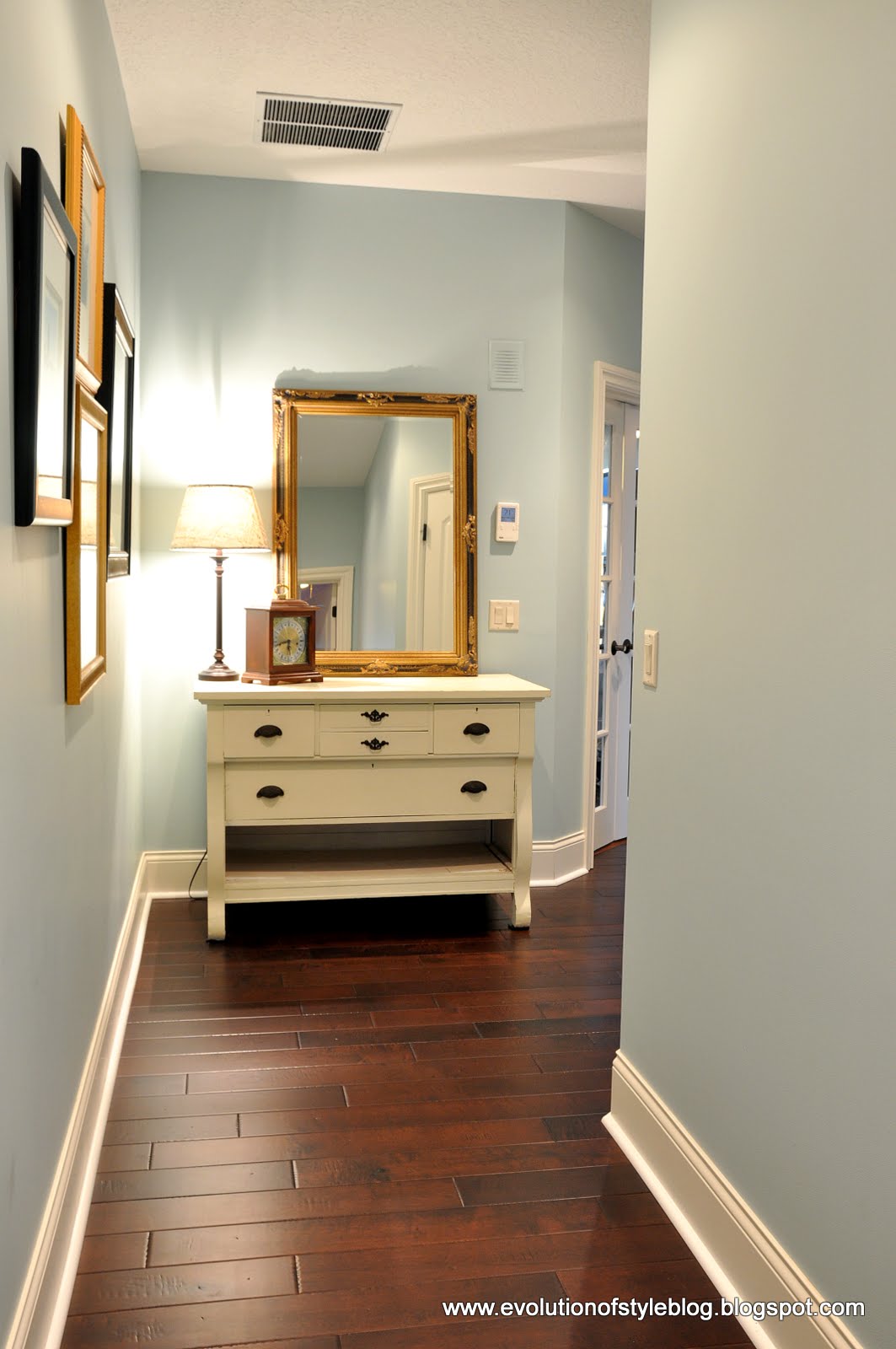
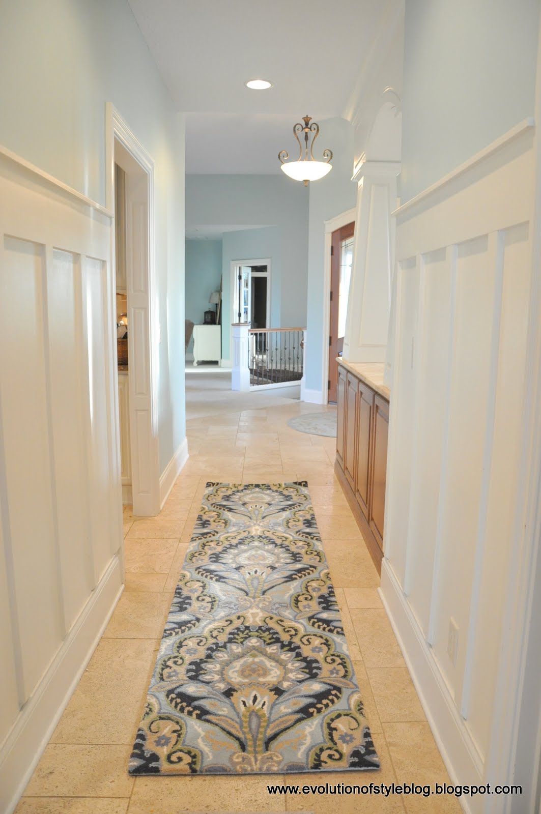
This color carries through to the breakfast room and the hallways that are connected to it.

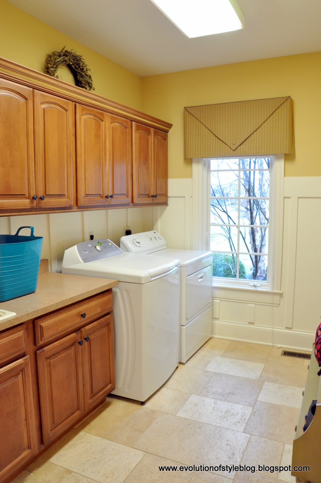
The laundry room is right off of this hallway, and it’s painted in Sherwin Williams’ Blonde:
Our dining room is within view of the great room as well, so after a couple of paint iterations, I settled on Natural Choice, by Sherwin Williams:

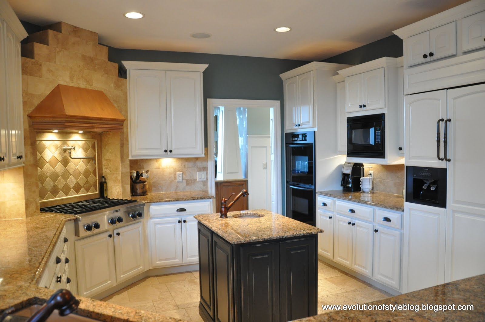
The kitchen has been my biggest labor of love, and my favorite room in the house. I painted the cabinets and the walls in here, and love the fresh look it has as a result. The cabinet color is custom, based upon a sample I brought in to have color matched, and the wall color is Mountain Laurel by Benjamin Moore. I think it’s one of my favorites in the whole house.

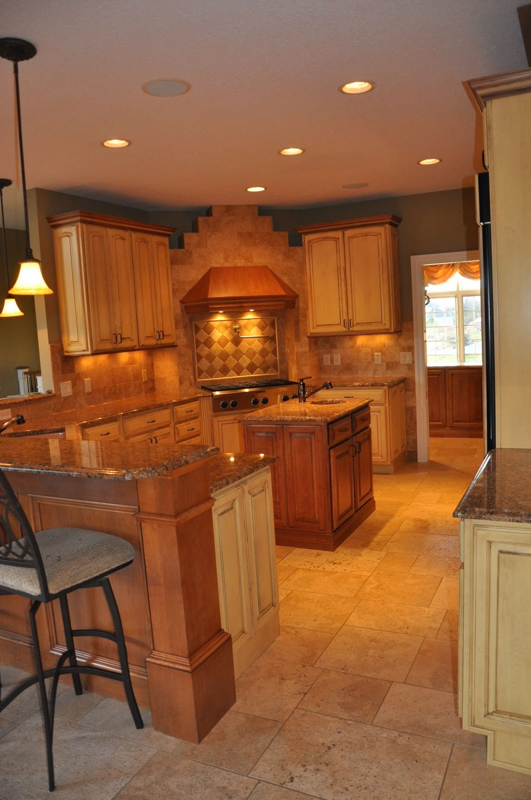
I never tire of the transformational power of paint! Here is the kitchen when we first bought the house:
I carried the Mountain Laurel to our basement powder room as well.
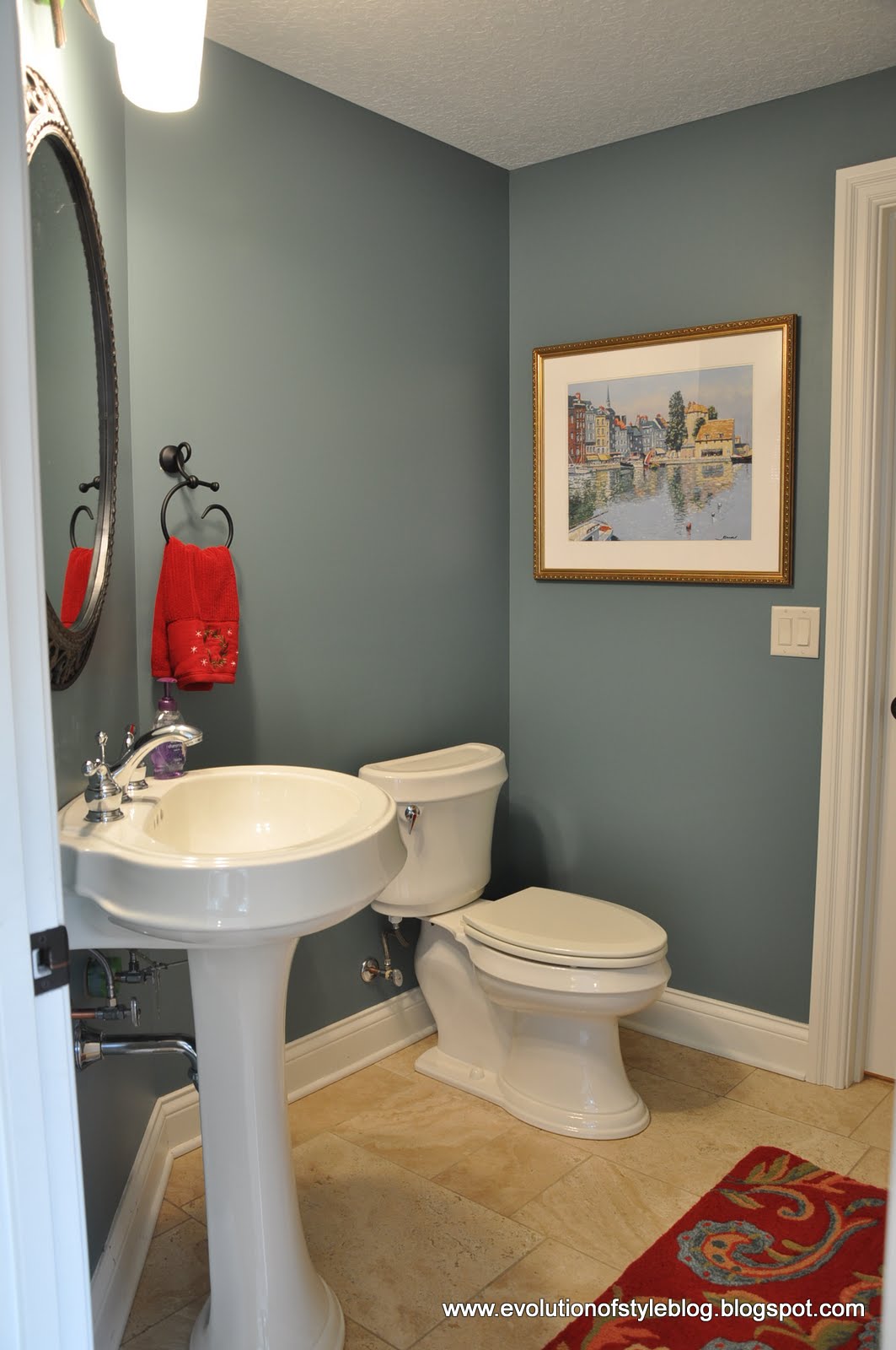
Our main floor powder room is a deep indigo blue called Gentleman’s Gray by Benjamin Moore. I love a daring color in small spaces like this:
My husband’s office is currently a work-in-progress, but I developed the palette for his space based upon some fabulous fabrics I found. They meet the “masculine office” requirement my husband has, and the room is finally starting to come together:

The walls in his office have been painted in Cape May Cobblestone, by Benjamin Moore:

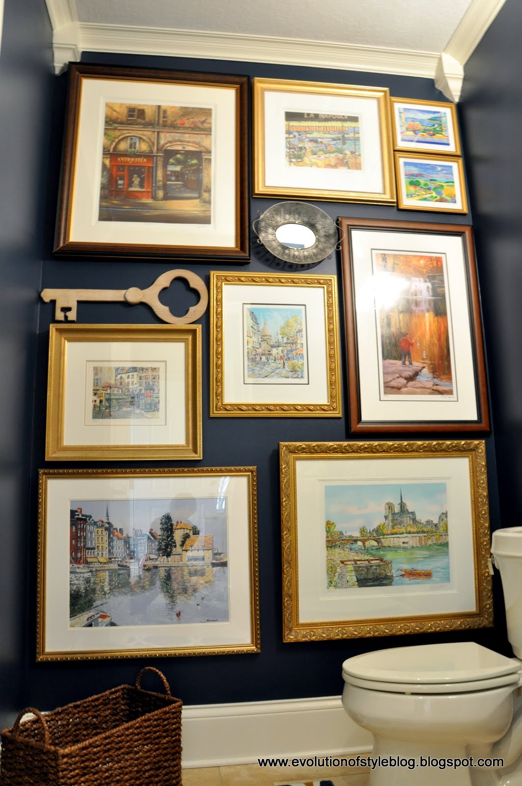
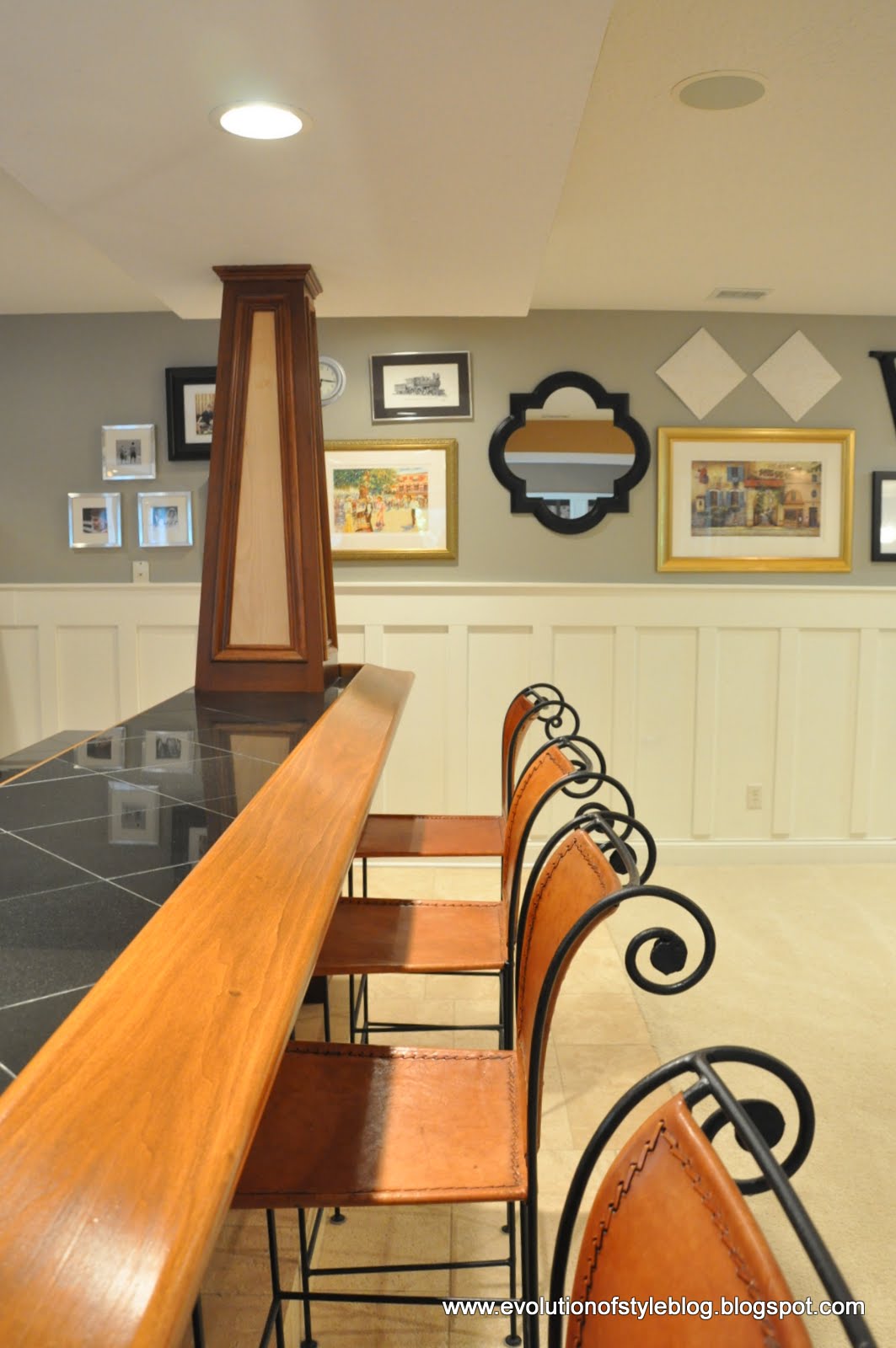
As you can see, the stairs leading to the basement are open and the transition color needed to flow well with the Palladian Blue. So, I went with Ethereal Mood (Sherwin Williams):


This wall color carries through along this gallery wall:
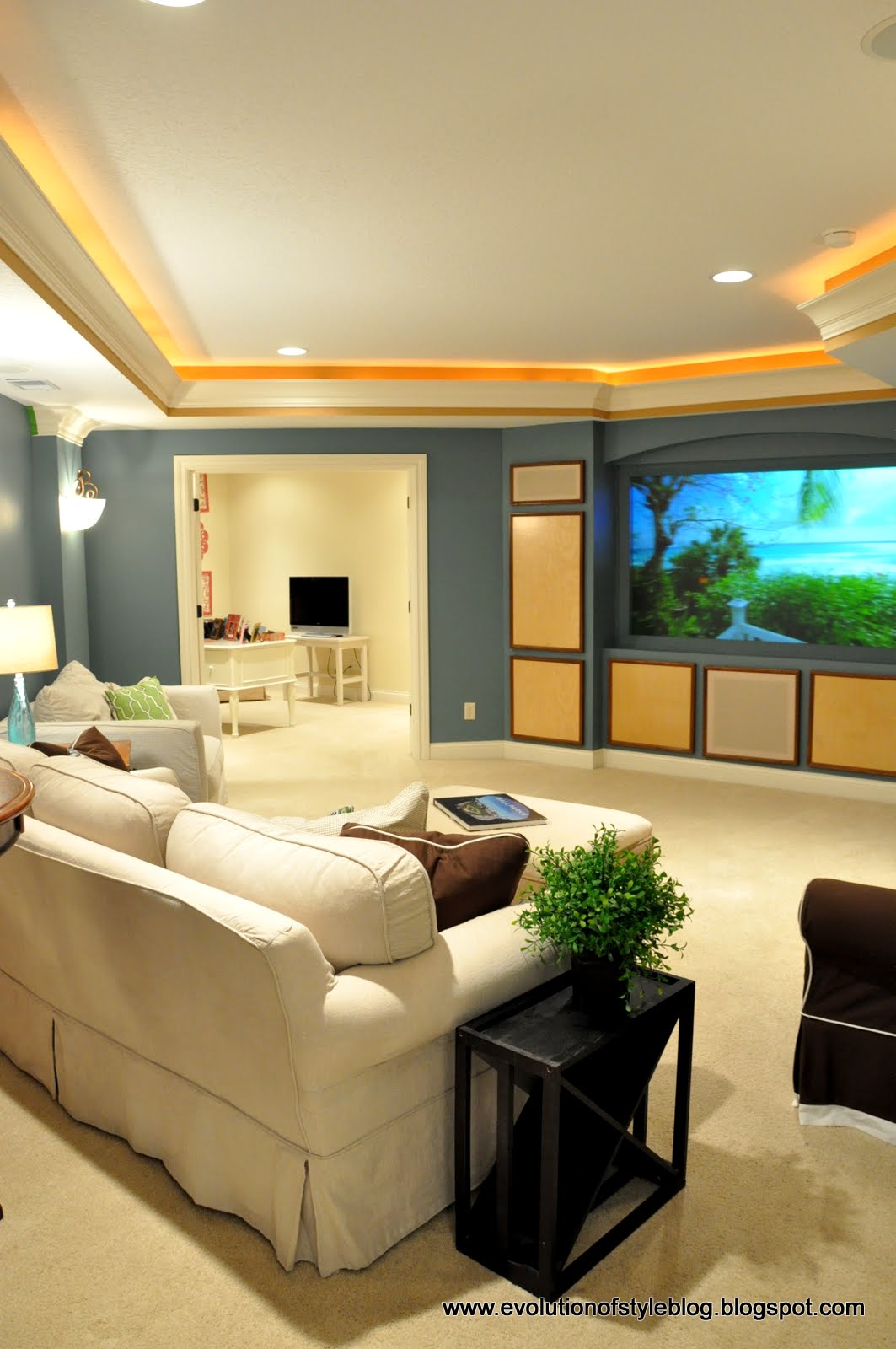
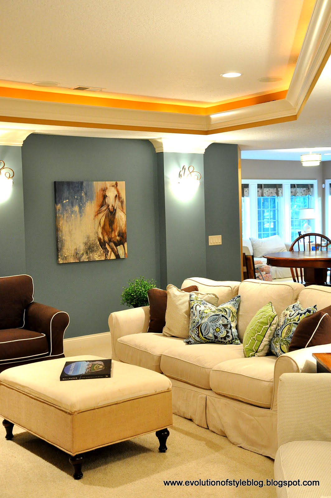
We’re fortunate to have a media space in our basement, so I went with Aegean Teal (Benjamin Moore) since movie watching lends itself to darker colors:
The horse canvas was a great inspiration piece for this room:
My office/mom cave is off of the media room area, so I took the opportunity to make it my own. Since there aren’t any windows, I kept it light and went with Muslin by Sherwin Williams:

In the adjacent nook, I added a pop of color with a fun stencil:

That wraps it up for me. A huge thank you to Cyndy for including me in her Color Palette series! I would love it if you would stop by and visit me at Evolution of Style sometime!
Jenny
Thank you so much Jenny!!
Every time I see pictures of Jenny’s home, I am just blown away. It’s so beautiful and the colors are just amazing. Great job Jenny and thank you again for guest blogging today and sharing your home and color palette with us!!
When you guys get the chance, please visit Jenny on her blog Evolution of Style. It’s one of my favorite blogs and Jenny does such a great job sharing so much design inspiration. So which color is your favorite? It’s so hard to choose, I just love them all.
Have a great week friends and thanks for hanging out with us today. If you missed last week’s color palette, you can get to it by clicking the image below:

Cheers!
Cyndy
Jenny@EvolutionofStyle says
Thanks again for inviting me to guest post Cyndy – I enjoyed every bit of it and again, love this series!
Cyndy says
Thank you Jenny! Your home is so beautiful and your paint color choices are really fantastic. We are all inspired and thank you for sharing your home with us!!
ann says
truly lovely home—great architecture enhanced by paint–so clean looking
Cyndy says
I completely agree Ann! Jenny really hit it out of the ball park by choosing gorgeous colors to enhance the beautiful architecture of her home. Thanks so much for stopping by!
debbie says
Cyndy,
Thank you so much for sharing the blog of Jenny. I knew nothing about her blog. The colors I absolutely love. Very beautiful home. I love your blog, too and all your great ideas.
Cyndy says
Aw.. Thanks so much Debbie! Oh yes, Jenny has an amazing blog and her home is so beautiful. Thanks so much for kind words, you made my day Debbie!