
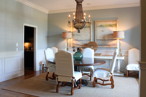
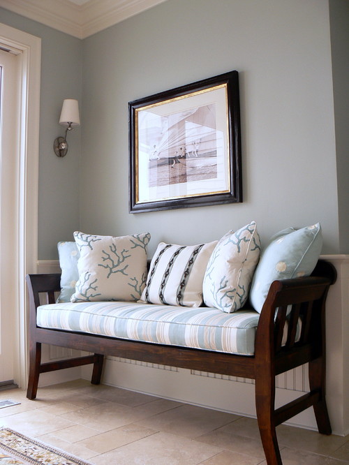
Happy Friday friends and welcome to another Friday Favorites!
One of the most common questions I receive from readers is how to make the transition in a home from warm undertones to cool tones. Ironically, I also get the same question from readers wanting to transition from cool tones to warmer tones. I think it’s because trends in paint color undertones have really shifted in a significant way. It’s hard for people to determine what paint colors to choose when making such a big jump from warm to cool and vice versa.

via Sherwin Williams
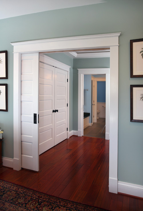
These days, so many homes are now built with an open concept, people are challenged by choosing paint colors that make a smooth transition because each wall has to work well with the other walls. In my home, you can see the walls of five different rooms as you stand in my entry way and when I change the color in one room, I have to think of the other four walls. Yep, it’s been a big challenge for me as well.
Just a few years ago, we were all painting out homes in very warm tones in creamy yellows, warm browns, tans, latte, etc… My whole home is pretty much the warmest of warms and I too am slowly transitioning to the cooler tones. It’s interesting how we all evolve with the colors in our spaces. It’s like going back and forth with our hairstyles from short to long and long to short!

via Aine.US
Fine Grain by Dunn Edwards
It’s one thing to change a paint color using the same undertone but when you’re completely changing an undertone, it’s challenging to know how to choose colors that can help with the transition. Especially if the rest of the home is not that new undertone. It’s not affordable for many of us to paint every wall in a new undertone at the same time, so picking a great transitional color is key. Today I thought I would share some great paint colors that can help with the big undertone transition.
My recent master bedroom revamp is an example of jumping ship from one undertone to another:
Before:

After:

As you can see, I went from a room painted and decorated with all warm tones into cooler tones. However, I still incorporated touches of warmth in my drapes, carpet, pillow and blanket to make the transition smoother into my kitchen, which is all warm tones. I also picked a cooler paint color that had the slightest hint of warmth to keep the transition to cooler tones not so jarring. My home still flows and the transition from my kitchen to the bedroom is smooth because I didn’t go completely cool and kept touches of warmth.
Here is the transitional paint palette of colors mixed with warm and cools that was my inspiration for the room revamp:

Instead of jumping completely into a new main undertone, I think it makes all of the difference by choosing colors that are a balanced mix of both cool and warm. Finding paint colors that have a nice mix of cool and warm undertones will help if you are wanting to transition to new undertones in your home.
I wanted to give you some examples of some paint colors with a nice neutral balance of both cool and warm that would work for both groups of people; those wanting to go cooler and those looking to add a touch of warmth. Some of these colors may lean more cool or more warm than others but they all have a mix of the two tones.
Pleasant Valley by Benjamin Moore is a great balanced transitional color and notice how well this mix of cool blue and warm green works with the warm wood tones in the floor:
For an even cooler blue with a hint of warmth, Benjamin Moore Slate Blue is another great transitional color. This color is ideal for those wanting to go cooler and to incorporate blue:
Benjamin Moore Sea Haze is another great cool blue with a hint of warmth and it is beautiful mixed with warm tones in wood and furniture:
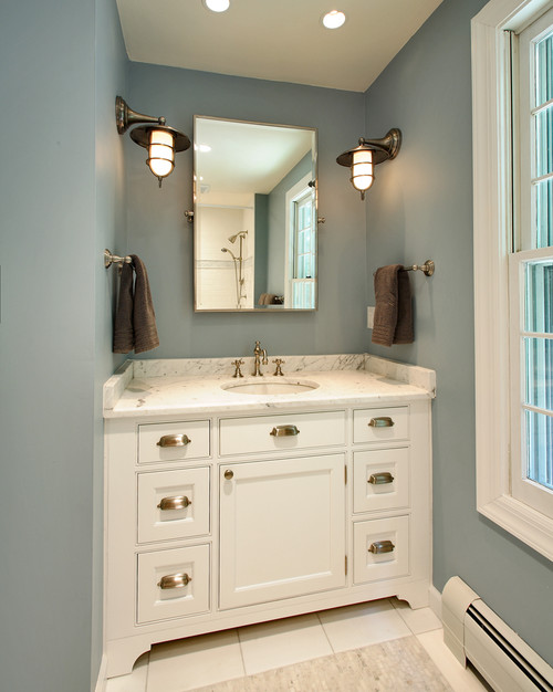
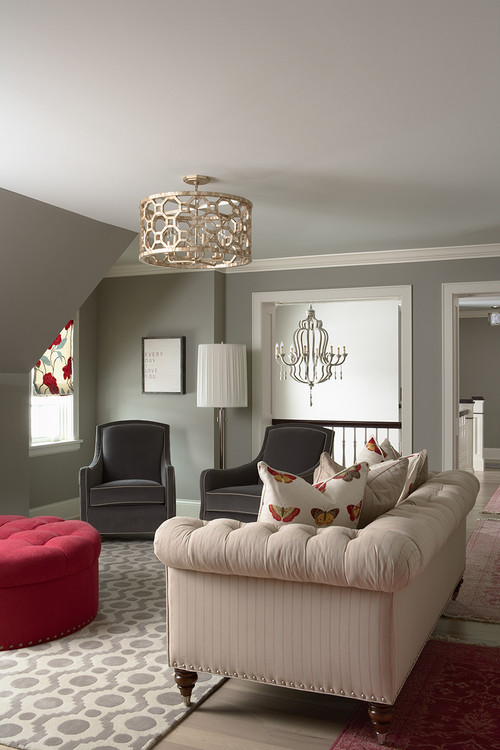
Sleepy Blue by Sherwin Williams is very cool but with the slightest hint of warmth and it transitions perfectly with warm wood tones and the warm tile floors in this image below:
For those warm wanting to transition to gray or for those wanting to add a touch of warmth, Gray Owl from Benjamin Moore is a great balanced gray because it has hints of yellow in it that again would compliment warmer tones in floors or adjacent rooms:

Via Emily Henderson
Again, notice how Gray Owl works well with the warm wood floors. The hint of yellow really make a big difference. By the way, Gray Owl is HGTV Designer Emily Henderson’s favorite paint color and one that she says she uses often because of the hint of yellow and the balance of cool and warm.
Northern Cliffs by Benjamin Moore is another great gray with a balance of warm and cool:
For a very light cooler color, Benjamin Moore Shoreline is the perfect balance of warm and cool and it’s a great catalyst if you want to mix cool and warm tones together in a space:

I stumbled across this awesome collection of warm grays from one of my new favorite paint blogs; Painters Place Blog that are all a nice balance of warm and cool. There are a couple colors in this batch that may lean more cooler or warmer but these colors are a great starting point:

via Painters Place Blog
These examples of paint colors that I have shown you are all starting points for those of you looking for direction in transitioning undertones. Keep in mind that lighting in your space will play a huge roll in determine what undertones will ultimately pop out in the space and what may be perfect in one space may not work in another.
If you’re looking for additional help in how to choose exact colors, you can check out my post “Tips and Tricks for Choosing the Perfect Paint Color“, which I go through the tricks with spotting an undertone and eliminating paint color choices quickly.

One last thing… Keep in mind as you choose paint colors, you can help transition significant changes in undertones through accessories, furniture or art work. You can go cooler with little to no hint of warmth in a paint color (like I did in my bedroom) and you can balance it later by incorporating touches of warmth through accessorizing.
If you want to see more rooms with exact paint colors, I have a really nice collection that you can look through on my “Pick a Paint Color” Board on Pinterest found here.
I would love to know which of these colors
Have a great week friends!!
Cheers!
Cyndy
Ann says
Hey Cyndy –
First let me say how much I enjoy your blog. I discovered you via a friend on Pinterest and have followed you ever since! 🙂
This topic of trends/warm/cool is very interesting to me. I am one who:
1) tends to take a long time to pull a room’s look together;
2) has limited resources & time;
3) doesn’t like to REdecorate;
4) is working with a totally schizophrenic / awful color scheme left to me via the original owner who custom-built our home.
You hear the nightmare inherent in those last few words, right? I’m talking fuschia counter w/gray toilet & sink in the powder room; coral counter w/same toilet & sink PLUS built-in shower/tub in the kids bath; and best of all, sea foam green counter with Barbie pink tile surrounding a rose soaker tub with rose toilet and built-in shower. Not to mention the white vinyl flooring and gray carpet throughout the main floor, and the patchwork of colors via individual room carpets upstairs. Ahhhhh!!
I chose a palette for my whole house several years ago and am still supremely happy with how it works throughout the space. It is very warm, as that was my goal, and I still LOVE it. But I’m still working it in, re-doing the awfulness described above as our budget/motivation/time allows.
Therein lies my question: at what point do you follow a trend, whether it’s transitioning paint colors, or deciding to paint wooden cabinetry, or any other cyclical styles, and at what point do you stick with what you love? Especially knowing it will eventually come around again anyways?
For instance, besides the question of wall paint colors — where I love how you suggest incorporating BOTH cooler and warm tones — I would be open to painting my oak kitchen cupboards. Or my awful orangey-oak trim/doors/stair rails — or ALL of the above.
But my husband, in stereotypical fashion, is dead-set against it. And I tend to agree with him to some extent, knowing that painted wood has come and gone at many points in the past.
How does one stay current without being a slave to trends and starting over every few years?
Would love to hear your thoughts!
~Ann
Cyndy says
Thank you so much Ann!
I completely hear what your saying and I know a lot of people have the same issues. In my own home, I have had the same struggles and I have found that the rooms that I am happy with the the most are ones that I painted years ago that are all very light colors with a calm mix of warm and cool. I really try and stay away from following a paint trend when it comes to bold colors or heavy on one particular undertone. I did just do the trendy blue in my bedroom, but that’s it for me. The rest of my home will stay the same or as I transition, I will stay light with balance of either very little undertone or a calm balance.
I have learned over the years to keep up with the fun trendy stuff that I love with inexpensive pillows, rugs and accessories but keep my walls as neutral and timeless as I can.
Very light calm taupes are pretty timeless and they are not boring and can have depth but will always work in home.
Good luck and thank you so much for stopping by!!
Marlene says
I’m looking for brazillian cherry engineered wood. I cant find it in canada. Do you know where I can purchase it? Marlene
Lori says
Great post… lots of useful information. I am SO glad I came across your blog (per Pinterest) and am looking forward to reading more. 🙂
Stacy says
Help please!! I live in a townhouse that is entirely open the kitchen and living room are divided by a small wall that is open on both sides and it opens up to a sunken living room. Right now it is all painted Shaker Beige. If I could go back in time I would have painted it all in a neutral gray like Agreeable Gray but I can’t go back in time and I can not afford to paint everything all over again. We just renovated our kitchen and it is now white shaker cabinets with absolute black granite counters. I want everything to flow but I really would like to do a color and not shaker beige but I worry whatever color I pick might make it look disjointed like a patchwork quilt. Can I pick one of these colors like the Sea Haze??? Will that flow with the shaker beige enough that they can coordinate the different rooms but also set the kitchen apart?? Help please!! I am agonizing over this with trying to create cohesion without painting it shaker beige but ultimately will do what looks best.
kelly schilling says
Do BM gray owl cabinets look good with BM sea haze walls and white dove trim?