

Source: Benjamin Moore
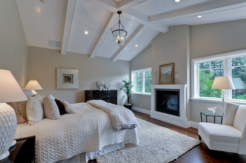
Wedgewood Gray (trim Kendall Charcoal) Benjamin Moore Paint
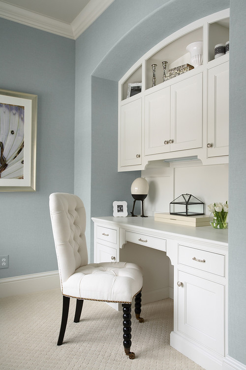
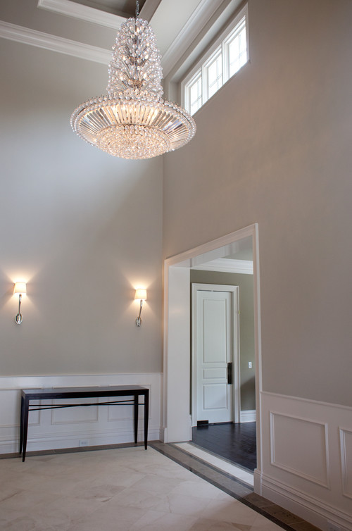
Grant Beige Benjamin Moore Paint
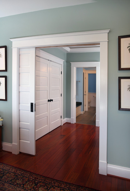
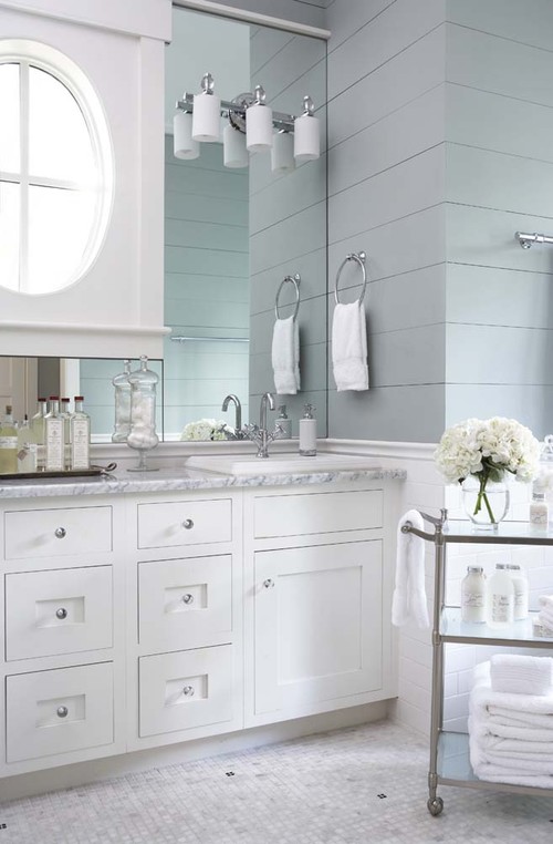
Summer Shower Benjamin Moore Paint
Over the last couple of years, Pinterest has become one of the top sources for finding paint colors. The reason for this is that over the years since Pinterest started, people have been pinning images of spaces and noting the paint colors used in the space. Over time and hundreds of thousands of pins later, we now we have access to a fantastic library of images of rooms painted in virtually every paint color on the planet! Today, I wanted to share some of the most popular paint colors on Pinterest.

Source: Lia Griffith
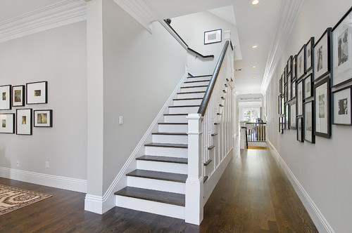
Peppercorn Sherwin Williams
If you search a specific paint color on Pinterest, chances are a collection of various spaces painted in that particular color will come up. It’s so much easier for most of us to visualize how a paint color will look if we can see it used in a space. In fact, I have collected and pinned more than 300 of these fabulous colors on my “Pick a Paint Color” board and all of the colors I have picked for my home have come from this board in some way.
Balboa Mist Benjamin Moore Paint
Over the last few weeks, I have used various Pinterest analytic tools to pinpoint a collection of some of the most popular and most pinned paint colors on Pinterest. It’s not “official” or anything like that but it is great information to have if you’re looking for paint color inspiration. I have also narrowed it down to colors that have a great history of working well in various lighting situations. I weeded out the popular ones that are finicky and have a history of not working so well.
Keep in mind too that what looks great in one space may not look the same in your space. This information is best used as a starting point to get you in the zone of a color and give you a feel for finding shades and undertones of a color.
Pleasant Valley Benjamin Moore Paint
I wasn’t surprised at all when I finally was able to pull together the palette of all of the colors to see that they are all neutral and transitional (balanced mix of warm and cool tone) colors:

Source: Benjamin Moore Paint
Tapestry Beige Benjamin Moore
Right now, people are still looking for safe and calm colors that are rich in depth. I have talked a lot in the past how so many of us are really making our design statements in bold patterns and colors in accessories rather than wall colors. I’m sure the wall color pendulum will swing at some point in the future but right now, the most popular colors are calm and soothing but rich in depth.
Silvermist Sherwin Williams
Fine Grain Dunn Edwards
It’s so interesting to see how paint colors become so popular on Pinterest and I can tell you that it’s because of bloggers and interior designers. For instance, the hugely popular color Sea Salt by Sherwin Williams became an overnight star after Erin from one of my favorite blogs House of Turquoise featured this gorgeous bathroom designed by the talented Molly Frey back in 2010:

Source: House of Turquoise/Molly Frey Designs
Sea Salt Sherwin Williams
Bloggers and designers are not only sharing color inspiration but they also share product details including paint colors used in their projects. The great news is that the best colors spread like wildfire on Pinterest, giving us tons of great paint color inspiration and color possibilities for our own homes:
Berkshire Beige Benjamin Moore
Metropolis Benjamin Moore
Again, I can’t stress enough the importance of considering these colors carefully as you find images of spaces painted in colors that you love. You have to remember that a lot of these spaces are professionally photographed with high tech lights and that each space has different lighting conditions and variables that can drastically impact a paint color. In other words, what looks amazing in a picture may not look so amazing on your wall and in your home. Therefore, be sure and use images of paint colors as a starting point and go pick up the paint card and the surrounding cards and choose paint colors in your space with the predominate lighting.

Silver Marlin Benjamin Moore
River Reflections Benjamin Moore
So now the big question, what is the most popular and repinned color on Pinterest? I bet most of you can guess what it is!
By a landslide, it’s is Revere Pewter by Benjamin Moore. Benjamin Moore Paints also says it’s the number one color searched on their website as well:

Source: Benjamin Moore Paint
Revere Pewter Benjamin Moore Paint
Revere Pewter Benjamin Moore
I have lots of favorites in this group and I can’t wait to hear which ones are your favorite. I just painted my dining room in Balboa Mist and I absolutely love it. I am also loving Van Courtland Blue by Benjamin Moore:

Van Courtland Blue Benjamin Moore
So, is there a color jumping out at you? I would love to know which colors are your favorite in the comment section below. If you want more color inspiration, be sure and take a peek through my “Pick a Paint Color” board here on Pinterest. Also, as you look through that board and have any of those colors painted in your home, please leave a comment about the color. Do you love it or hate it? Does it lean a certain way? Comments on these colors on the board really help so much as we look at picking colors.
If you need a little extra help in figuring out how to pinpoint and narrow down a color, you can check out my Tips and Tricks for Choosing Paint Color post, where I shared an easy way to choose paint colors through eliminating shades and tones. My little elimination method takes the pain and agony out of deciding on a color and helps make the best color for the space jump right out at you!
Thanks for hanging out with me today friends!
Cheers!
Cyndy
Jenny@EvolutionofStyle says
Seeing all of these gorgeous rooms is getting my painting hands the itch to get to work! I’m really taking a close look at Metropolis – I have wanted a rich color for my master bathroom that will work with the tile in there, and that one might fit the bill (once I take down the wallpaper, that is). I also love the Wedgewood Gray with the Kendall Charcoal. The Silvermist caught my eye, because we were *this close* to painting our master bedroom that color. So pretty!
Megan @ Our Pinteresting Family says
These rooms are absolutely beautiful! What a great collection of colors.
Michelle Taylor says
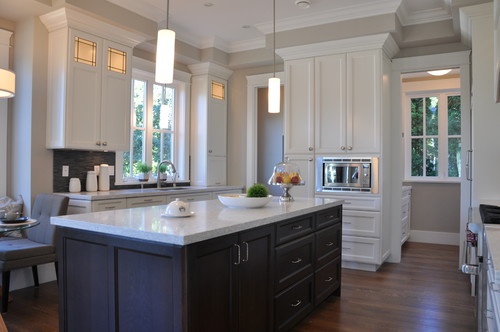
In the photo: Traditional Kitchen by Lake Oswego Interior Designers & Decorators Jenny Baines, Jennifer Baines Interiors
Hi
I just want to make sure that the color noted for that kitchen is indeed Van Courtland Blue? It’s gorgeous and I want to go get a sample of that soon.
Thanks!
Erin says
Just to say – I am so enjoying this post! Thank you!
Sally Moore says
We used Revere Pewter in our entryway, hall, and staircase walls with BM Dove White trim. There is only some natural light due to trees around our home. More than two years later I still love this color. In the adjoining dining room our walls are Wythe Blue, which looks more green. The two complement each other well.
Susan roberts says
Hello, I sure am hoping you can help me. I found this post of your on pinterest, fell in love with the colors! I finally convinced my husband to paint. Went to the store to purchase the colors listed and Benjamin Moore no longer list the 3 colors I desperately want! How can I get colors from 2013 post???7
Liz says
Any BM store worth their salt will be able to mix a paint to match the colors you want – keep looking and hounding therm to do their job!
Renee@Two in the Kitchen says
Hello, I came across your site on pinterest (of course) while looking for paint colors to paint our new home. Love your site! I am going to try Revere Pewter and Wythe Blue, which I am surprised is not on this list…..Although, this list is from a few years ago, maybe that is why. Thanks so much for your great posts!
Lynne says
We are considering painting the red brick on the exterior of our 1958 ranch style home. The gables are light grey siding and shutters are black. The home is small. Any color suggestions for the brick?
Cyndy says
I had a friend who just did the same thing and she tried about 10 colors and she finally narrowed it down to Sherwin Williams Agreeable Gray and loves it. Exterior grays are really hard but I recommend leaning warm gray like Dove Tail or Gray Owl (Benjamin moore). Exterior grays usually go blue because of the sunlight, so choosing a gray with a little yellow in it will really help balance. Good luck and keep me posted 🙂
sonnie says
We have a 100 year old home and a brighter blue living room. Across from the entry adjacent the livingroom is divining room and kitchen. My question is what would be a color to add their? Someone mentioned a green?? Your thoughts….thank you!
Cyndy says
Hi Sonnie! I would suggest maybe a mix of green/blue as a very nice compliment to your blue living room. Something like Beach Glass from Benjamin Moore or maybe Gray Wisp by Benjamin Moore as well. If you have a lot of natural light in the space, I would suggest moving a little more into the green undertone (Sea Salt Sherwin Williams) because natural light casts blue. The transition from blue to green can be harsh but if you tie in some blue into the undertone, it will flow beautifully to your blue living room. Keep me posted and let me know what you decide. 🙂
Amelia says
Thanks for this post. I am searching for foyer color, living room and mud room. Foyer is a priority at the moment. I have dark gray grasscloth wallpaper in the dinning room adjacent to the foyer. No color yet in the living room, which is also adjacent to the foyer. My kitchen and breakfast nook are in Revere Pewter and family room is BM’s winter gates AC-30. I am leaning towards light color, but open to suggestions. My foyer is quite big and has decent amount of light.
Amelia says
and there is white wainscoting in the foyer and the dinning room
shery says
I am trying to add some more happy colors to my home. So far I have painted my dining room Behr Zen (love it) and my family room a color I mixed that is a slightly bluer shade of Zen. Leaning towards a green for the formal living room but I have an open floor plan and an entry with 18 ft ceiling. Need a neutral to tie all of these together and a grey suggestion for the kitchen which will be grey, island is already Peppercorn, and cottage white.
JM says
I love the ideas on this site and hope to include some of the suggestions in my own home!
I’m eager to paint my home office and the guest bath and would like advice on both! I’m interested in a darker blue tone such as Van Courtland Blue for the office, but have built-in honey-oak cabinets that will stay for years to come. Do you think they would work together? Almost all the online pictures I research don’t include oak cabinetry anymore. I’m hesitant to paint them.
And, for the bath, I worry about blue, green, or yellow tones that makes skin look terrible when putting on makeup. It’s been pink and lavender in the past, used as my daughters’ bathroom, but they are (almost) grown and I can re-do with a more elegant look. It’s a small room, no windows, same honey-oak cabinets, though in that case, I can do a new vanity. Thanks so much!
Sara says
I used seasalt in my bathroom and it is so gorgeous!
kla says
Looking for favorite wall colors for rooms with cream (beige?) trim.
Steph Breske says
I have dark paneling in my 1967 ranch home family room. I am looking for suggestions to lighten it up. It also has a brick fireplace. Any ideas would be welcome!