

This week for Color Palette Monday, I wanted to talk about the gorgeous HGTV paint colors by Sherwin Williams. I have talked in the past about how Sherwin Williams and HGTV partnered to come up with eight really amazing paint collections but today, I wanted to pull together a palette of some of my favorites and touch on the collections a little more.
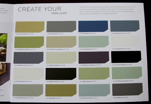
Before I go into the details of the HGTV paint colors, here is this week’s printable color palette, which are some of my favorite colors from each collection:
(As a reminder, each Color Palette Monday is a printable palette. It makes a huge difference to look at paint colors that have been printed out on paper, versus your computer monitor. It helps even more if you print out the palettes on smooth white card stock. My palettes should not be used to replace a paint color card, so if you see a color you like, please go pick up a paint color card).
Here is the link to this week’s printable palette: Printable Color Palette Monday #12
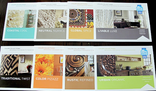
So a couple of years ago, Sherwin-Williams Paint and HGTV teamed together to create HGTV HOME Color Collections, which are color collections that have been coordinated together into different design/decorating styles in eight different gorgeous brochures:
I know these collections have been out for awhile now but they are really fantastic paint colors. I always tell people pick up these large brochures from Sherwin Williams if they need inspiration or they are not sure where to get started in choosing paint colors. Many of these colors have become some of Sherwin Williams most popular colors because of these collections. Also, having the brochures in your hands is great because not only do they each have a collection of paint chip/cards in them but they have beautiful pictures showing rooms with the coordinating paint colors that are displayed within each design style brochure.
There are eight different collections based on different decorating styles. My favorites are:

One of my favorite colors in the Livable Luxe collection is Serious Gray:
![]()

Serious Gray by Sherwin Williams
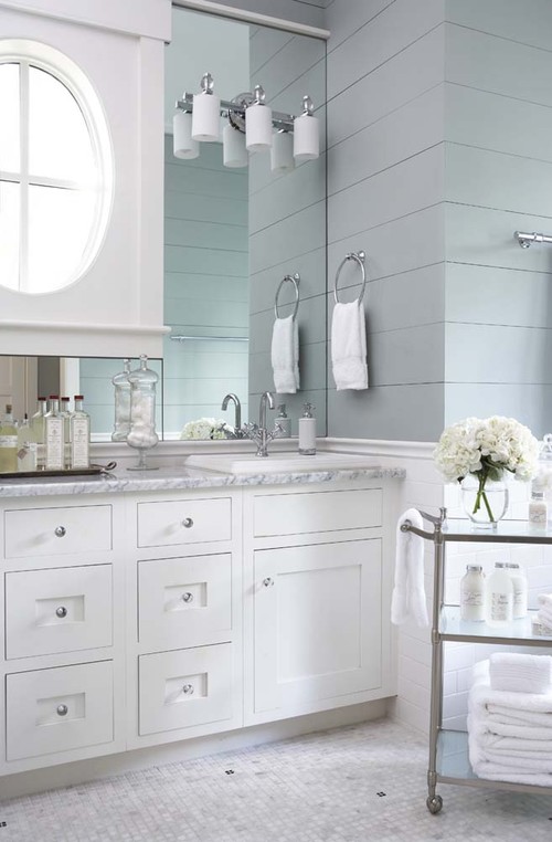
and I also love and have used Silvermist several times now and it’s one of my favorite paint colors out there:
 Silvermist by Sherwin Williams
Here is an example of Silvermist painted in a space so you can see just how amazing this color is:
and if you’re looking for a true black, I think Tricorn Black is one of the best true blacks out there:

Tricorn Black by Sherwin Williams
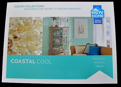
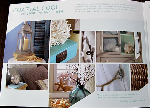
Another one of my favorite collections is Coastal Cool:
All of the colors in the Coastal Cool collection make me smile. They are all very calm and serene coastal colors, which I just love. I have so many favorites from this collection but for this week’s palette, I picked:
 Watery by Sherwin Williams

Eider White by Sherwin Williams
For a little bolder and brighter colors, the Global Spice Collection has some fantastic bolder colors. I love that they are bold in more of subtle way:

I really love Stunning Shade from this collection. It’s such a rich darker gray/plum combination that is really gorgeous. I want to try and find a place in my home to use this color:

Stunning Shade by Sherwin Williams
What’s also great about these brochures it that all of the photographs of the spaces and furniture pieces painted in the coordinating paint colors shown in the back of the book:
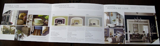
The middle section of the brochure gives us different paint combinations from the color choices shown painted on multiple rooms. This really helps if you are painting more than one room:
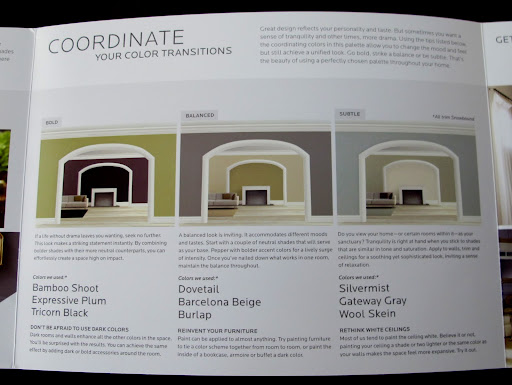
This is not your usual boring paint color brochure, these are really some of the best paint color combinations that I have seen. Of course it helps to have the talented design folks at HGTV and the experts from Sherwin Williams partnering and choosing such great colors/combinations. Seeing the color combos sparked some new favorite colors and combinations for me like Tricorn Black! I would have never considered painting a room black until I saw this:
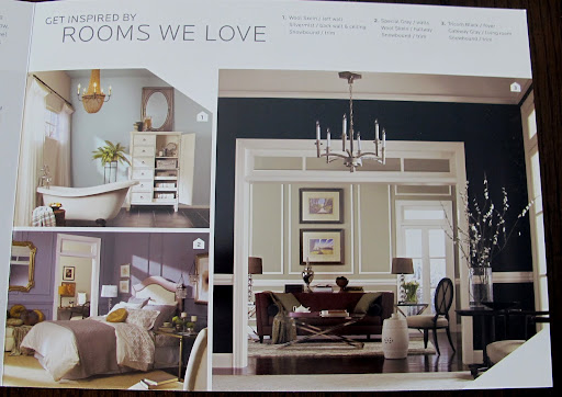
I love the decor placement and room designs in the brochures as well (a lot of design inspiration too):
There are eight different HGTV HOME collections/brochures out right now. For those of you that are really having difficulty finding color inspiration, this is really a fantastic resource for inspiration and color combination ideas. You can pick up the brochures at the Sherwin Williams store and (again) it really makes a big difference to have these brochures in hand versus looking at them online.
Here is a picture of the brochures that I picked up:
I know I sound like an infomercial for Sherwin Williams but I just love these brochures and collections and they are really one of the best paint color resources out there. I hope that this will help and inspire some of you with a new paint color or two! Let me know if you pick them up and which style/color is YOUR favorite!
Thanks for hanging out with me today! If you missed any of the previous Color Palette Mondays, you can get to those posts here.
Cheers!
Cyndy
Jenny@EvolutionofStyle says
I love these palettes, and used Neutral Nuance as inspiration for my basement colors. Such great combos – like Garanimals for paint palette addicts like myself. 😉
I thought of you yesterday when I was at Home Depot looking at paint (of course). Behr had little cards that you could pick up that had three paint colors inspired by a photo. Have you seen these? So cool!!
Cyndy says
They really are such a great resource and I wish they would do more. Exterior ones would be great too!
No, I haven’t seen the new Behr cards yet. Oh, I can’t wait!! I have to head to Home Depot this morning, I will check them out. Thanks so much and thanks for stopping by Jenny! Hope you’re enjoying your summer girl!!
Laura says
We just painted our main living space, kitchen, and laundry room! I went to sherwin williams not even looking for HGTV colors until I saw the brochures. We went with Proper Gray for the entire main living area (open concept) – can see from the front room ALL the way to the back sliding doors. The one wall is all connected with just a half wall to break it up. We painted the half wall your Peppercorn and the mini wall with our pantry door in the kitchen to break up the long wall. I LOVE IT. It’s dark for sure – but that one long wall has 4 windows, the front room has 2, and the back room has sliding full glass doors. So LOTS of natural light. The kitchen is a pop of turquoise they matched for us from a Behr paint color I adored. And because we had leftover we decided since I spend lots of time in the laundry room (anyone else know a good system??? I love doing it, it’s the putting away the clean stuff that gets me everytime..) since I spend so much time in there I decided I better LOVE the color on the walls even more! So it too matches my kitchen. Everyone loves it and can’t believe that bright turquoise looks so nice. It’s just enough wall space broken up by cabinets that it’s not overwhelming. But the statement is the peppercorn wall, I haven’t had anyone over that doesn’t like it. But it’s my house so I love it and don’t really care what other people think. 🙂 Onto the halls….bedrooms…bathrooms…hmmmmmmmmmmm
rivka says
do you have pictures?
Megan says
I love their brochures. They are full of ideas and inspiration that’s for sure. I would love to move into any of the rooms that you’ve shared above. I hope you have a great 4th of July.
Brenda says
We used Sherwin Williams Silvermist in our laundry room…it’s been on the walls at least 3 years and I still love it!
MARIE says
would love to know how to make an old, unused fireplace & mantel,
“sparkle” thanks for all your imput.
Kristi Burr says
Love your blog, AND Sherwin Williams! The paint may be expensive, but so worth it. Some of my favorite are Ramie, High Tea, and Rice Grain!
Gee says
Love your tips for narrowing down paint colors which is what brought me here! I want that relaxed spa feel in the master bath but I am having a hard time. Too blue or too gray and the beige cultured marble screams yellow. Too muted and the walls look like tooth paste. Room is west facing and gave me problems last time too. I ended up with SW Latte but I would like something lighter and more soothing. And less beige! Master bedroom is SW Amazing Gray which I absolutely love but it clashes with the beige of the tile and cultured marble. Thanks!
Gee says
I meant to add that I keep going back to those HGTV colors but they are getting me no where!